
Project Name:
V Riise Campaign
Project Type:
Personal, Didn’t work with V.
Tools Used:
Adobe Fresco, Illustrator, After Effects
Month/Date:
April 2025
THE BRIEF
THE BRIEF
To get more projects and more work for my portfolio, I’ve decided when something catches my eye, whether it’s something I think I can improve or add to. Whether it is a brand redesign, packaging redesign or designing a campaign for new or existing products and brands. This is how I will build my portfolio.
PROJECT BRIEF
PROJECT BRIEF
This little project came to me when I saw this new exciting product from V Energy Drinks while working in the supermarket and started having ideas for designs for a campaign. I then made up my mind. I would buy the drink, try them, and create a design based on the flavour, the can design, my thinking of the intention of their drink and their previous campaign designs.
Morning Drink (Riise, Sun Vector, sunrise gradient)
Importance - Slow-release energy
Other campaigns typically say “NEW” somewhere
Their other drinks have a circular repeating “v’s” behind the “v” logo.
Drink is sparkling and refreshing
Campaign Design
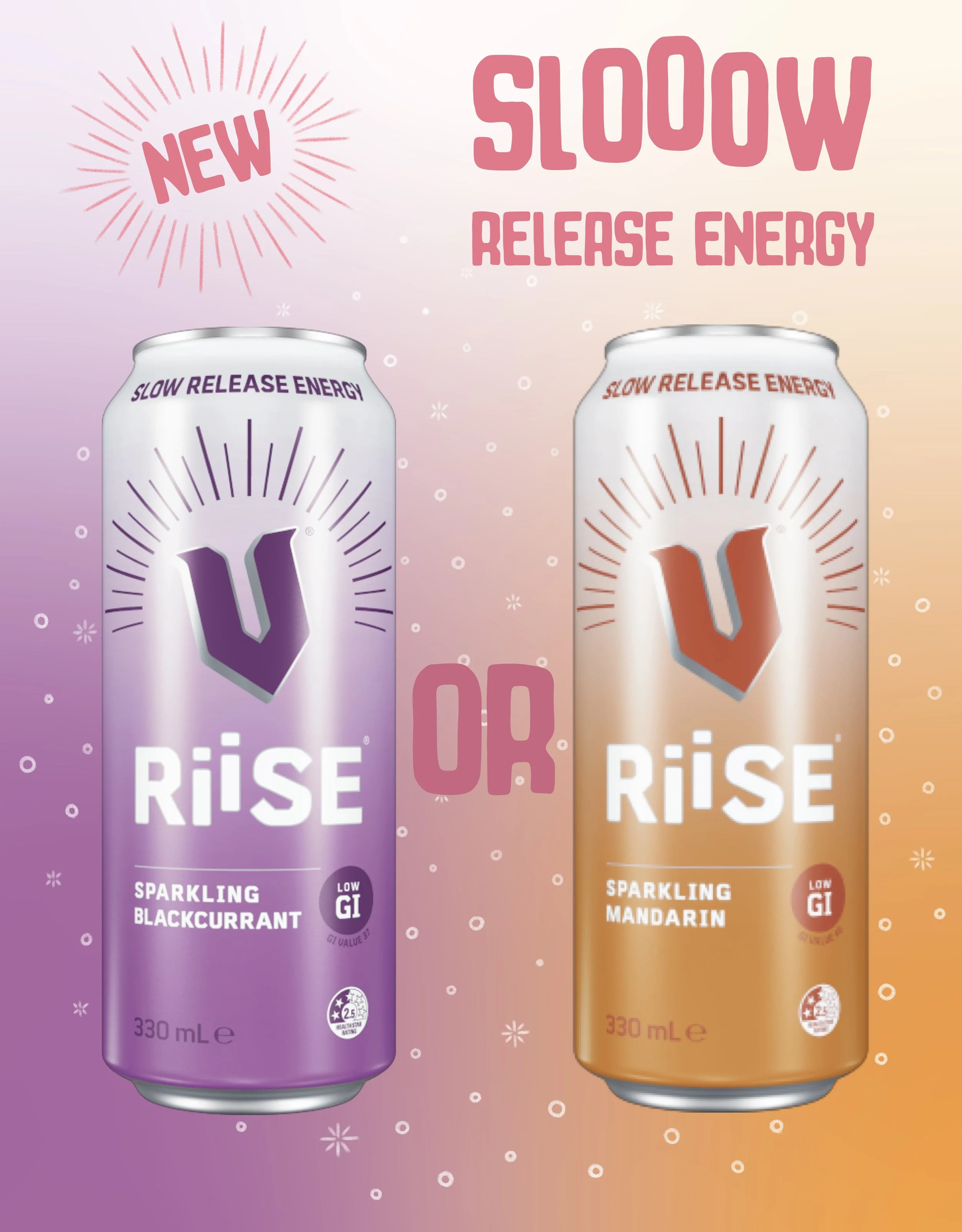
The first part I started with was the background gradient. The colours of the gradient are the true colours of the cans. I wanted the campaign to show both of the flavours and give a prompt on social media for engagement, to ask people which they like more. I did a similar gradient that was on the can, and in the middle, where they mix, I did a sunset pink colour.
I felt like the slow-release energy was an important part of the drink, so I included a text somewhere I thought was important. To create a link between the drink and the rest of the design, I stretched out the slow and lifted up a few of the “o’s” like in the “Riise”. I chose a typography that was sort of similar to the typography already being used but one that is a little more organic, too, for the natural fruit juices in the drink. For all the extra text, I used a pink sunset colour to keep with the morning aesthetic. I wanted a colour that would stand out, rather than using purple or orange, but still keeping with the aesthetic.
In V campaigns for a new drink, they always have a “new” stamp. So, I wanted to include one. To make it link with the drink, I reused their sun line design around their V logo for the new stamp.
Normal V drink cans have a circle fading gradient pattern of their smaller v logo around their main logo. I wanted to use a similar shape to simulate, but also the sun shapes for the bubbles for the sparkling part of the drink. I used an organic-looking brush, again for the natural fruit juices used in the drink, for the bubbles and the new stamp lines.
Social Media Motion Design
Instagram posts that have some sort of motion or reels rather than just still photos are getting more engagement in these times so I thought it would be good to try out some animation on this design.
I didn’t want to have too many elements in motion at one time because that would be over-stimulating. I start with the most important, to the next to the next. I wanted the bubbles to keep popping for the full reel. I used a stop motion style for this part utilising the feature within Adobe Fresco and redrawing the bubbles smaller, bigger and popping.
For the rest of the animations, I used Adobe After Effects. At the start of the video/gif, I thought it was important to have the “New” in motion first, just tilt from side to side. I have this repeating another time after the “slow release energy” animation.
The next important element is the slow-release energy text. In the still version, the letters are rising up, so I animating this with all the letters after the “new” animation is finished. The “slow” bounces up more as it is more important than the “release energy”.
Lastly, I have the cans enlarging and tilting and going back to the original size, one can after the other.