

Project Name:
The Oil Smit
Brand Redesign
Project Type:
Personal, Social Media Brand Presence Redesign
Tools Used:
Adobe Fresco, Illustrator
Month/Date:
January 2025
THE BRIEF
THE BRIEF
To get more projects and more work for my portfolio, I’ve decided when something catches my eye, whether it’s something I think I can improve or add to. Whether it is a brand redesign, packaging redesign or designing a campaign for new or existing products and brands. This is how I will build my portfolio.
PROJECT BRIEF
PROJECT BRIEF
This business is part of my family, yet he doesn’t know I’ve redesigned his brand. His business sells high-quality, affordable recycled chain bar oil for anyone cutting wood.
With this redesign, I wanted to keep some things of the existing design so it’s still recognisable. I kept the same colour scheme of black and white and the droplets he currently uses. However, I changed the typography for a warmer approach to show his personality and make the graphic logo better for social media. I also want to highlight the recycled part of his business because I feel that it is important.
I want to redesign want he currently has as a logo, and because this is for Facebook, a post, a cover photo and a profile picture.
Logo (graphic)
Profile Photo
Cover Photo
Social Post
Recycled Oil (highlight)
Same Black and White Colour Scheme and droplets (recognisable)
Changing typography to give a warmer approach
Logo Design
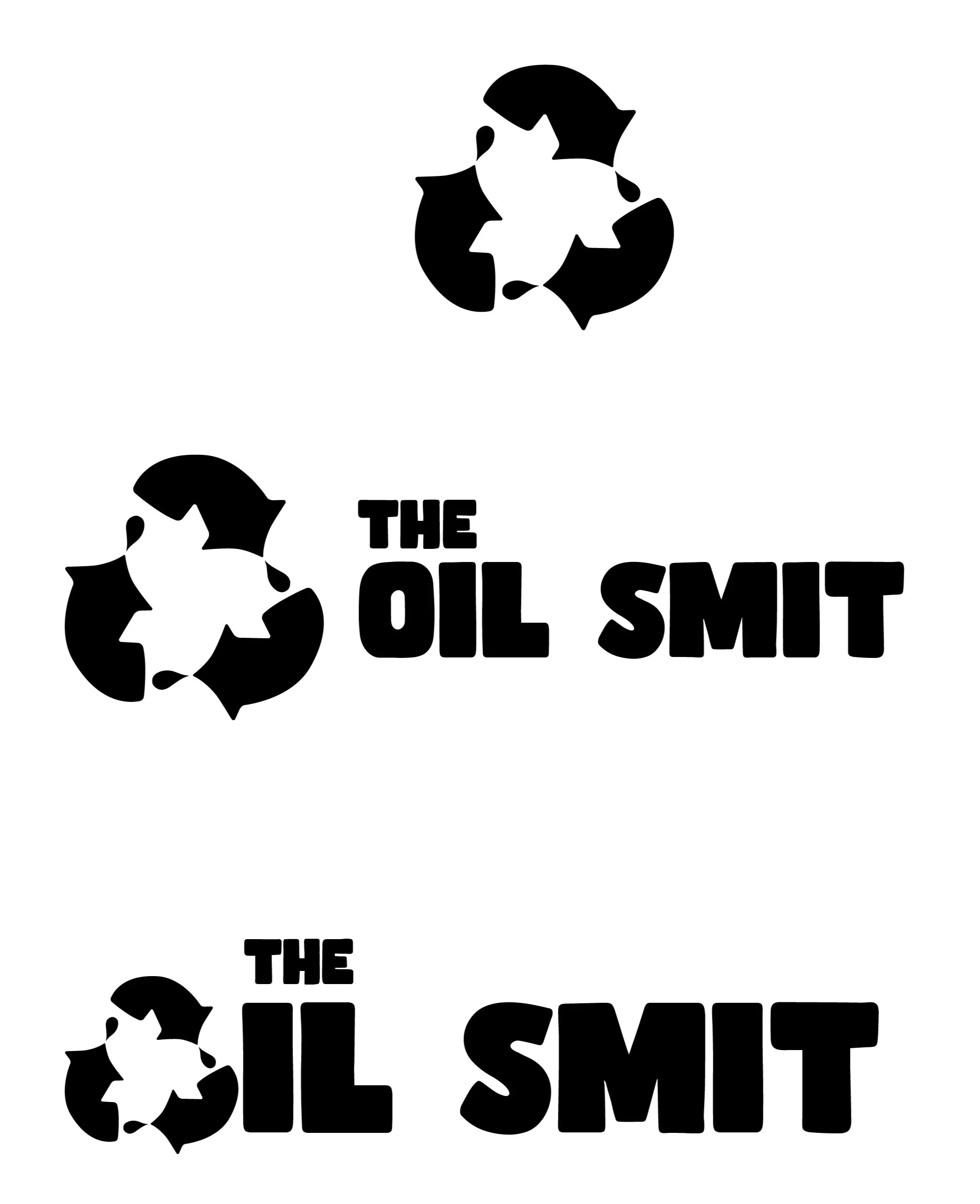
As part of the logo, I wanted to incorporate the recycle symbol because I feel that is an important part of the business. I put some droplets at the end of each arrow to bring in the oil part and the old branding. I’ve used soft edges for this icon to show the personality of the person behind the business.
For the logo typography, I’ve looked for something that has soft, organic edges, again to show the personality of the person behind the business and because of the use of recycled oil, something bold and blocky because oil is a strong material.
I’ve created three types of logos: an icon, a long form and a short form. The short form uses the icon instead of an “o” in “oil”. I’ve made “the” small in both logos because it is not an important text in the logo.
Facebook Layout Designs
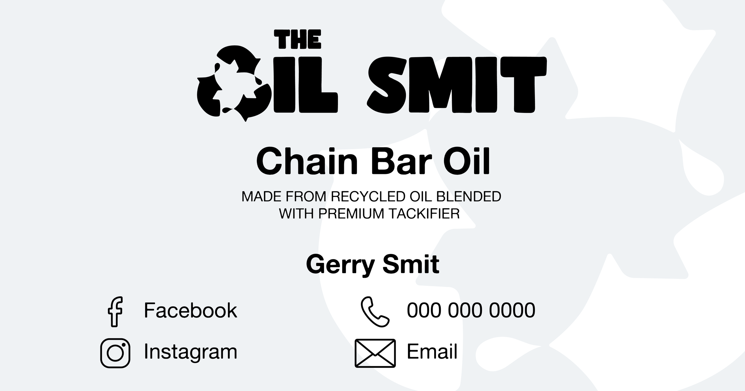

I’ve got the main/short-form logo big at the top of the post. Next is the biggest in the hierarchy, knowing what they are selling, “Chain Bar Oil”. Underneath that, in smaller text, are more details about the product. The next hierarchy is to know the name of the seller and their contact details. For all these important details, I’ve used a less busy typography to the logo, but one that has similar characteristics of soft curves. For the contact information, I’ve used icons to break up some of the text. I’ve continued using soft edges for these. I kept the background simple with a light grey background and the logo icon scaled up in white as negative space. It’s simple and not too distracting from the important information but impactful.
For the cover photo, I kept it simple, reusing the same background from the post, using the same typography from the logo and just highlighting what they sell.
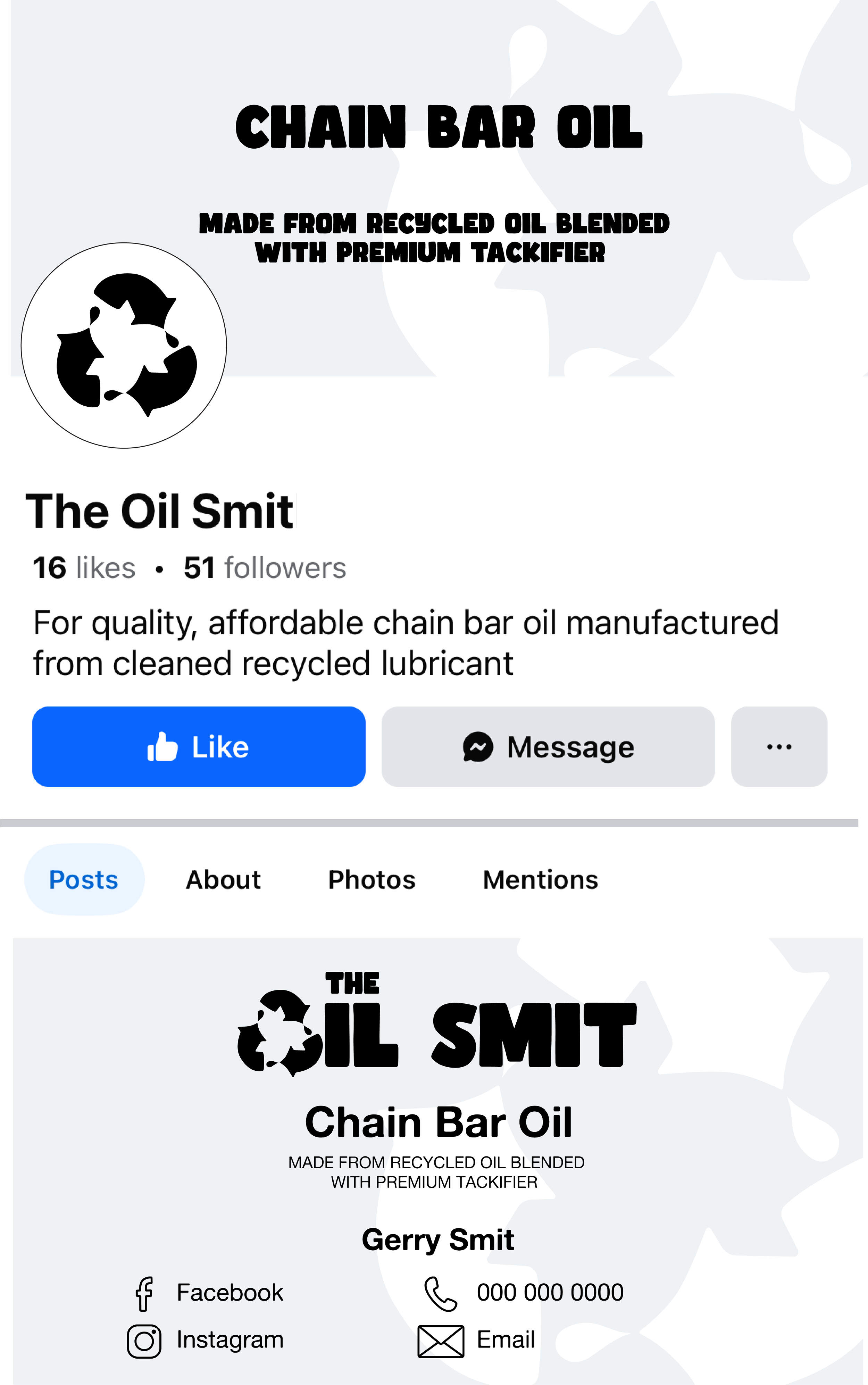
This is how it looks all together on Facebook layout. I’ve only got the logo icon as the profile picture because the text would be too small to read. You have what the business sells right at the top of the cover photo and then the post has all the details together.