
Project Name:
Te Manawa
Kids Club
Project Type:
Client, Kids Club Asset Creation
Tools Used:
Adobe Fresco, Illustrator
Month/Date:
Aug - Nov 2024
THE BRIEF
THE BRIEF
This is one of the clients I worked with while studying at UCOL. Te Manawa had this idea of a kids’ club but didn’t have a budget or the time to create it further which then brings it to us, four students at UCOL. The brief was mostly limitless. the themes we could focus on are space, dinosaurs, sunlight, New Zealand fauna and flora. The types of assets they were looking for were passport membership with a visitor stamp page, activity pages, bookmarks, stickers, pins, badges, subscription send, etc.
PROJECT BRIEF
PROJECT BRIEF
Once given the brief from the client I came up with my own brief and goal of what I would complete within the timeline. I mainly focused on the theme space since I’m a landscape illustrator while the others in the group focused on the other themes.
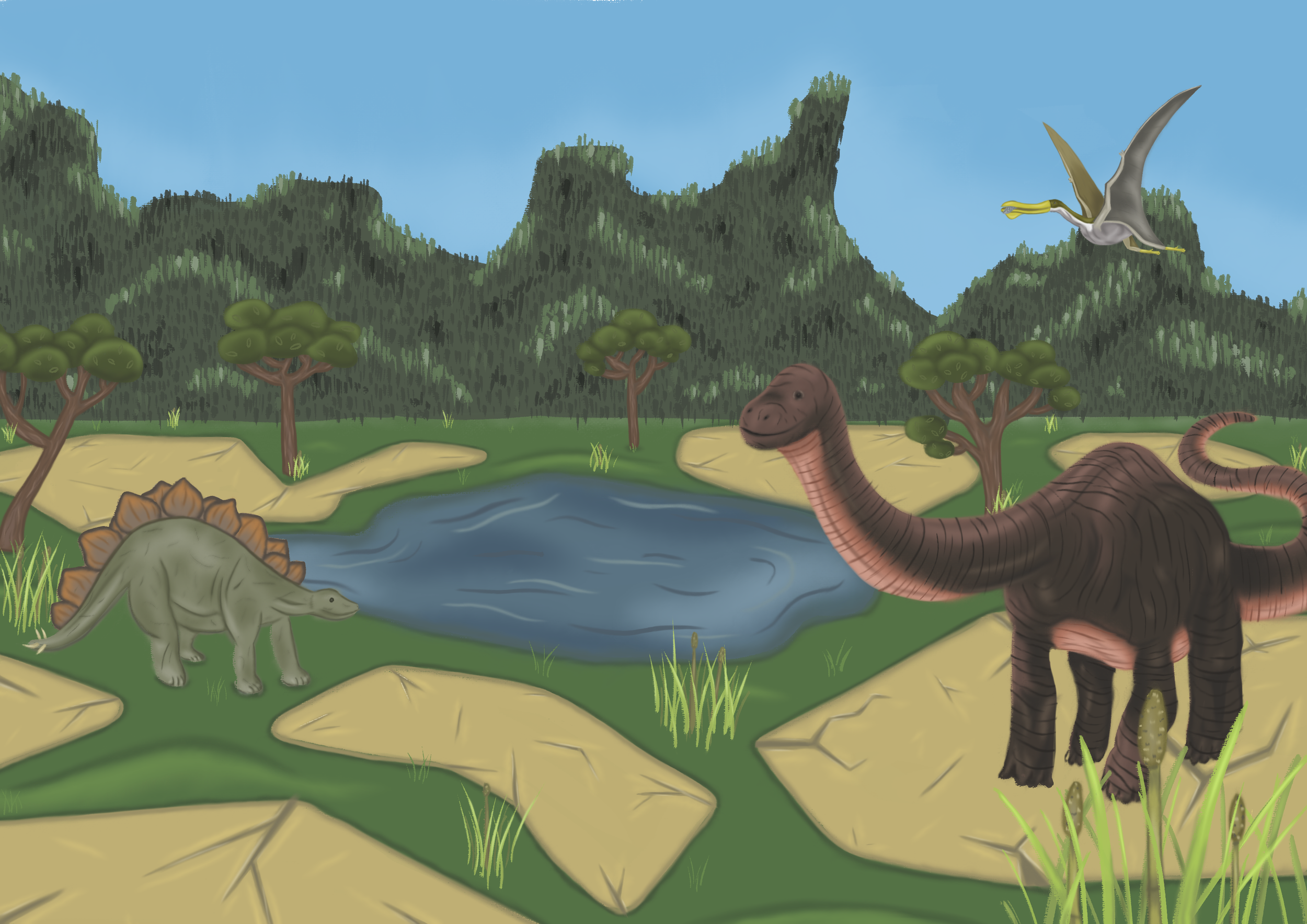
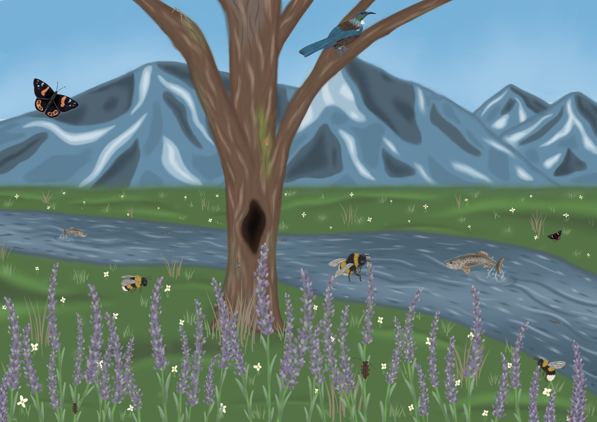
3 Passports covering the 3 different themes
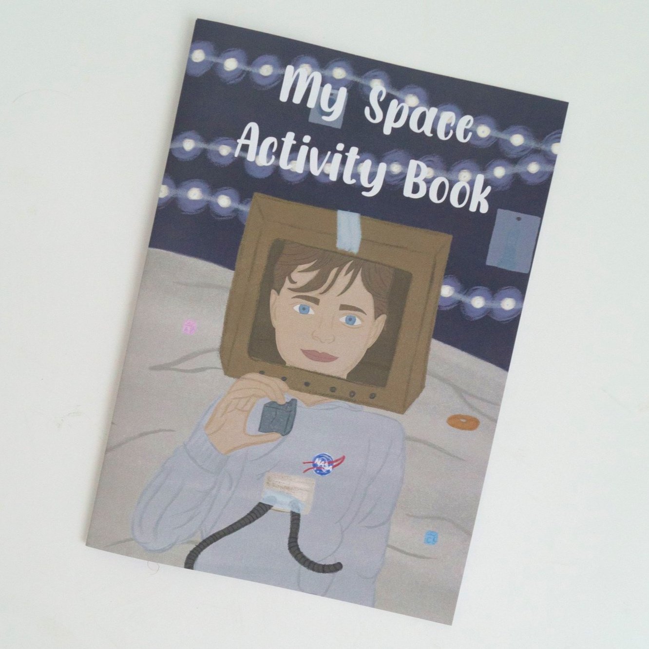
Activity Book
Subscription Envelope Packaging x2
Pins/Badges/Stickers
Bookmarks
Tote Bags
Stamps
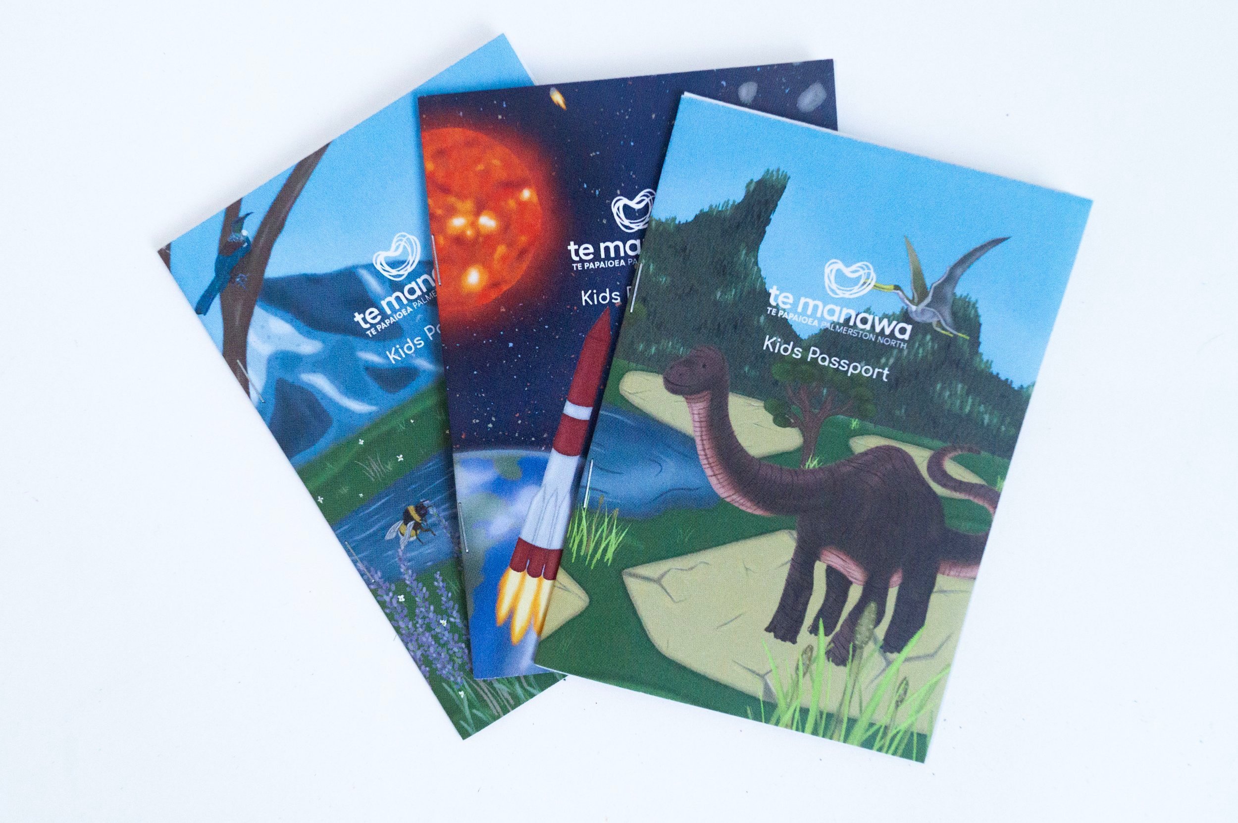
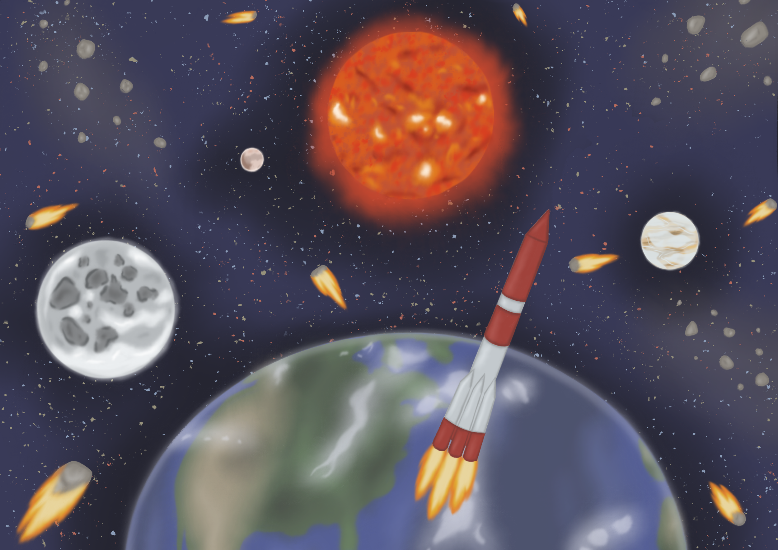
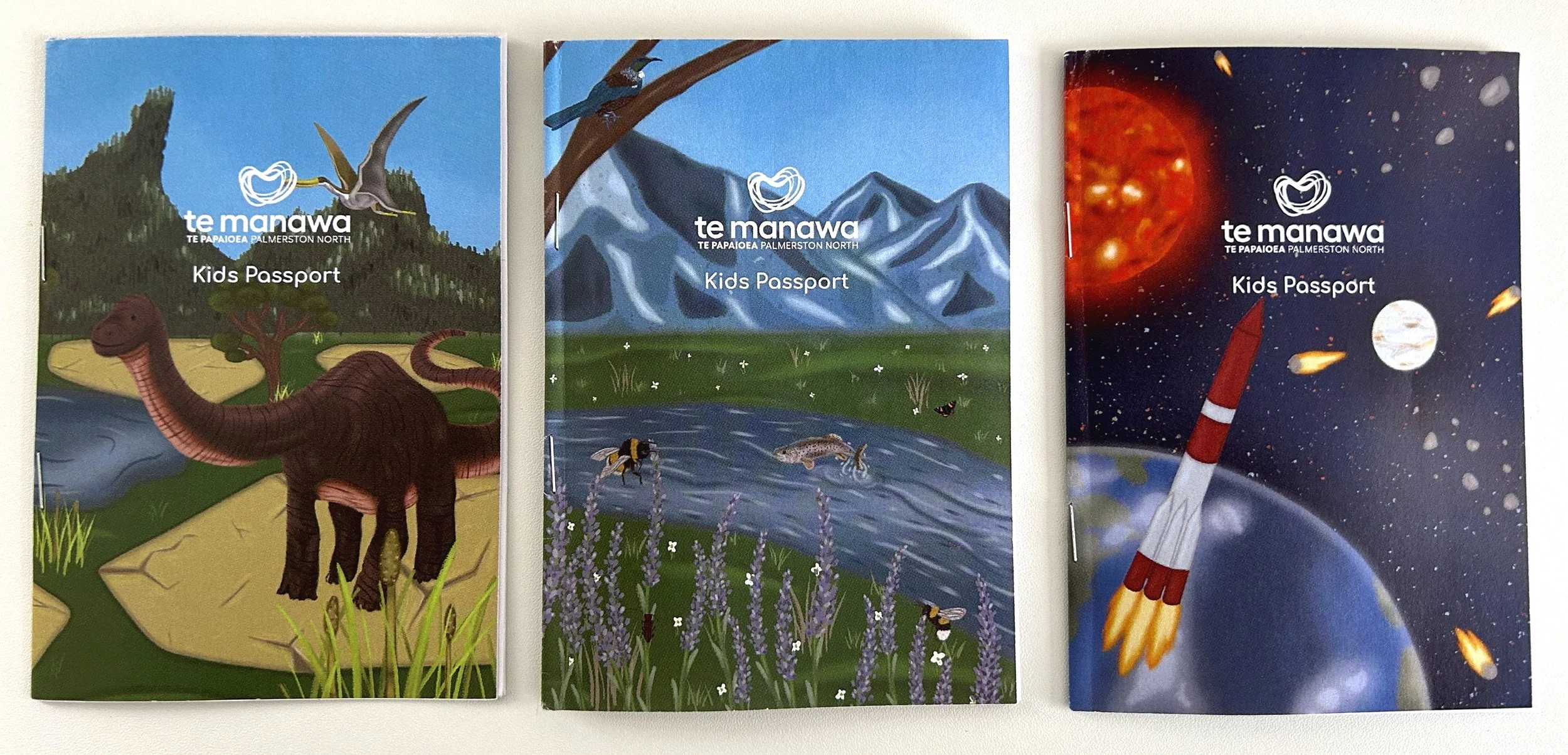
Passport Designs
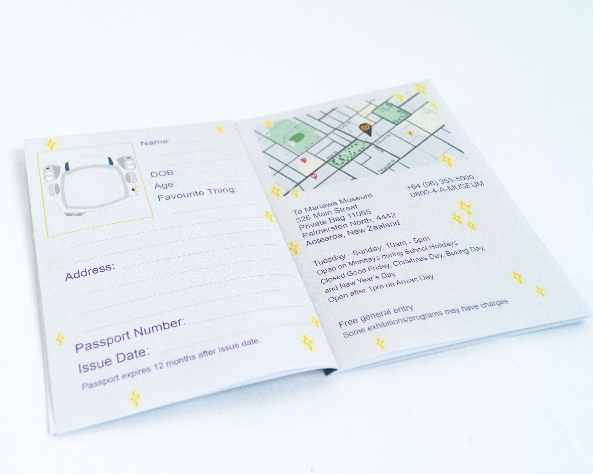
The illustration style for the passport was cartoon for the target demographic kids between the ages 4 - 10.
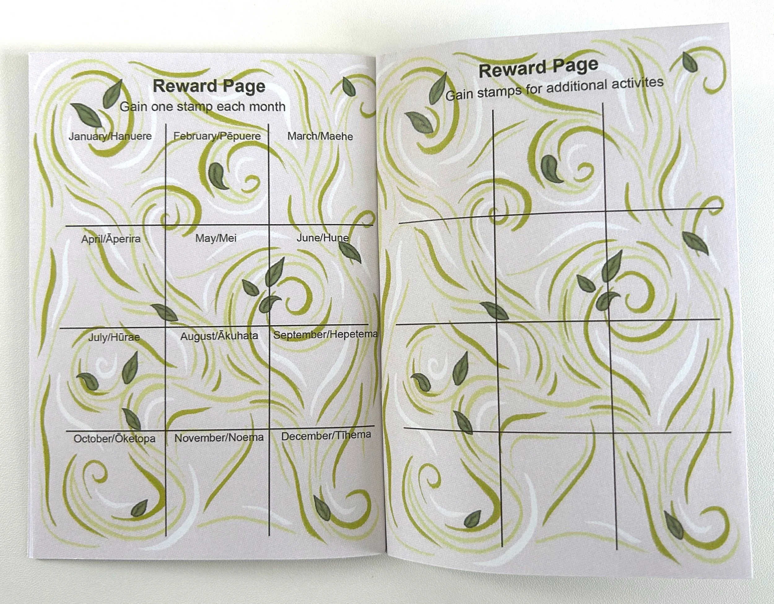
Te Manawa asked for what they called a “passport” which is their type of kid’s membership card which has the kid’s information and a stamp page to get a stamp for every time they visit.
I brought the idea of creating three different themed passports to suit the different kids who like dinosaurs, space and nature.
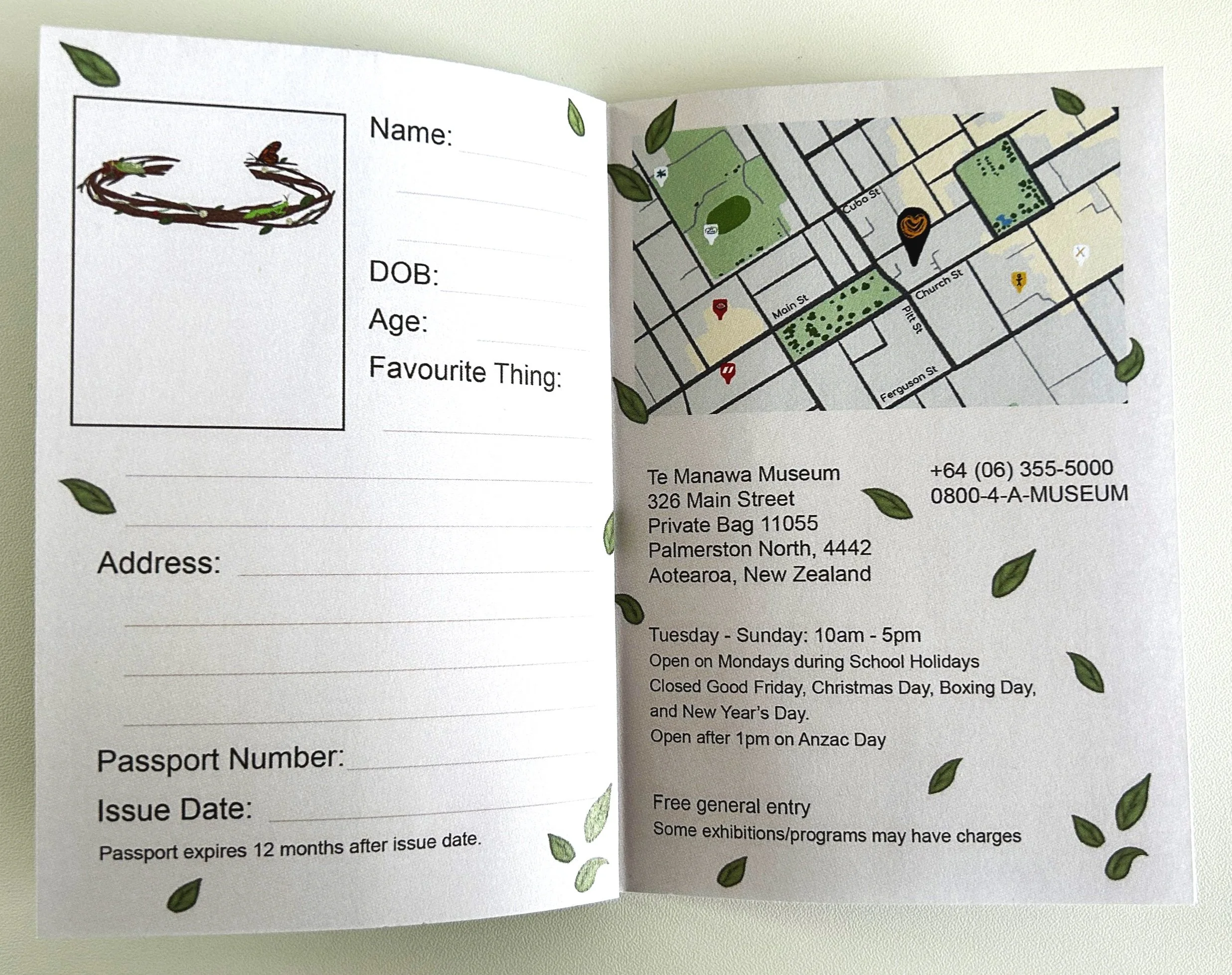
Within each of the passports on the kid’s information page, I included a favourite thing as a fun fact instead of just boring information. I also wanted to include a picture of the kid with their themed accessory but printing and taking the photo might be complicated for Te Manawa staff so I opted for the children to draw themselves instead.
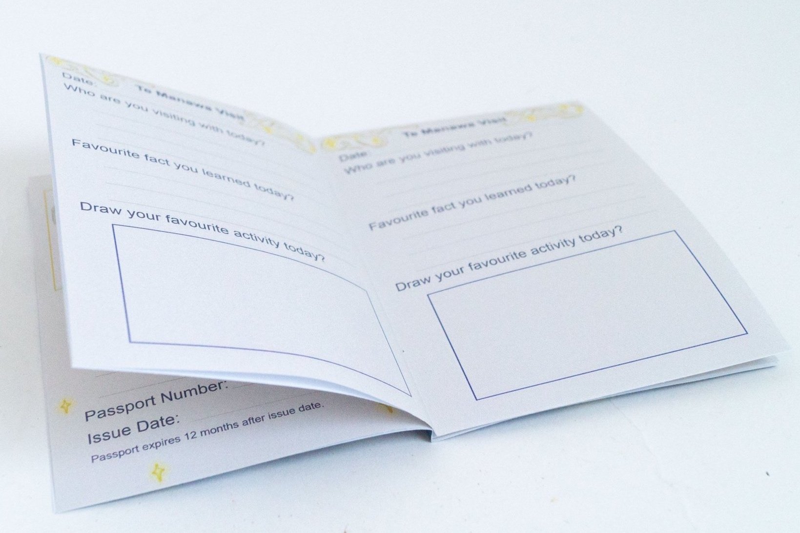
An idea for a page I had was information about Te Manawa. A map, address, phone number, their open times, days and prices. This is just so people don’t have to look up this infomation, its all in the passport.
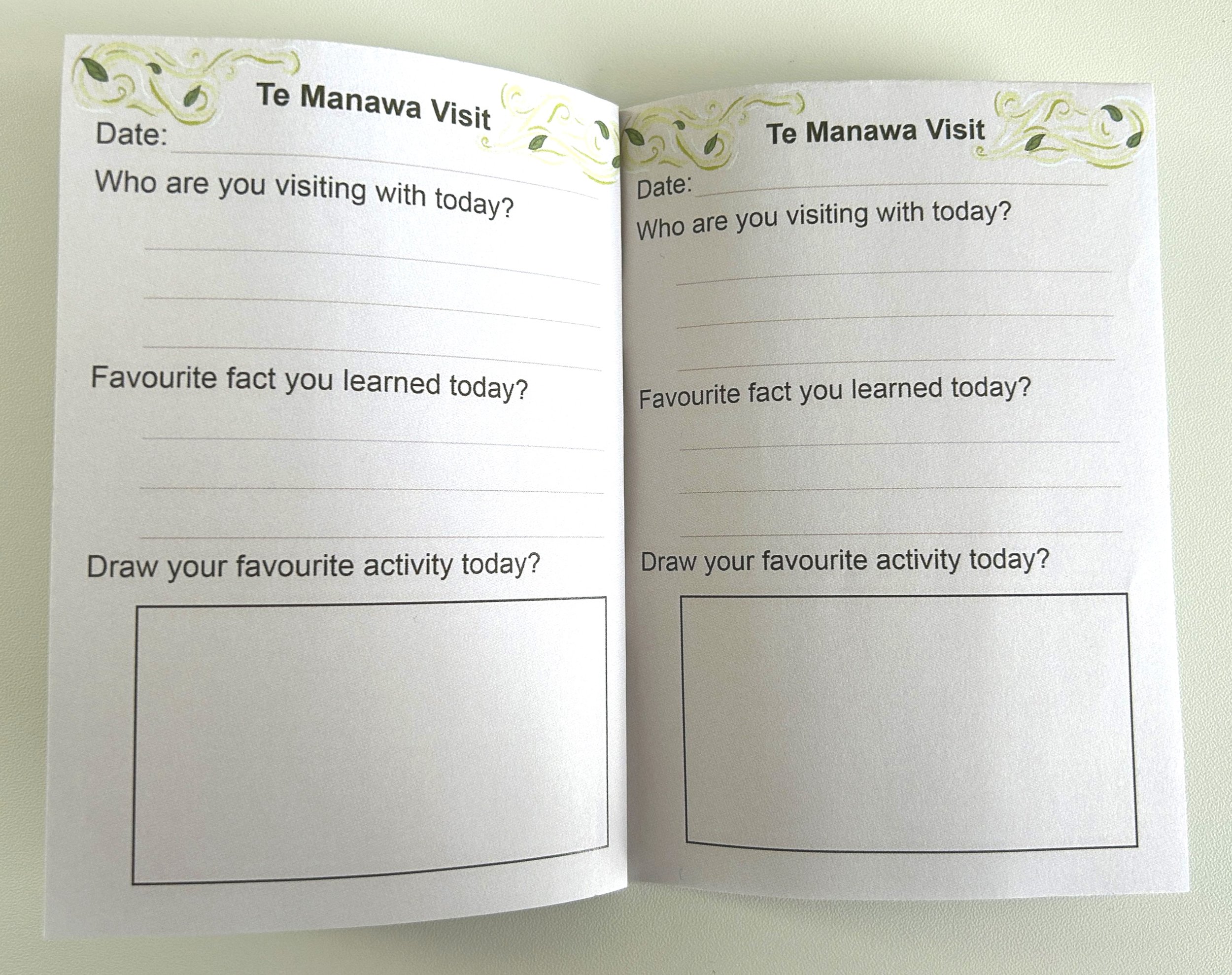
Another idea for a page was a questionaire about your visit. The date, who you visit with, favouirte fact, and drawing your favourite activity. I think this could be good infomation for Te Manawa to have. To learn what is successful with certain age groups.
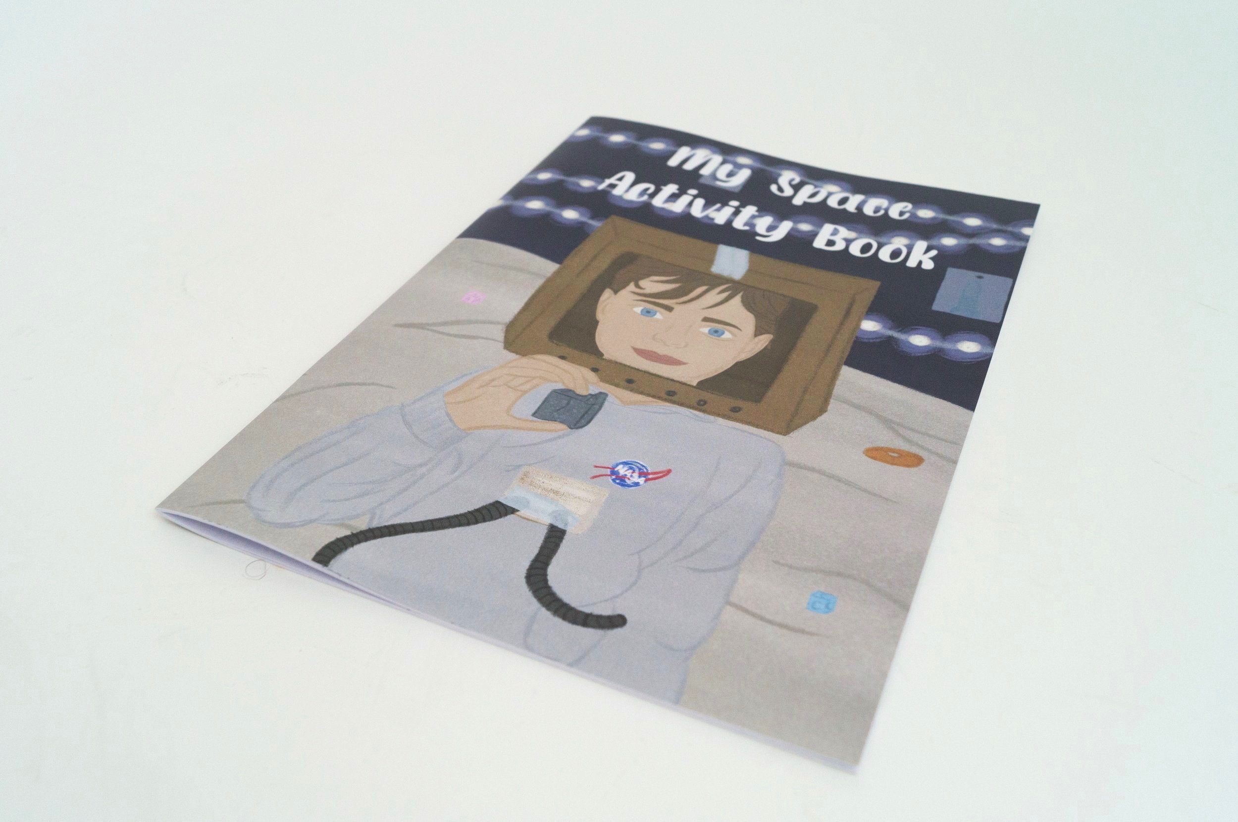
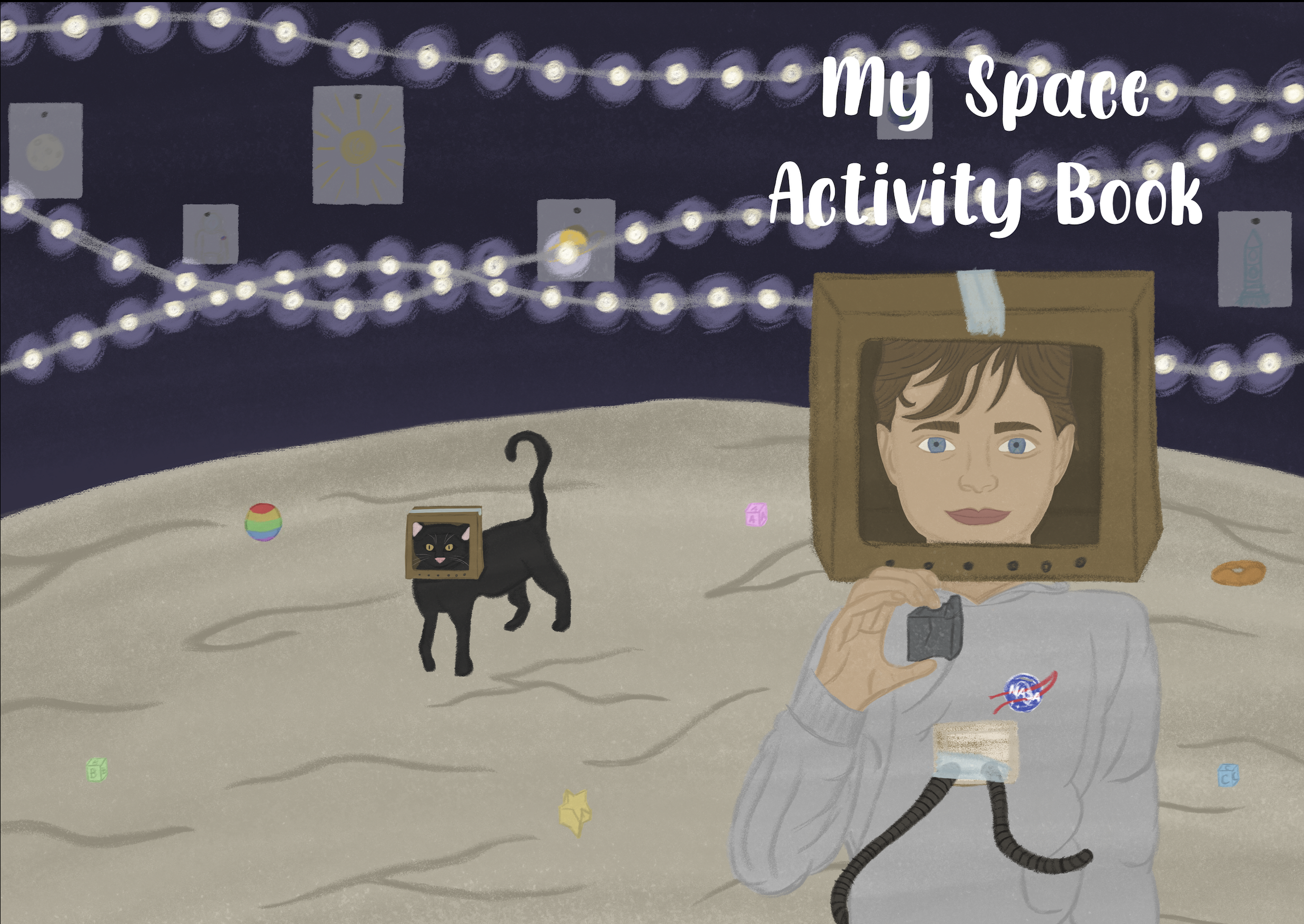
Activity Book Design
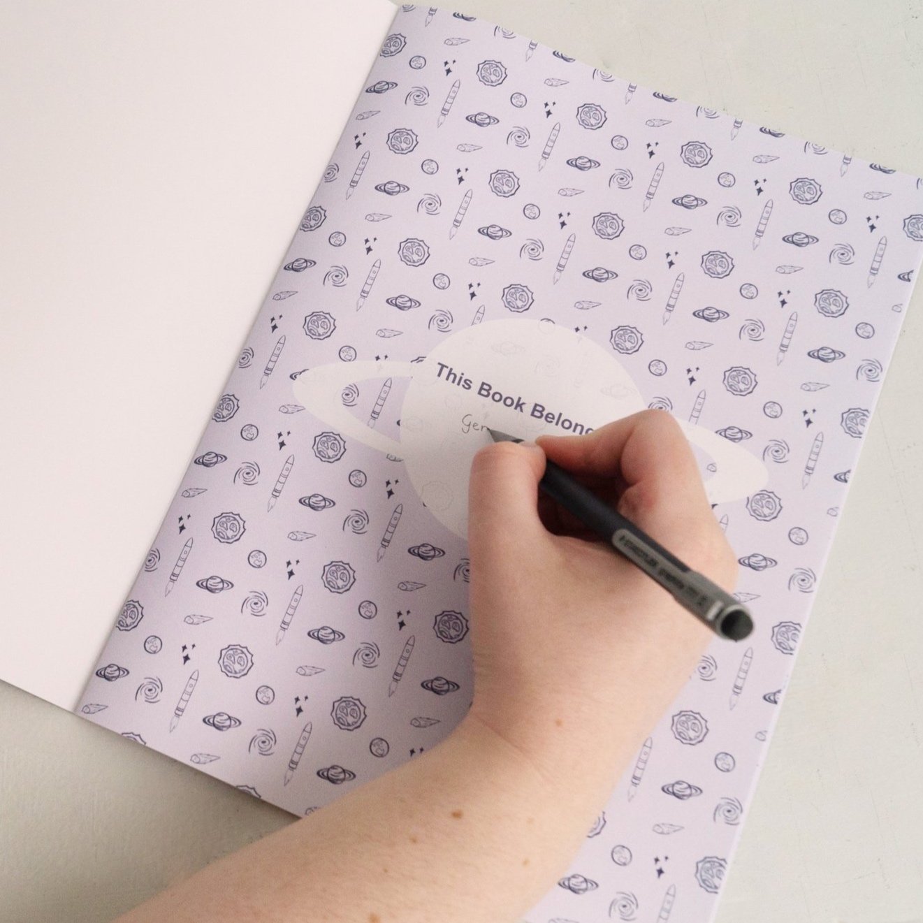
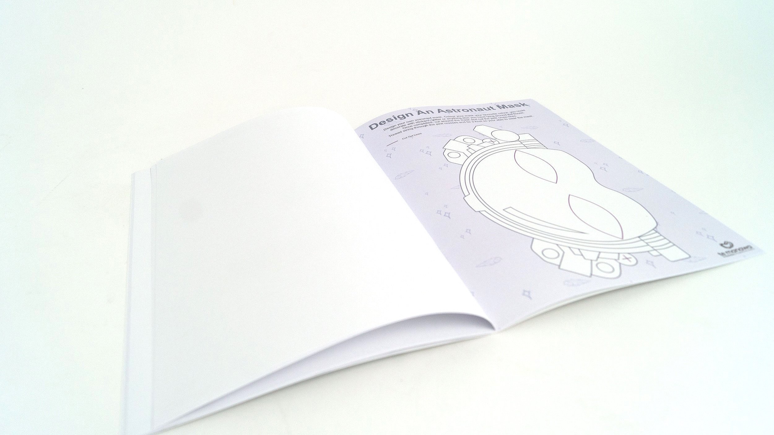
The illustration style for the activity book was more playful sketchy style to go with what it would look like once it would be completed, filled with lots of pencil drawings.
The front cover design is based on the idea of for the kid to imagine themselves adventurering through “space”. They are in their bedroom dressed and acting as the moon. Twinkle lights as the stars, a sheet on the floor as the moon floor and cardboard helmet.
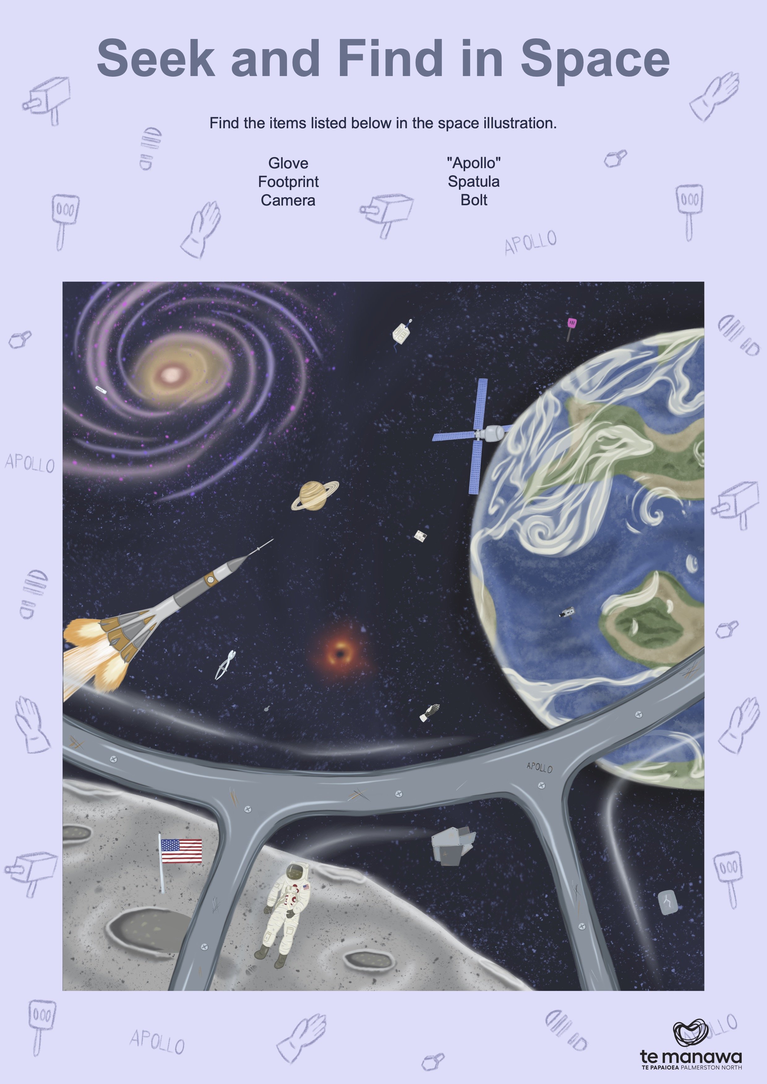
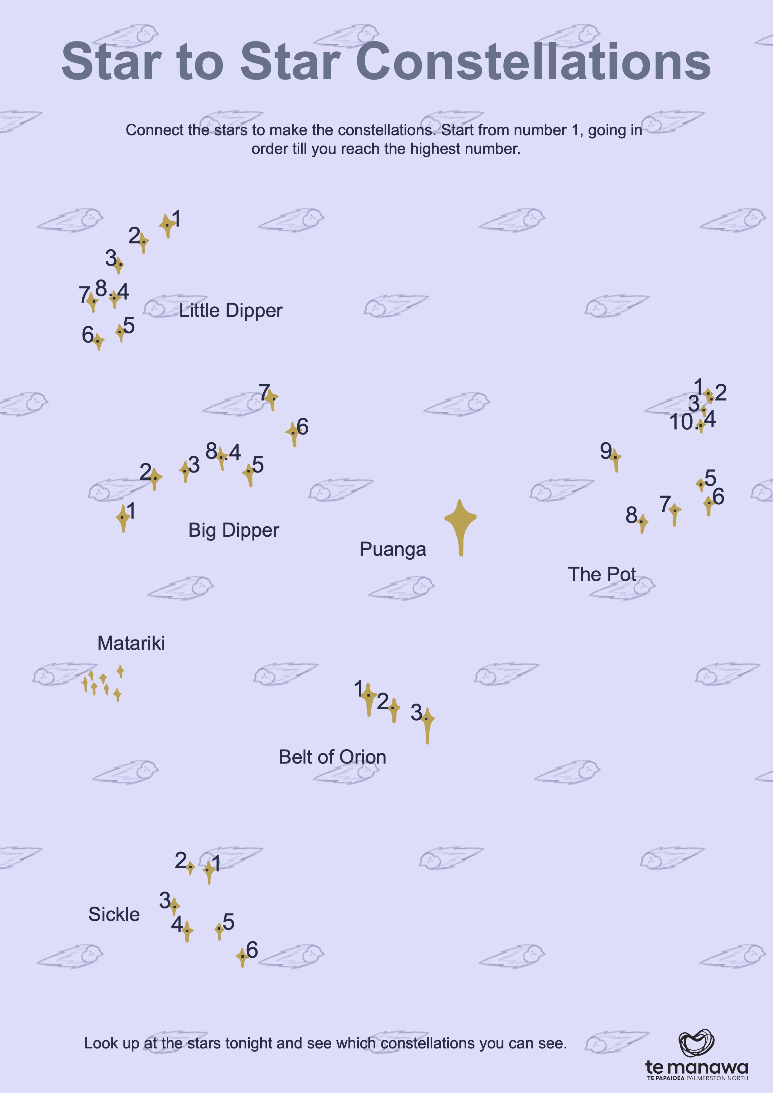
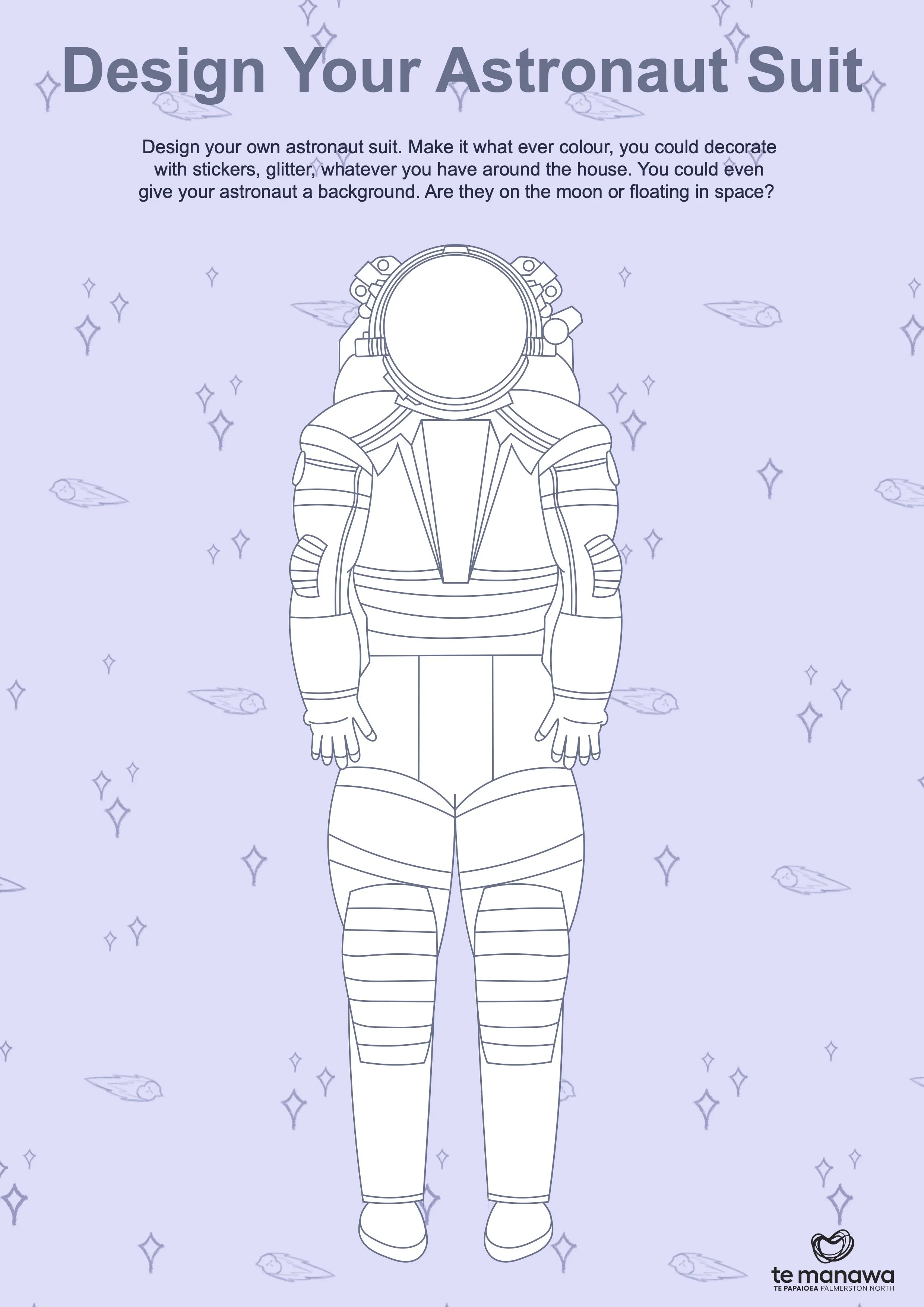
Te Manawa asked for activity sheets like word searches and mazes on the different themes.
I took this a step further in making a activity book that could be sold in their shop or be part of their subscription program but they can also use the individual pages as themselves as well.
I made the entire activity book themed around space and made it for all ages. The easy and fun activites like colouring activites are made for the younger kids, the easy activites like mazes, connect the stars, seek and find are for the middle kids and the activites that require more thinking like word searches, crosswords, sudokus are for the older kids. I also included some activites that require some arts and crafts.
Envelope Packaging Designs
Te Manawa suggested perhaps doing a subscription box sendout having bookmarks, stickers, pins, badges, etc in them. I wanted to take up the task of making the packaging of what all of it would go in.
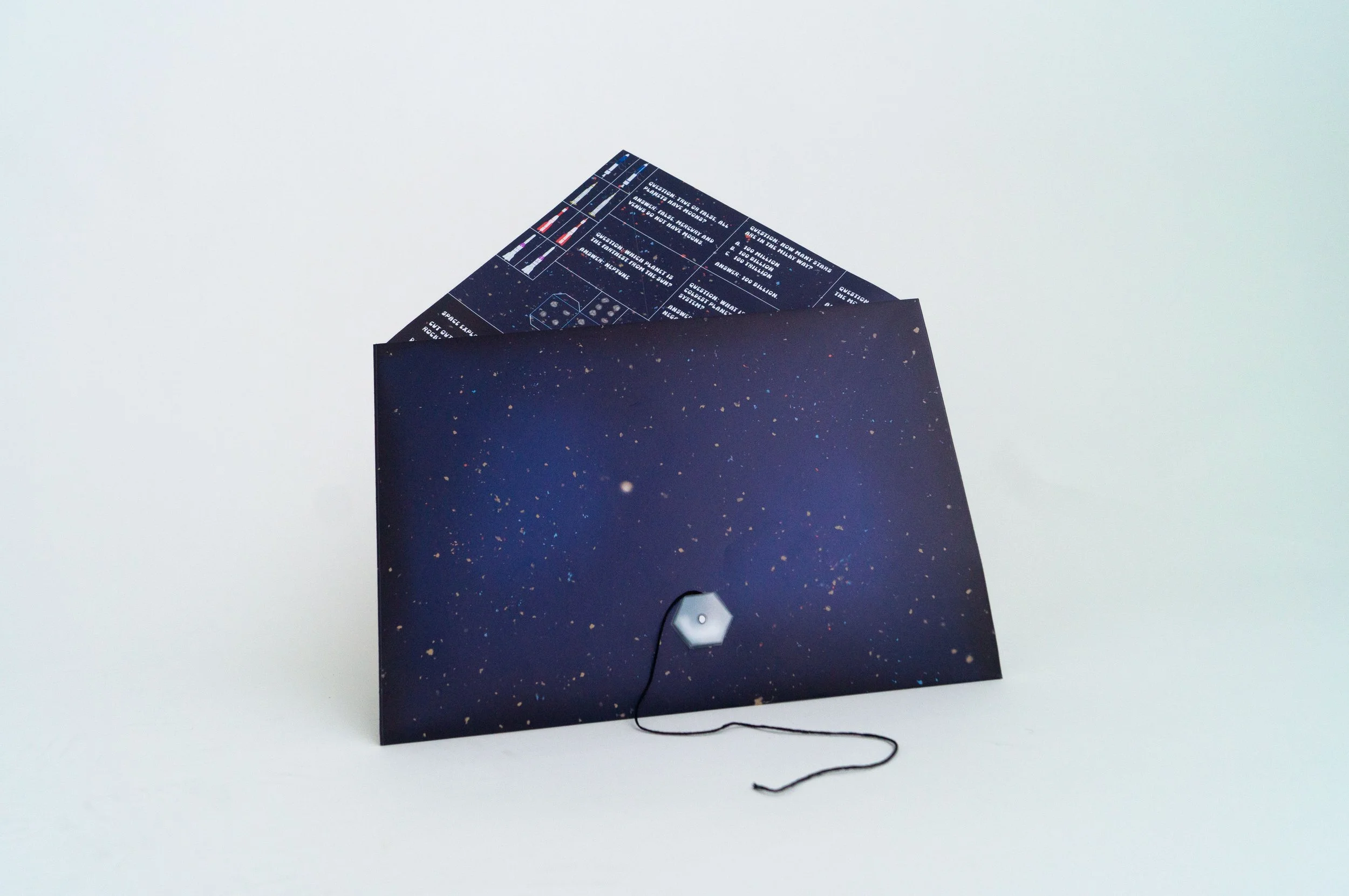
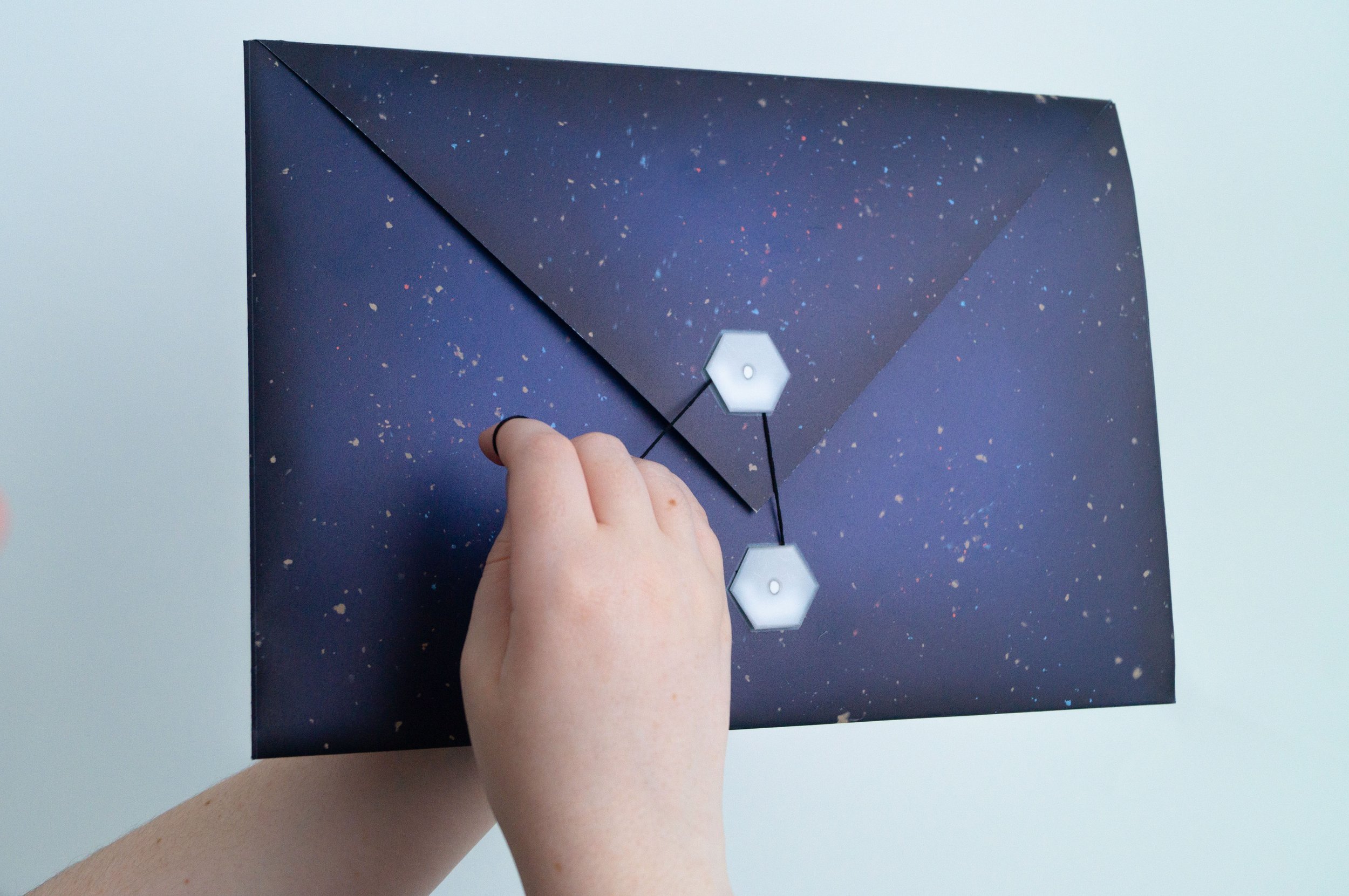
The more cost efficient is an envelope. I also had an idea to make the envelope multi use by after it being used as an envelope the inside of the envelope can be opened up and used as a game. This means I had to find a way fold up with little glue but also able to hold context inside.
I have succeeded this by a double-folded envelope system and a string and button system instead using to seal glue.
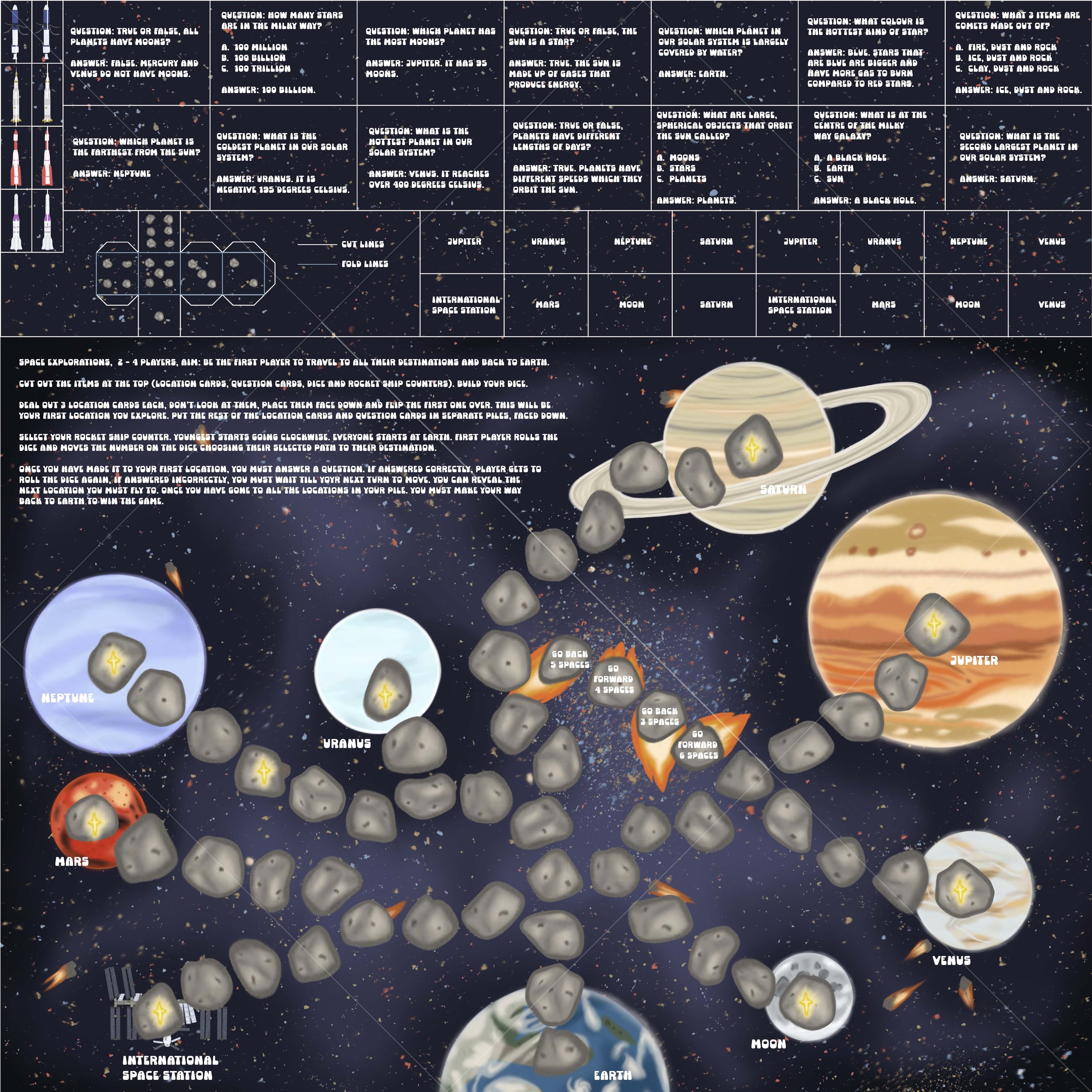
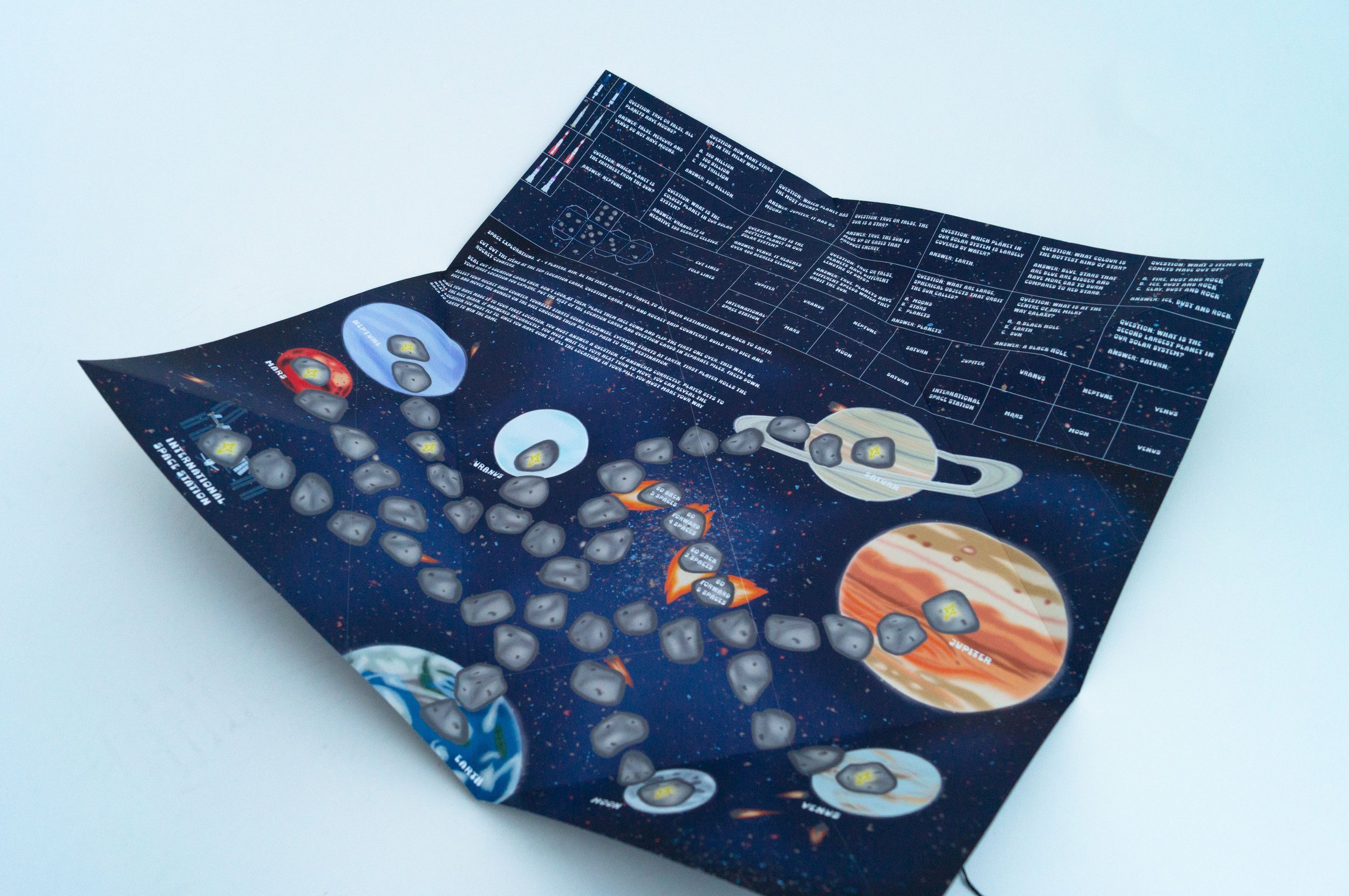
The idea for the game came from a game that my dad made when he was young about farming. I used the same concept as his game where you go around to different locations, answering questions on the way and the first one to visit all their locations wins but I made it space-themed. This game combines fun with learning trivia. I wanted to make sure I included everything for the game, even the dice.
For the questions, I did a mix of multiple-choice, one-answer and true-or-false questions. Also did a mix of easy questions and harder, perhaps guessing questions.
The typography I was going for is something that looks spacey, futuristic, bold and easy to read for kids.
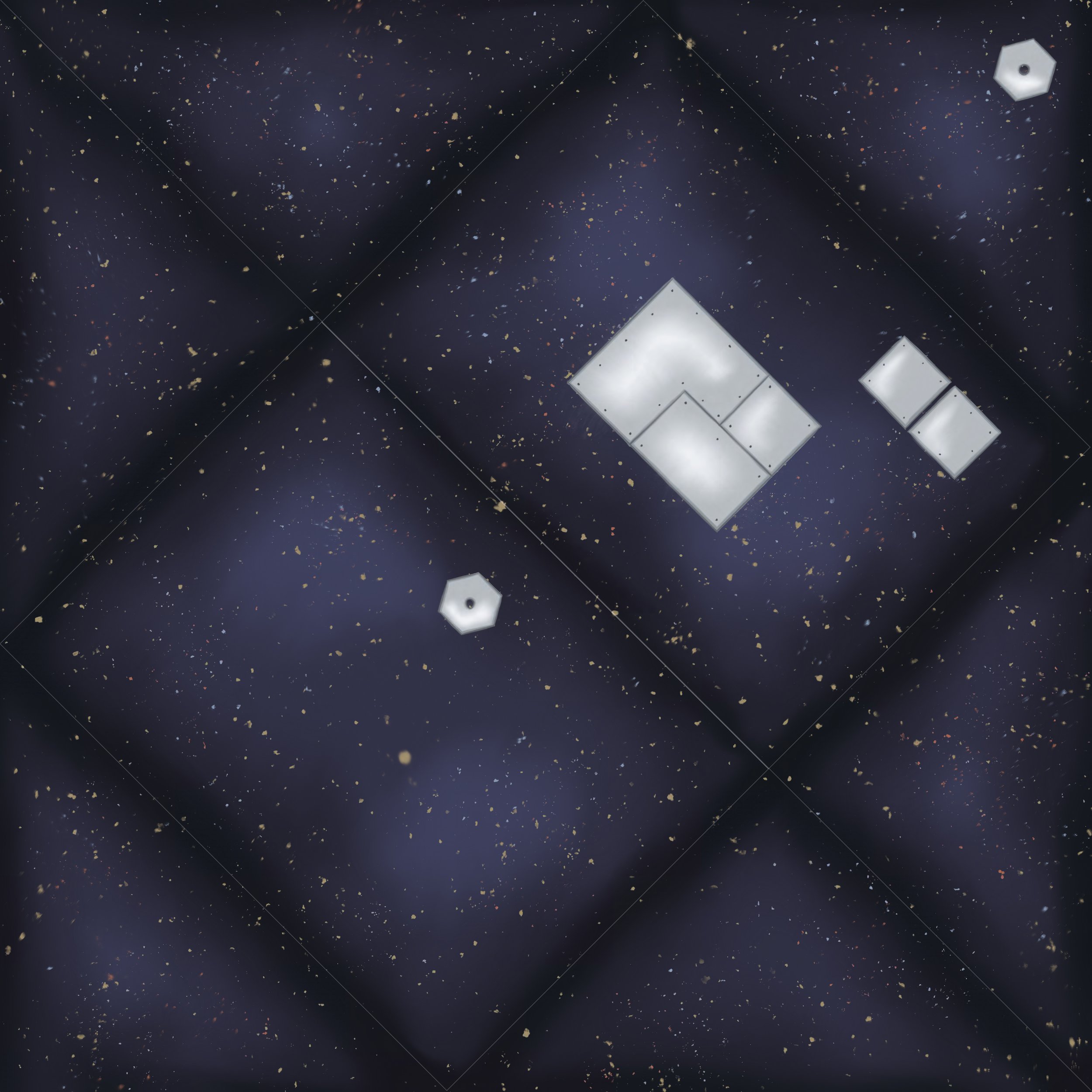
Since the inside of the packaging is so busy looking with the game. I wanted to have the outside fairly simple. So it’s just space background with scrap metal floating in space in strategic spots for your address and stamps.
Envelope Packaging Designs
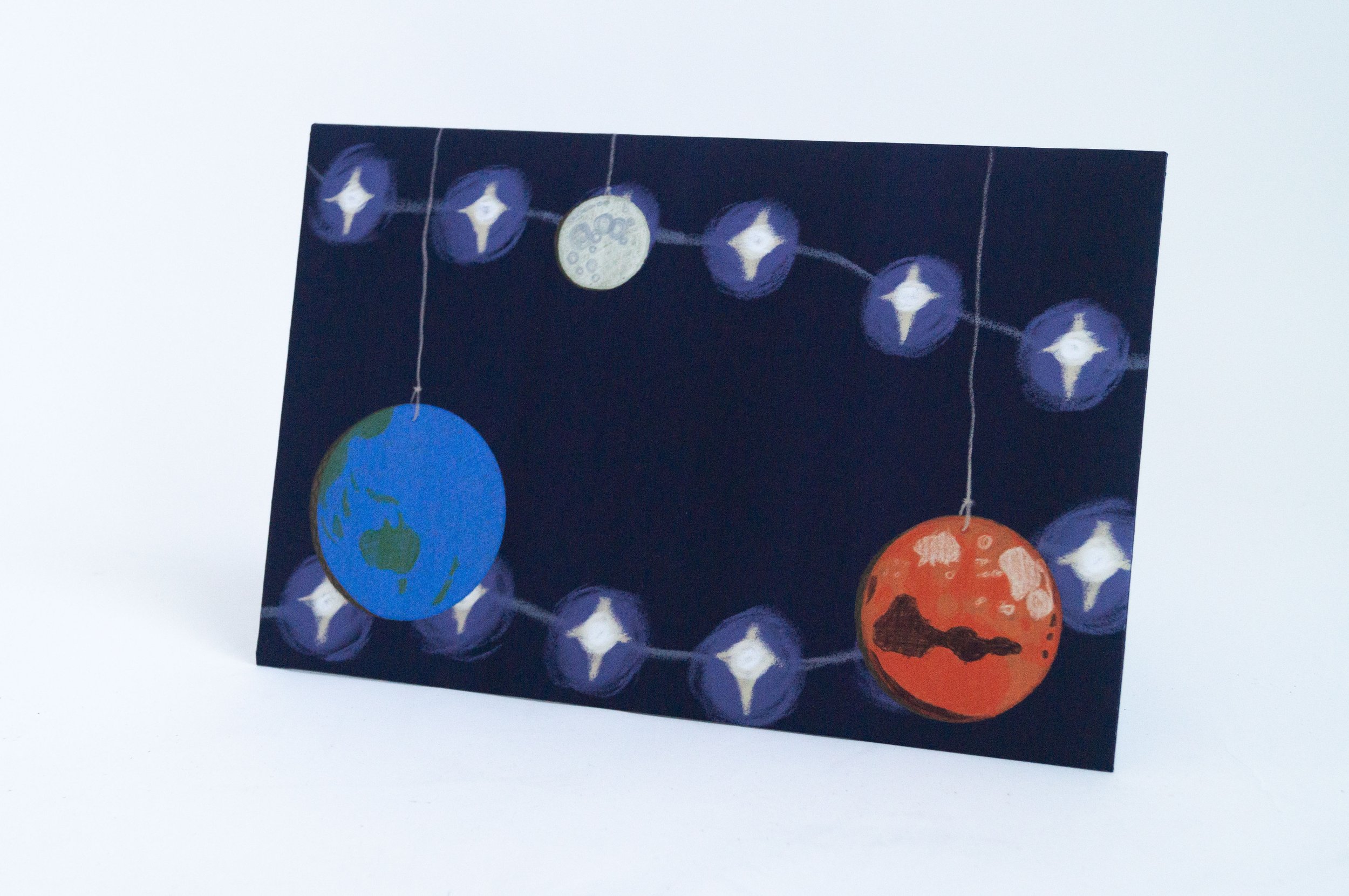
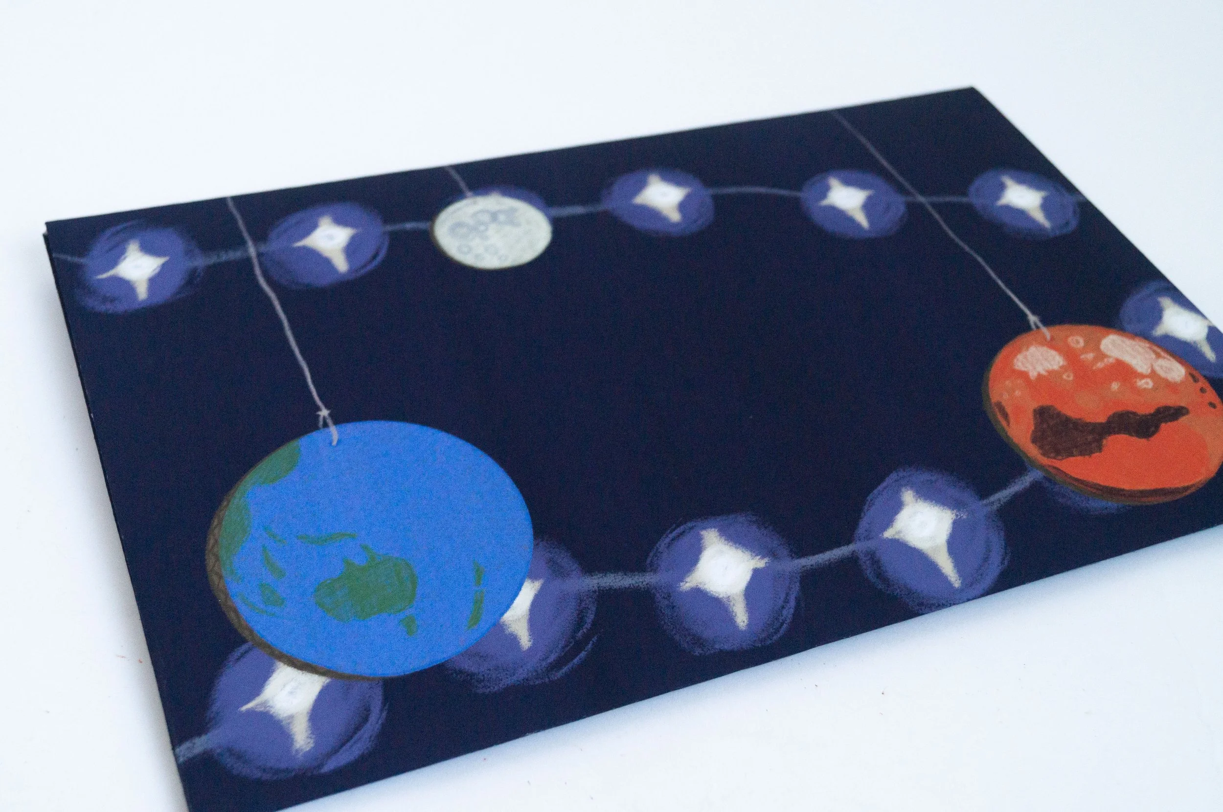
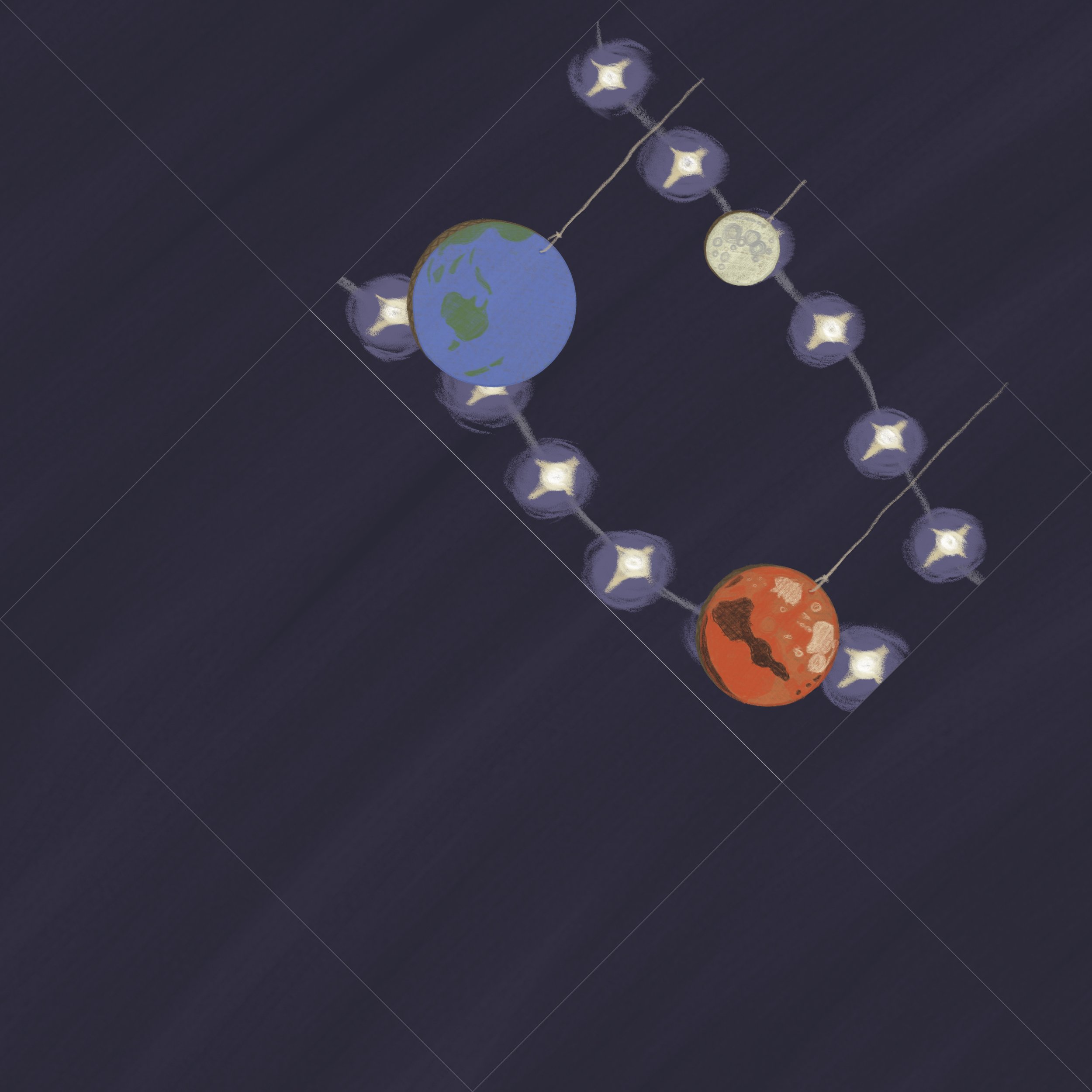
After I had made the double-sided envelope, I realised it was not easy to find somewhere to print on this large scale. Therefore, I made a second version, which is only single-sided and more interesting on the outside since I kept the first one more simple.
The style and idea were the same as the front cover of the activity book of this imaginative space scene. This time, it’s twinkling lights as stars and hanging stringed cardboard-drawn planets. This is all illustrated in the same sketchy style. I left space for the address and stamps.
I kept the same design for the folding of the envelope, but because there is no inside design, glue can be used instead of the string and button, which was used to open the envelope fully up as a game.
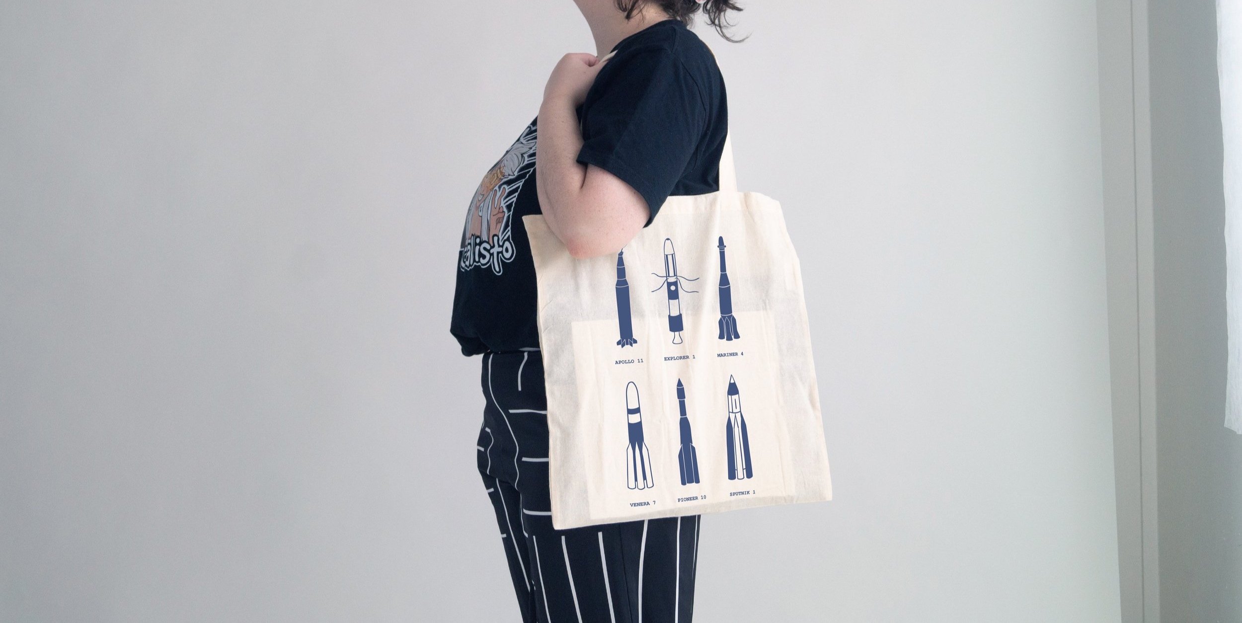
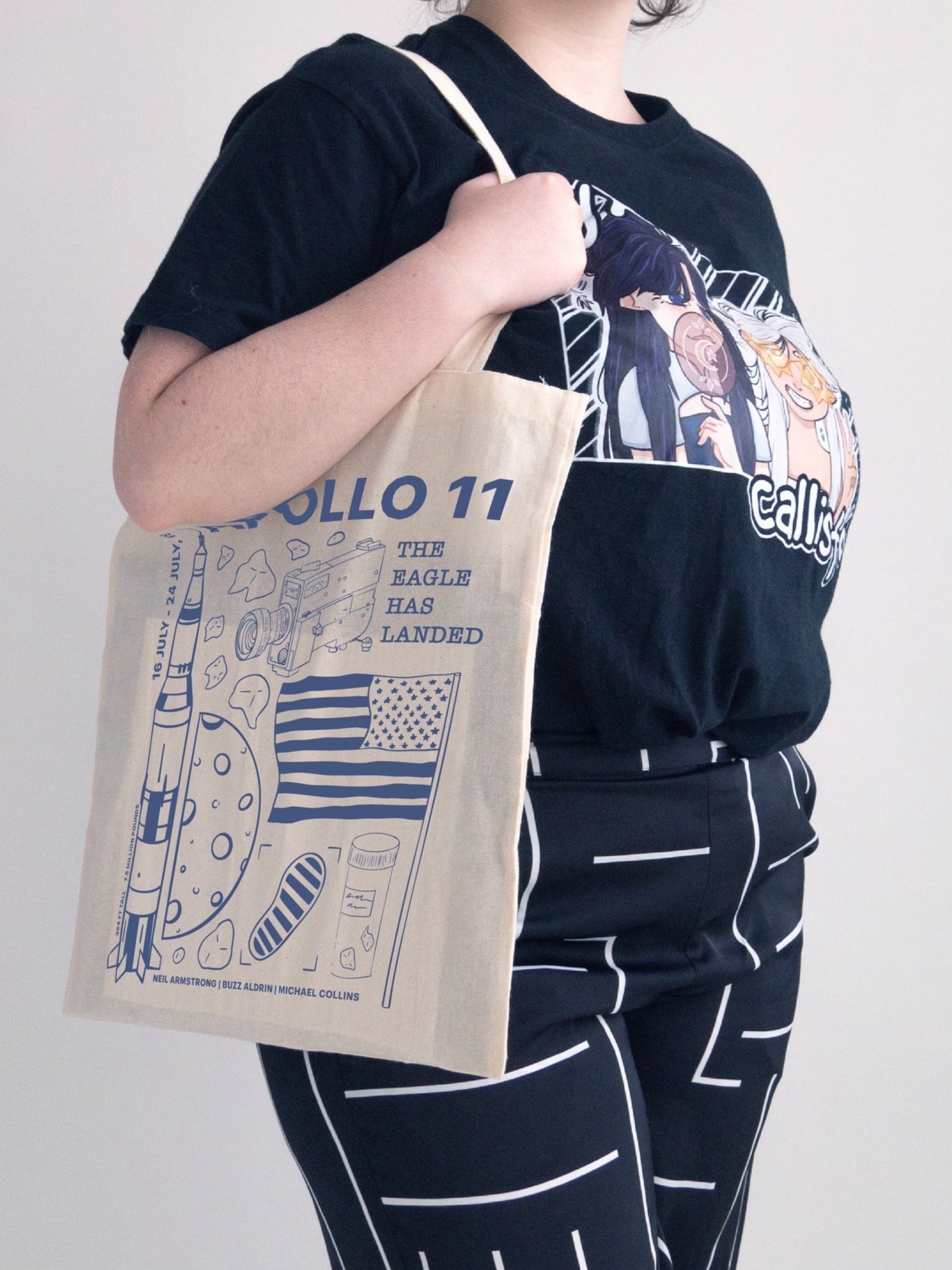
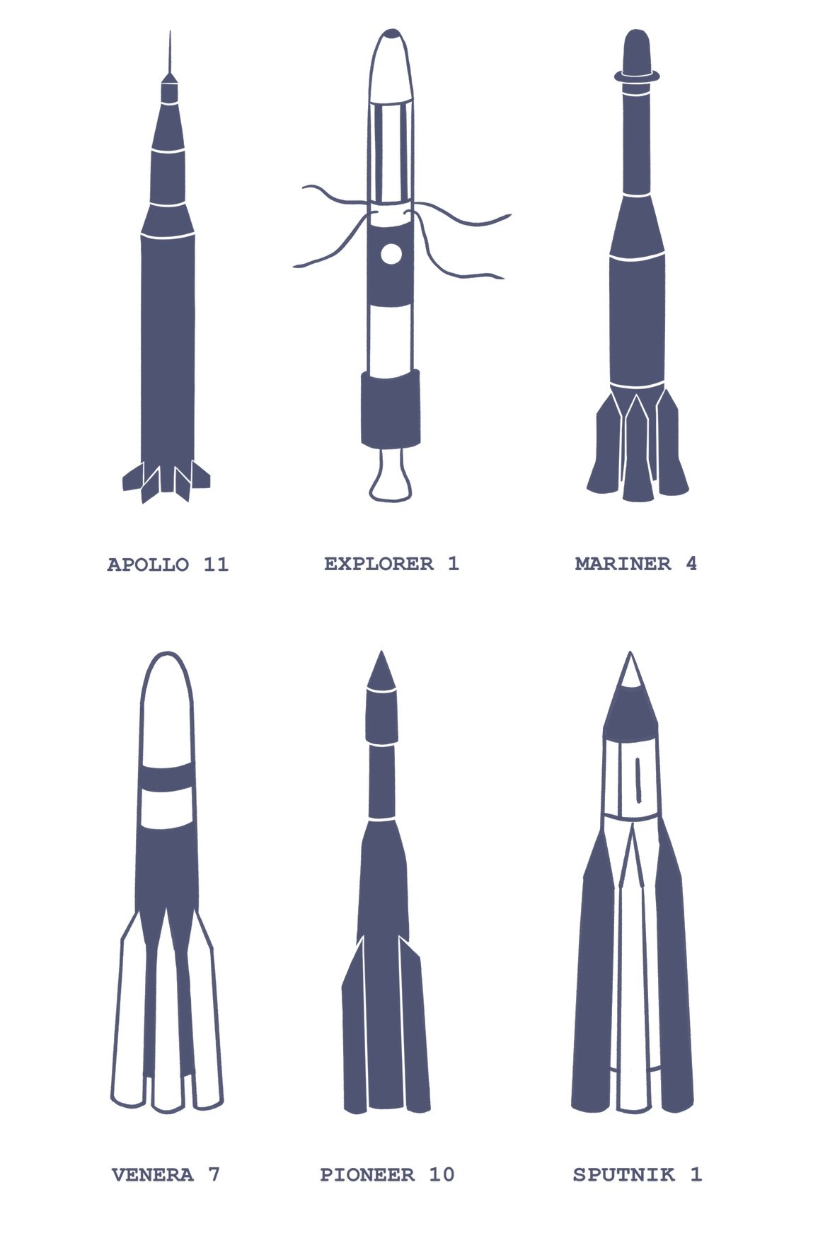
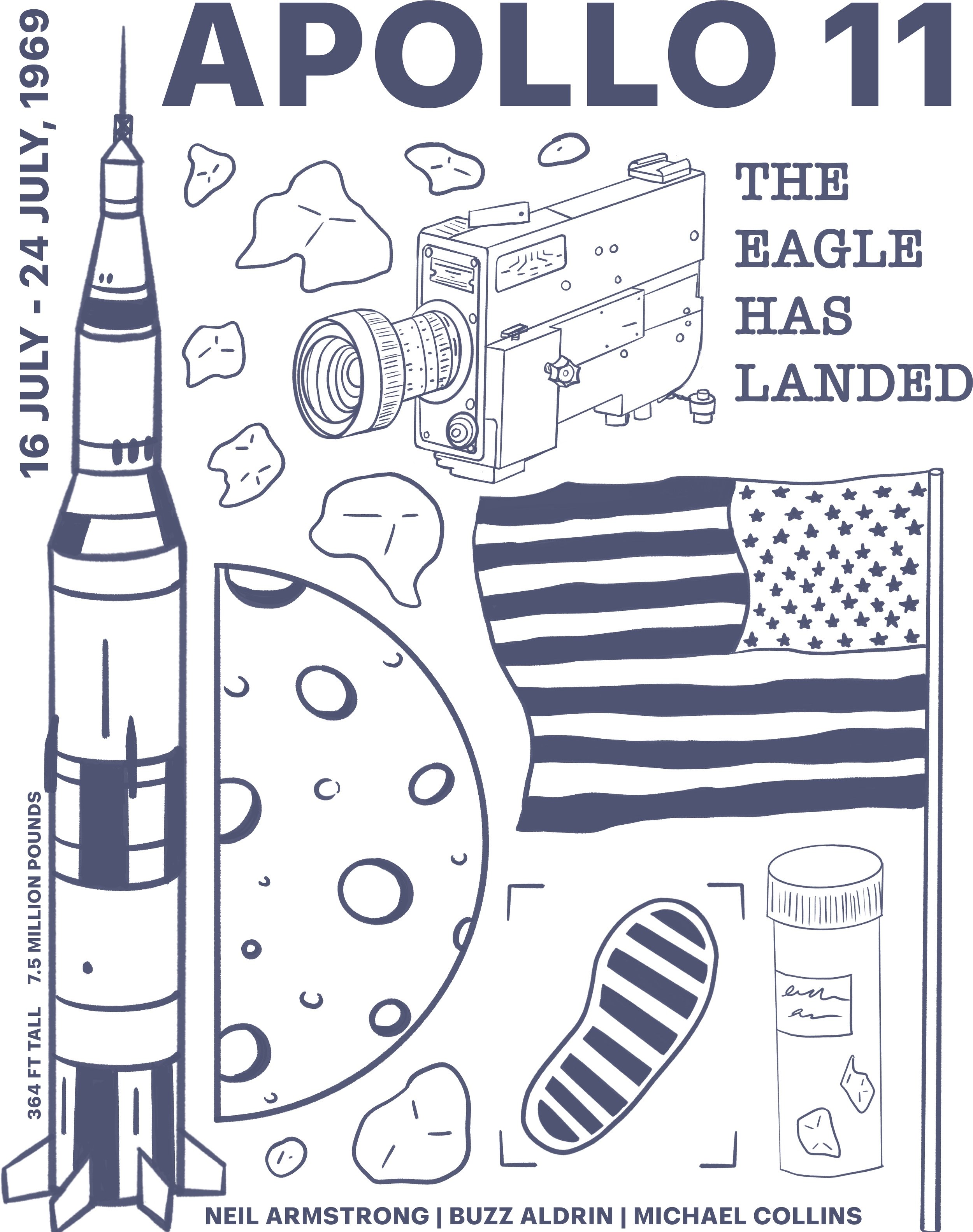
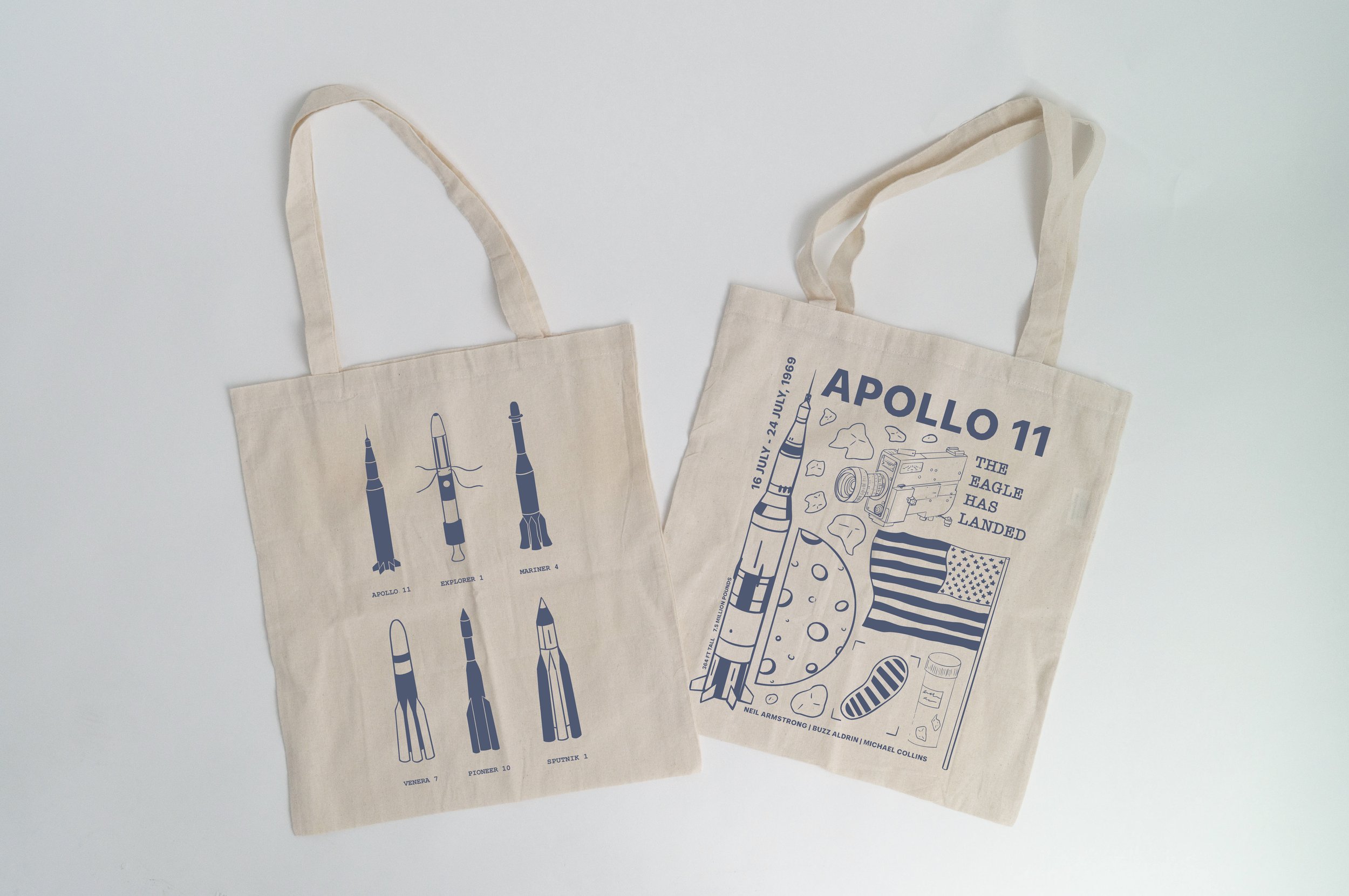
Tote Bag Designs
Another set of designs I made for Te Manawa were these, with the idea of being used for tote bags or t-shirts. I made 4 designs, 2 in full colour, detail in a cartoon style made for a younger kid demographic and the other 2 using 1 colour (cheaper for printing), line art, more scientific for the older kid demographic. I kept all the designs in a square/rectangular shape so they can fit on any style of tote bag or t-shirt.
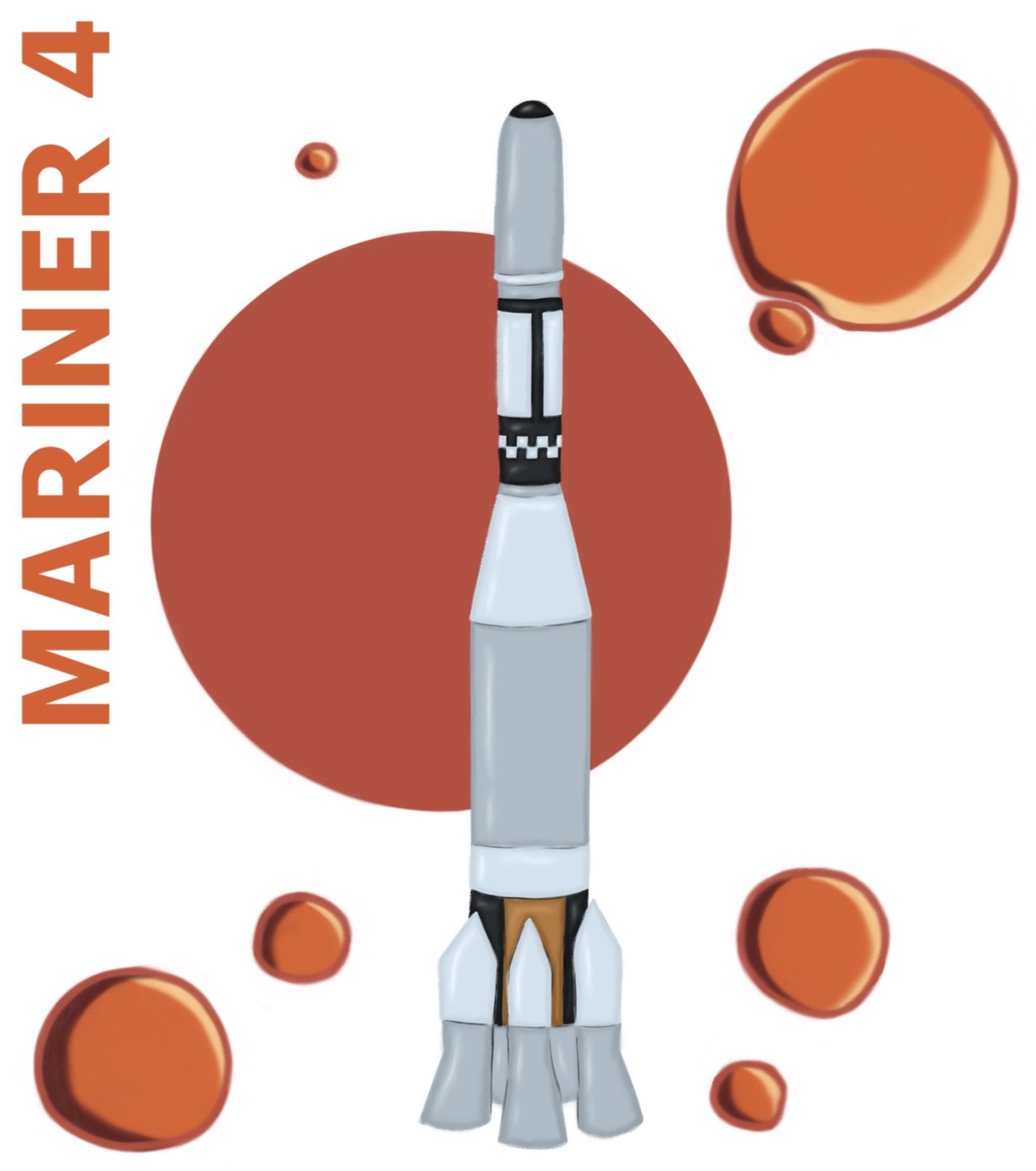
The second design is based on the Mariner 4 mission. This mission was when they went to Mars. This design and the last design were college-type. I’ve used a Mars planet colour scheme and illustrated the rocket from the mission and cavities from Mars's surface. I’ve also included the name of the mission in the text and a simple vector circle as the planet.
The first design is a grid/box illustration design with the centre showing the big picture and then the outer showing closer-ups.
The next design is some of the main rockets and their names. I used line art for this design with only using 1 colour I had to play around with line and fill.
The last design is based on the Apollo 11 mission, probably one of the most known missions, going to the moon. I’ve got college illustrations of the rocket, the moon, their first footprint, samples, the camera and some text from the mission including the name, “the eagle has landed”, the astronauts, mission dates, etc. I used line art for the design as well only using 1 colour playing around with line and fill but also different line weights for more importance.
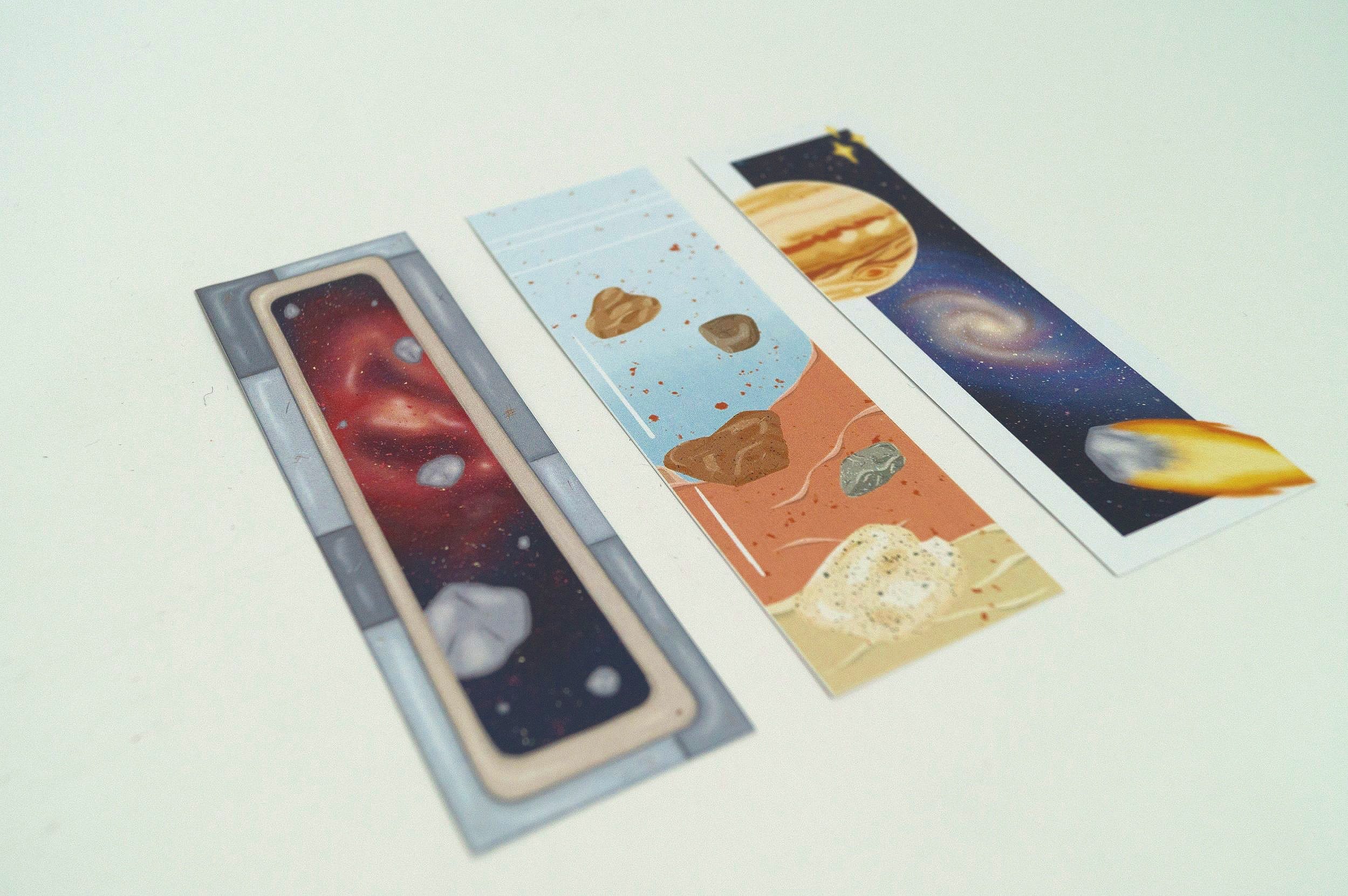
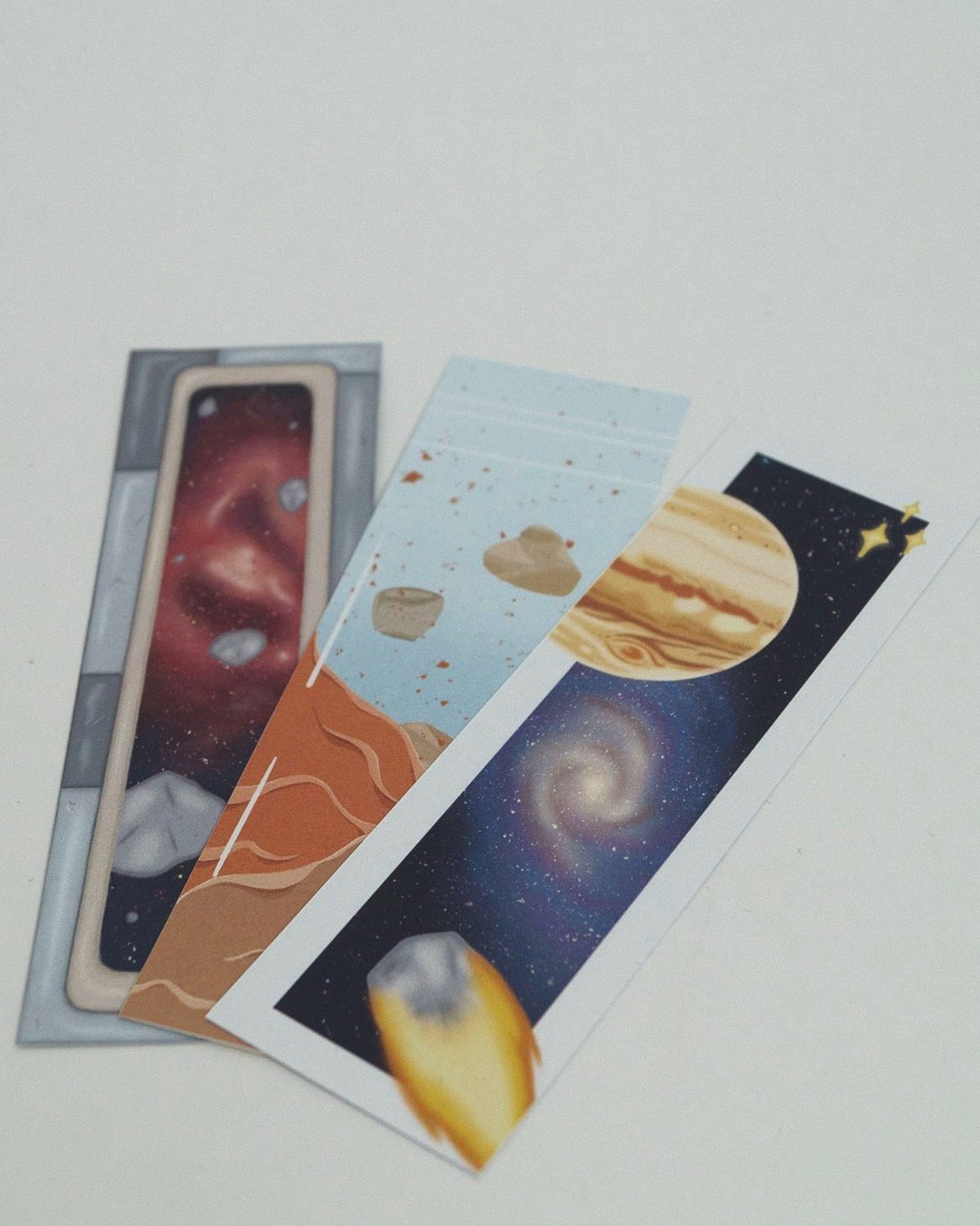
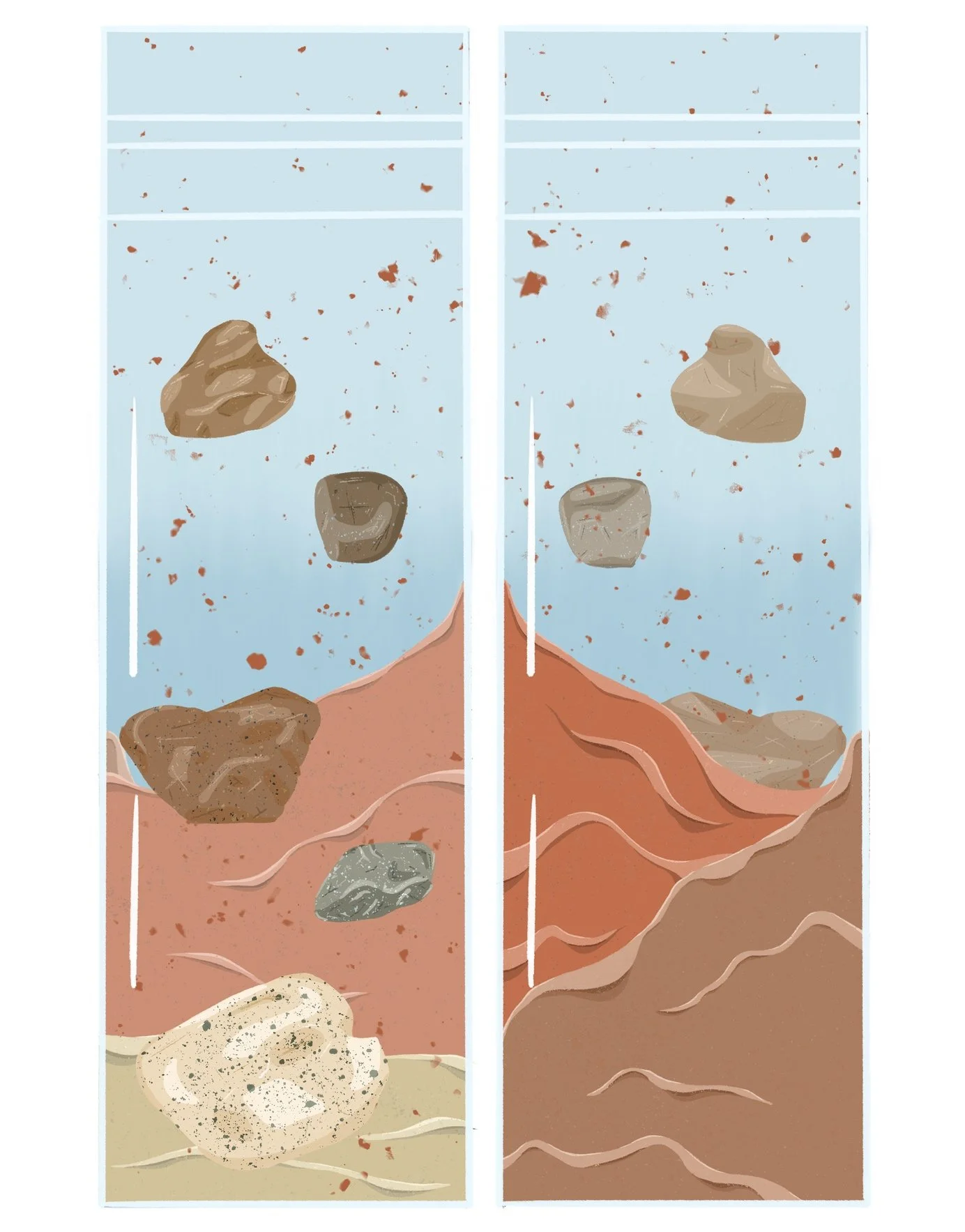
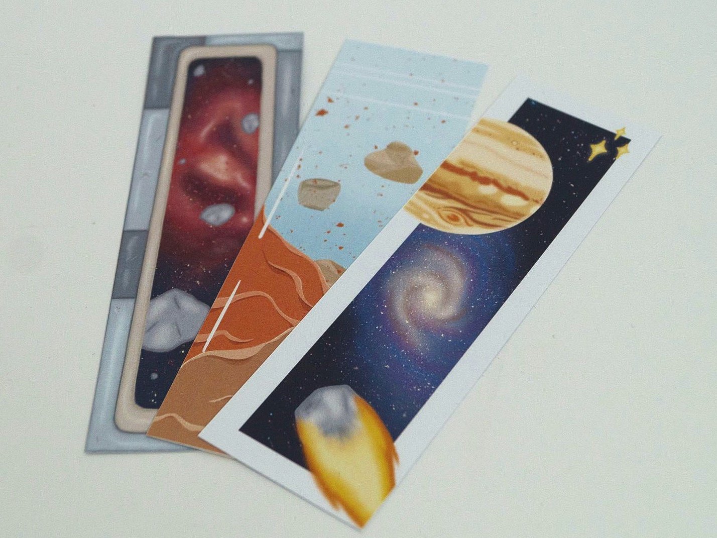
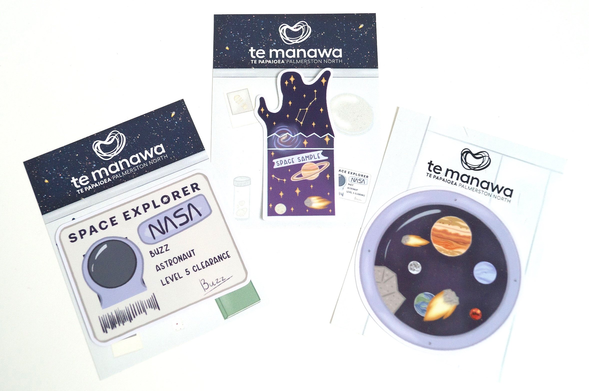
Bookmark Designs
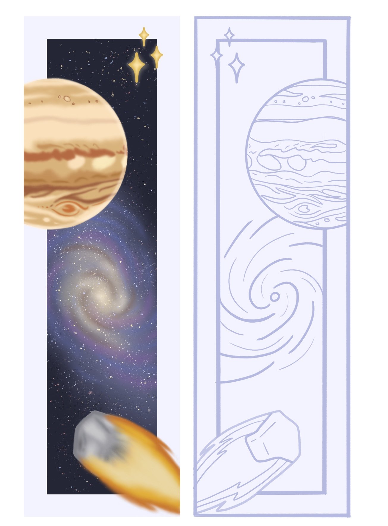
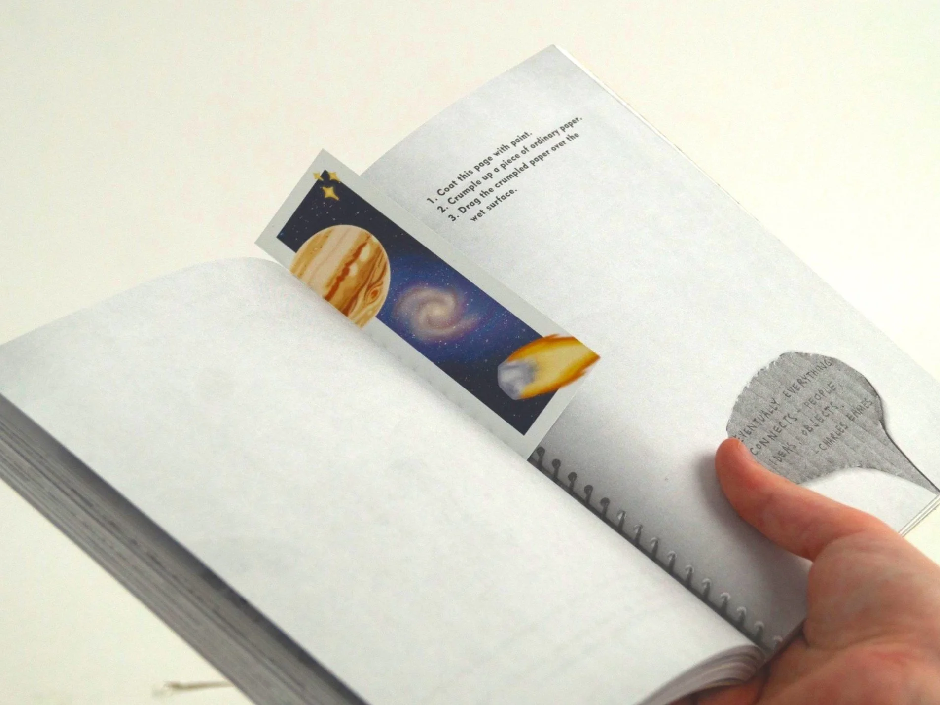
One of the many ideas that Te Manawa had suggested was bookmarks. I made three different space illustration designs, back and front.
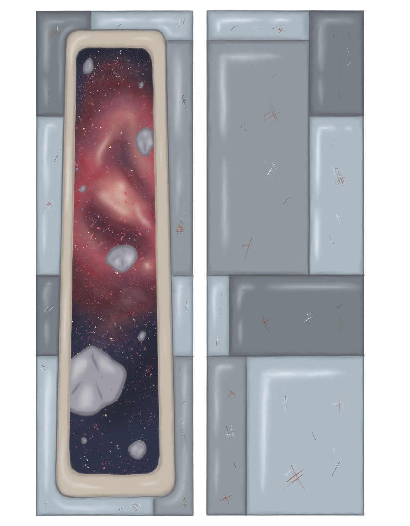
The first design, the front, is looking out of a rocket window, giving a nice frame to the galaxy illustration. On the back, I continued the rocket metal plating.
The second design is a collage of Mars, a comet, the Milky Way and stars. In this design, I’ve also done framing with the background galaxy, and all the other elements are coming out of the frame. On the front, I used my cartoon style, and on the back, I used line art of the same elements on the flipped side. Like I did with the tote bag line art designs with the different line weights, I did the same here.
The last design is a Mars plastic sample bag. There are rocks and sand/dirt samples, and you can see both sides of the bag from either side and look at both front and back. This illustration style is cartoon/vector and also reminds me of the art from “Little To The Left”, a video game. I might have unintentionally been influenced.
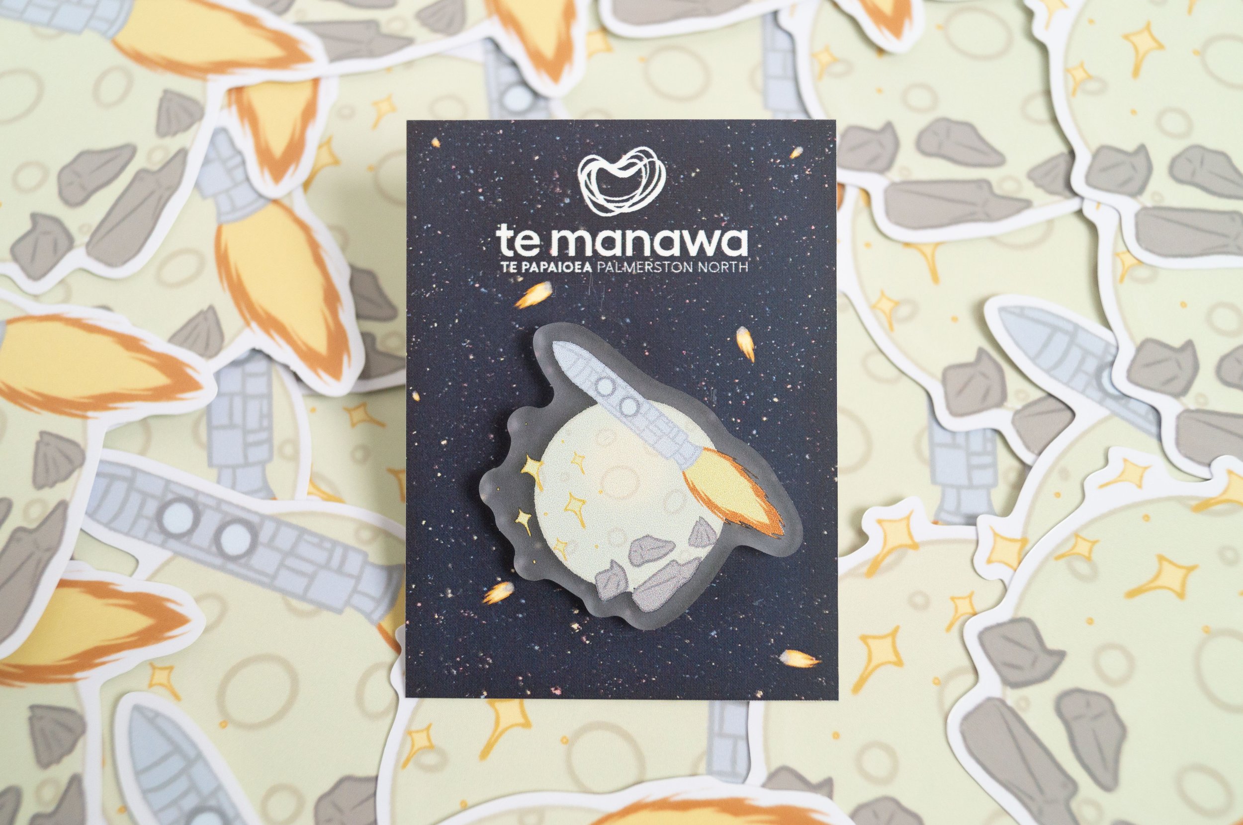
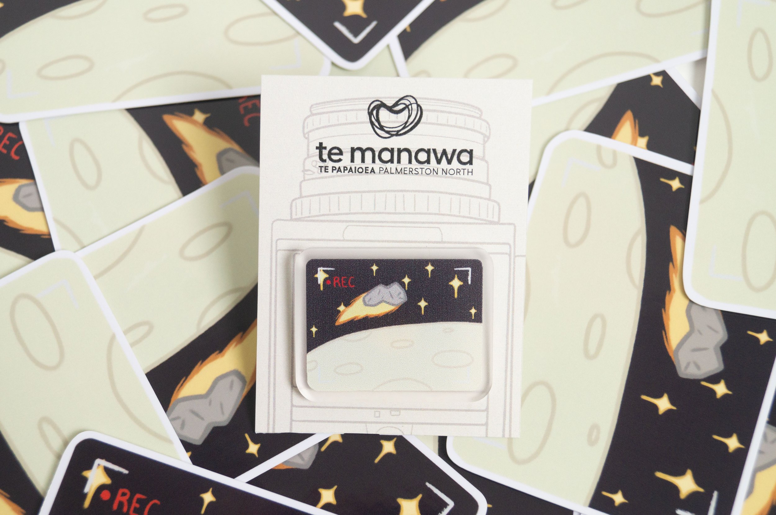
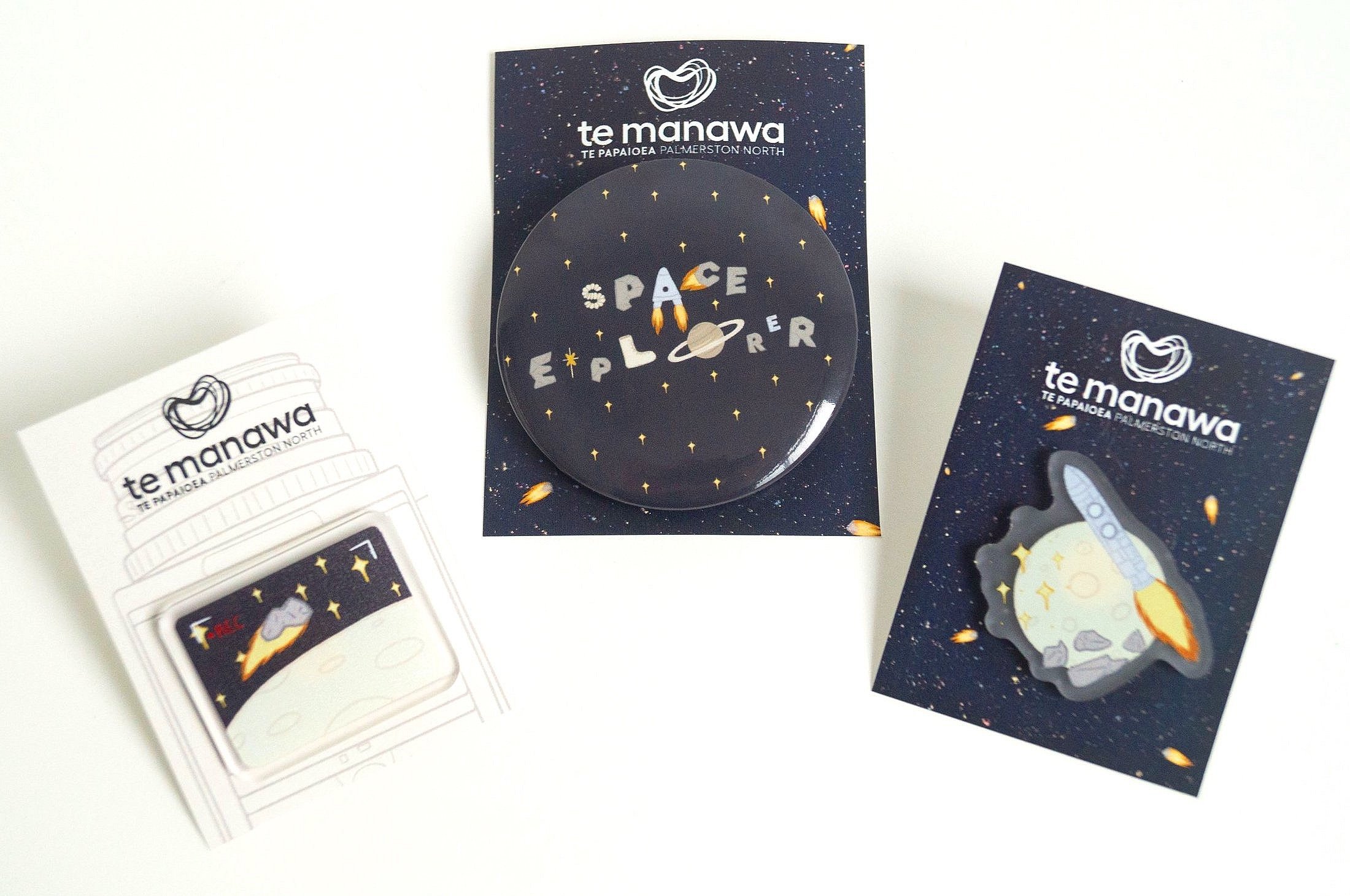
Sticker/Pin Designs
Another set of designs that Te Manawa wanted to see made were stickers, pins and badges. I made designs in mind for all of these, including packaging to go with them. I kept them all space-themed again. I designed 2 pins, 1 badge and 3 stickers.
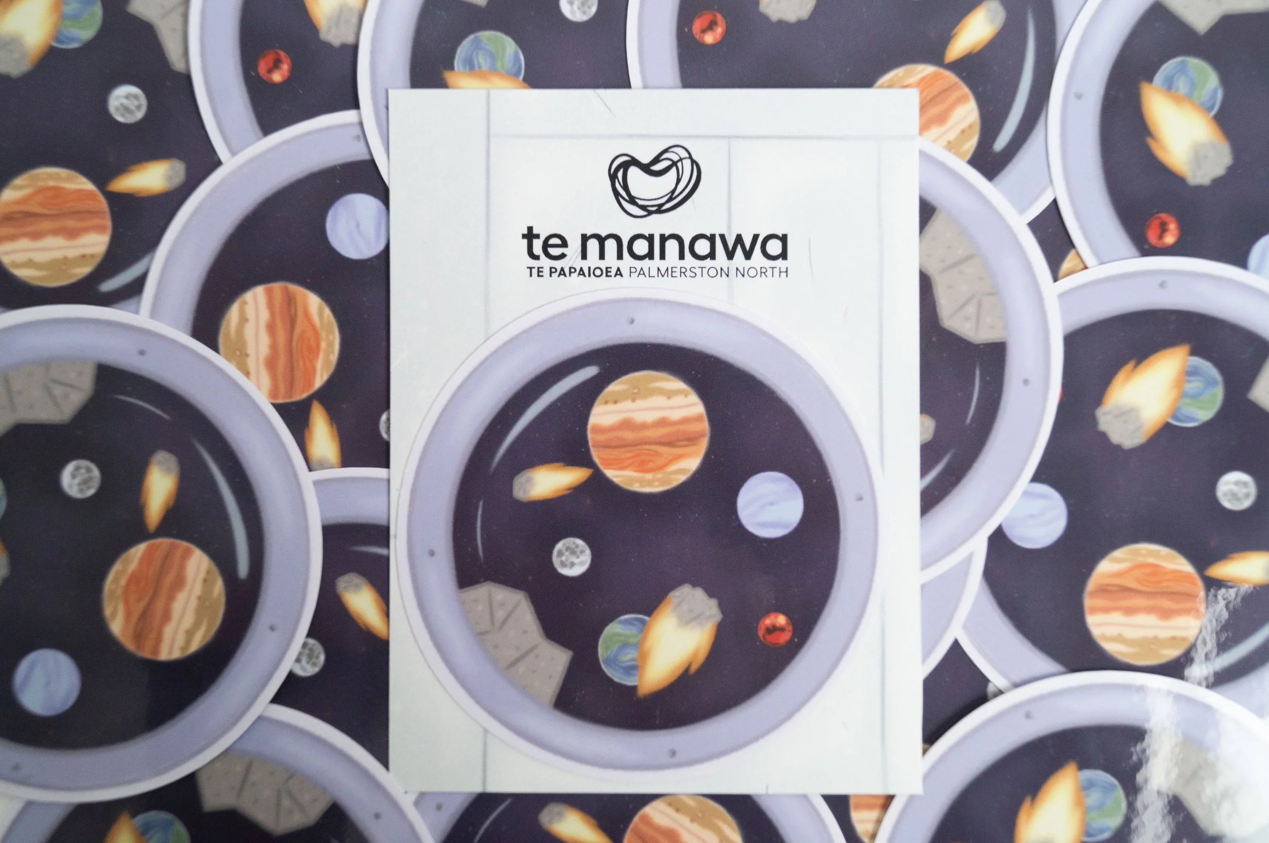
The second design is based on the moon landing being filmed. This is the camera view showing the moon's surface, stars and an asteroid soaring across. Again, I illustrated it in a simple cartoon/vector style so it’s easy to scale down and up.
The packaging, again, I wanted to relate to and be the background to the pin. Since the pin is of a camera screen, the packaging is of an outer camera. It’s illustrated in line art so it’s not taking away from the main focus, the pin.
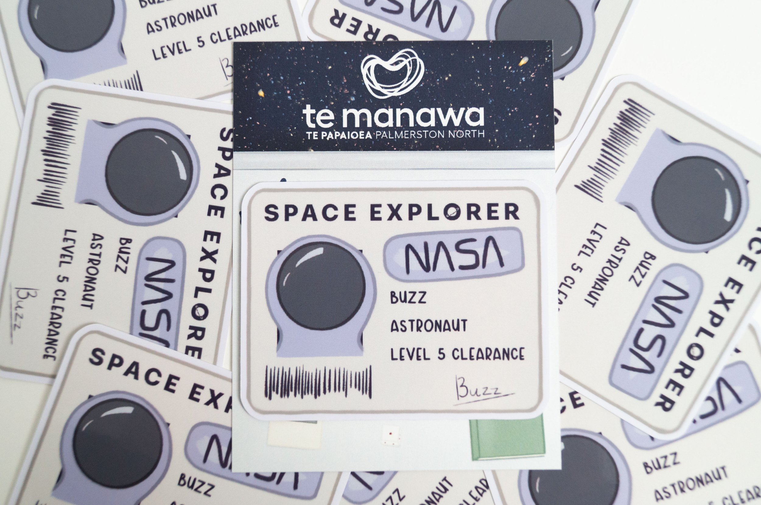
This sticker design is an astronaut ID badge. This is a simple illustration style, but it would be too small to see all the text details as a pin.
Same idea with the packaging. This time, it’s a table looking out to space. So, it looks like the badge is sitting on the desk. I’ve used a simple cartoon style for this.
The first design is a collage design with the moon, stars, rocks and rocket. I kept the illustration simple since it’s being scaled down to pin size but it can also be scaled up to a big sticker size as well.
The packaging is a related background to the pin of a space background with stars and meteoroids. I’ve used a cartoon style for this part.
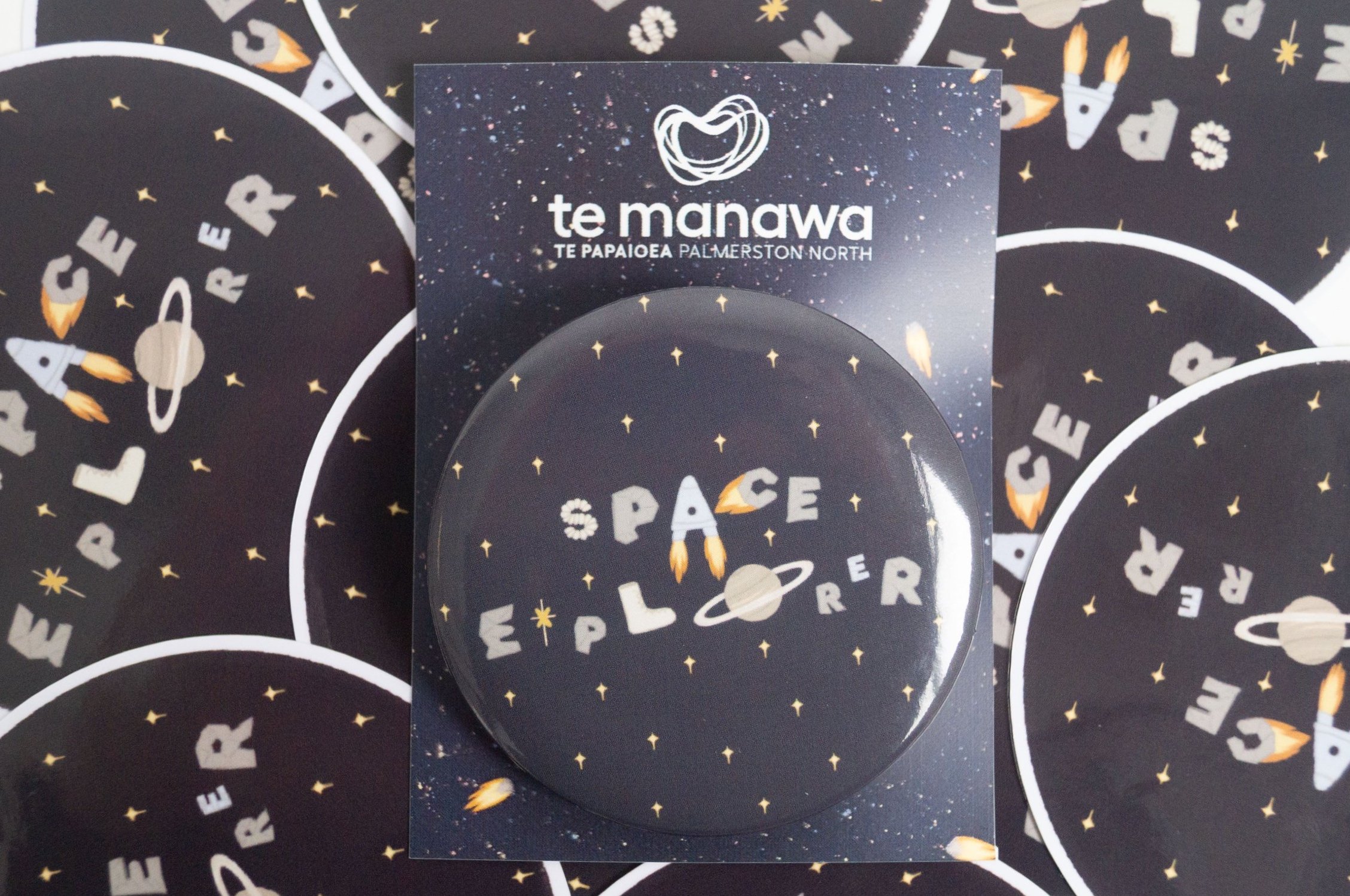
In one of my designs, I wanted to play around with illustrated text. I thought a badge that says “Space Explorer” might seem really cool to a kid as well. I used different space elements to spell out the text, and in the background is a plain blue with simple stars. All are still illustrated in a simple cartoon/vector style.
The packaging for the first pin worked for this badge as well just changed the ratio.
This sticker design is looking outside a rocket window to see outer space. Because stickers are bigger than pins, I could make the illustration style a bit more detailed than the last few.
Same idea with the packaging. This time, it’s the metal plating of the rocket. I’ve used a simple cartoon style for this.
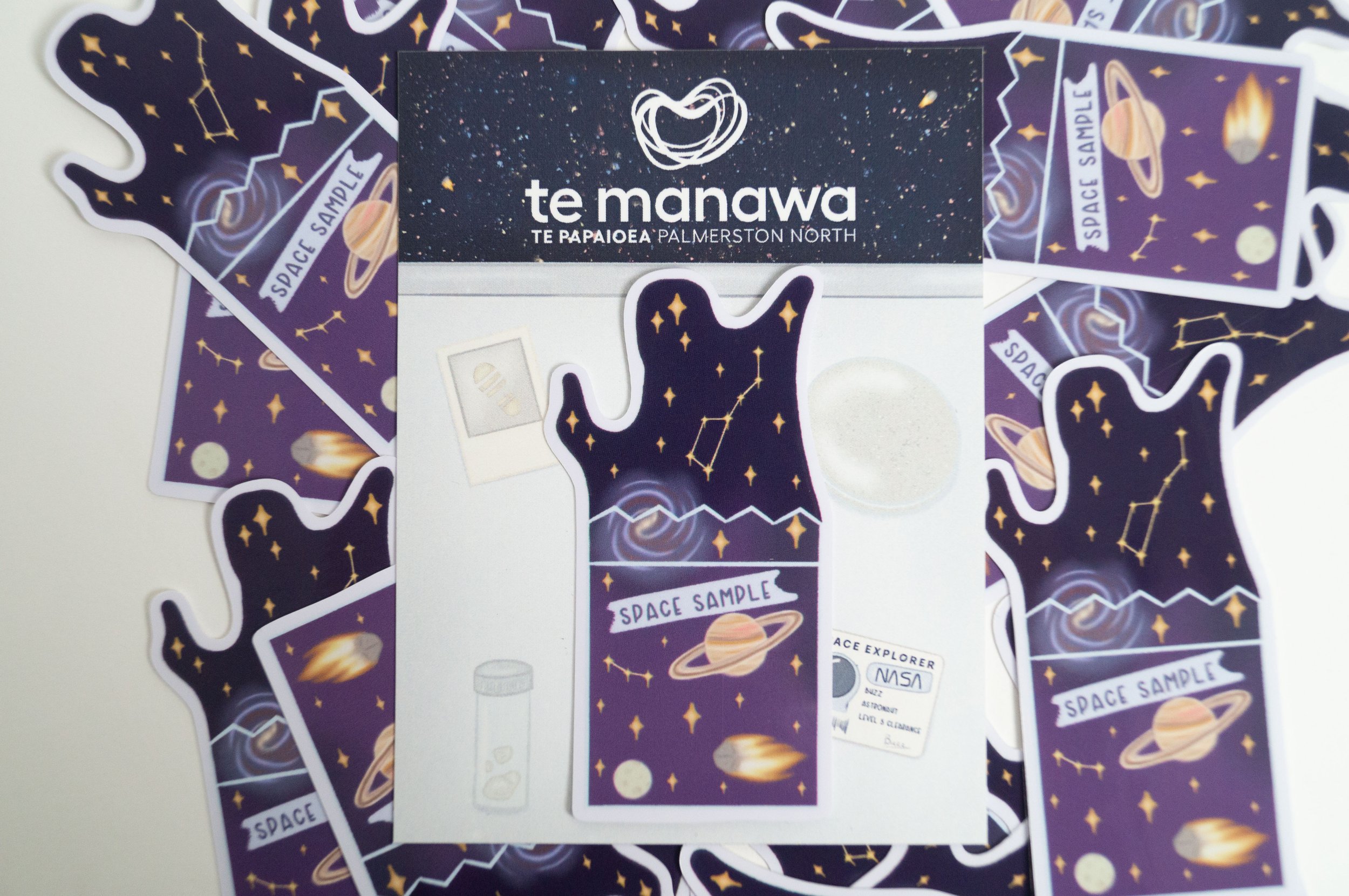
This sticker design is of a space sample in a plastic bag with space elements, for example, Saturn, an asteroid, constellations, a galaxy, etc. This is a detailed cartoon illustration style.
Same packaging as before sticker. This time, it’s a table looking out to space, but there are things on the table corresponding to the sticker. I’ve used a simple cartoon style for this.
Stamp Designs
Lastly, I made three stamp designs of the different themes for the passport. I used the Te Manawa logo as a base and added the different theme elements to them.
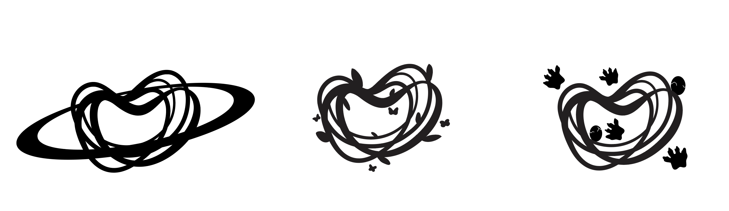
The first stamp is the space-themed stamp, simply utilising the Saturn ring around the Te Manawa heart logo.
The second stamp is the nature/bug-themed stamp. I’ve used the Te Manawa logo heart as intertwining branches and added leaves and butterflies flying around.
The third stamp is the dinosaur-themed stamp with dinosaur eggs and footprints.