Project Name:
Palmy Brick Show
Rebrand
Project Type:
Client,
Logo Redesign and Poster Design
Tools Used:
Adobe Fresco, Illustrator
Month/Date:
October 2023
THE BRIEF
THE BRIEF
This project was one of the first clients I worked with and was contracted with through UCOL for my studies. We had a range of different projects we could choose from to work on and clients to work with. I chose to work with Palmy Brick Show to create a new logo and a new poster.
PROJECT BRIEF
PROJECT BRIEF
Palmy Brick Show is an event where exhibitors bring along their Lego creations and viewers can spectate. This takes in Palmerston North each year.
They wanted a new logo that had brick and Palmy aspects. They wanted to keep the windmills from their current logo. They didn’t have too many requirements for the poster, just that it had all the information.
Logo
Poster
Brick aspects (not too obvious Lego for copyright reasons)
Palmy aspects

Logo Design
My intention for this logo was for it to be a graphic with Lego-looking elements of Palmy elements.
They wanted to keep the original imagery from their logo of the windmills and ranges. I added in the addition of the river because I thought that was also an important part of the Manawatu. The graphic of the windmills looks like a Lego windmill to give that Lego aspect the client wanted. The typography is boxy and straight, like a Lego brick as well. The logo colour scheme is colours only found in Lego bricks and are Manawatu colours.

Poster Design
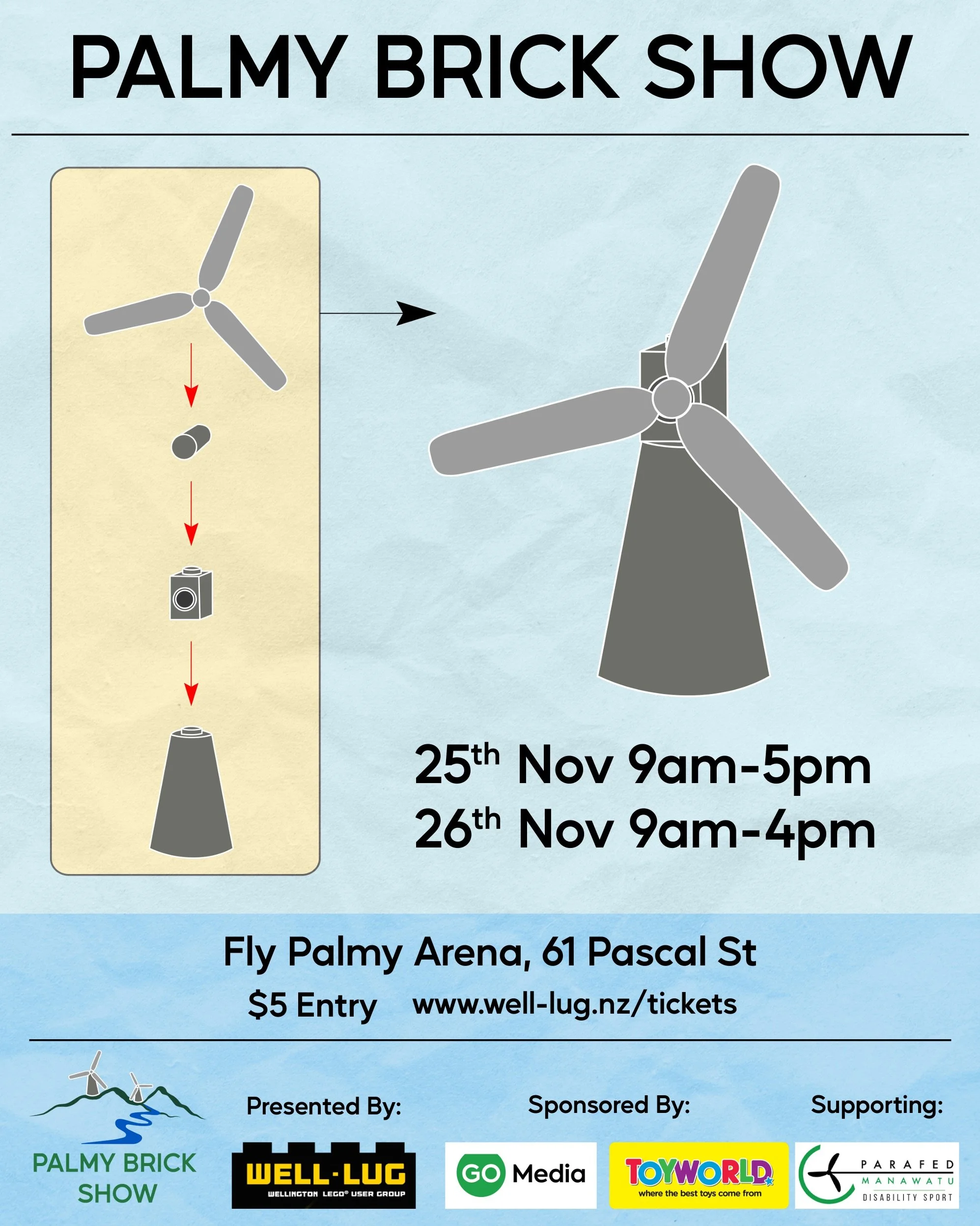
My idea for the poster was to make it look like a Lego instruction manual.
I used the same imagery, the windmill because I didn’t want to give false hope of what could be at the show, and I thought doing something generic to Palmy would be better. I used the same typography as the logo on the poster.
I used a paper texture to give that extra touch to the instruction manual look.
I gave “Palmy Brick Show” the most hierarchy, then the dates, then the location, then the pricing, then the ticket website, and lastly, the sponsors. I broke up all this text with different sizes, lines separating and colour boxes.


