Project Name:
Flow + Go
Project Type:
Personal
Tools Used:
Adobe Fresco, Illustrator, Photoshop
Month/Date:
June 2025
THE BRIEF
THE BRIEF
Flow + Go is a made-up brand for portfolio design purposes. This design project consists of logo design, activewear design and social media design.
PROJECT BRIEF
PROJECT BRIEF
Flow + Go is a women’s running club created for those late-night runs where it’s dark and unsafe to run alone.
Flow + Go
Safe Women Running Club
Target Market: 20s-30s
Colour Scheme: Blue-toned Purple and Neon Yellow/Green
Overall Style: Modern, Trendy, Bold
Illustration Style: Geometric, Lines, Diamonds, Moon and Stars
Communicate: Unity, Strength, Confidence

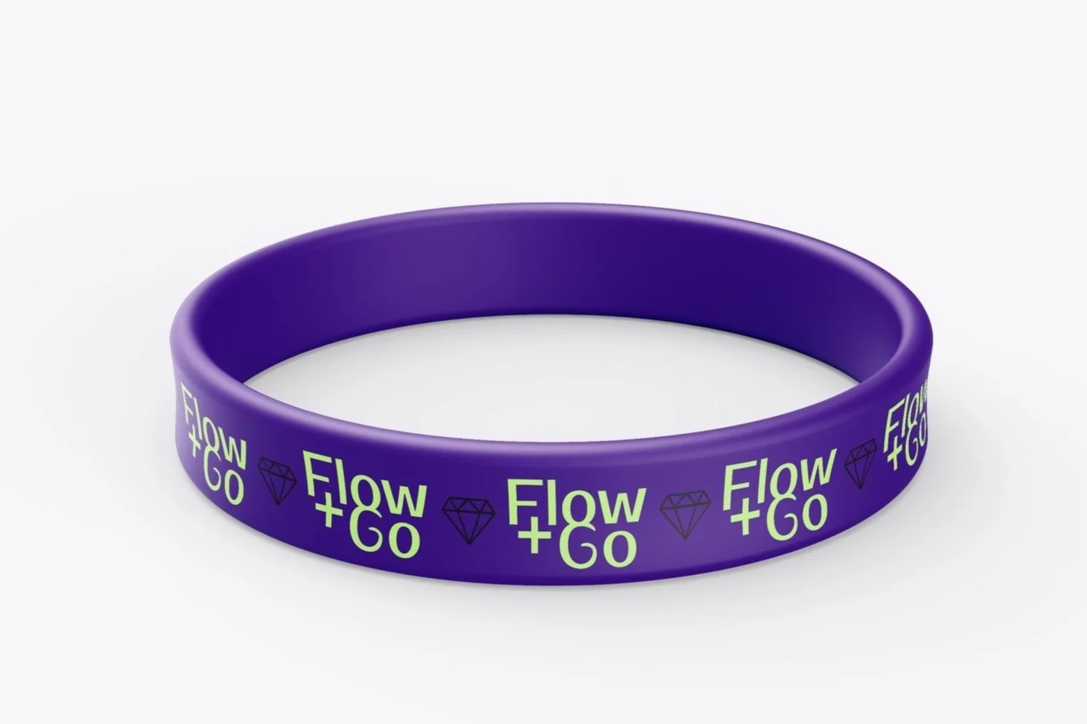
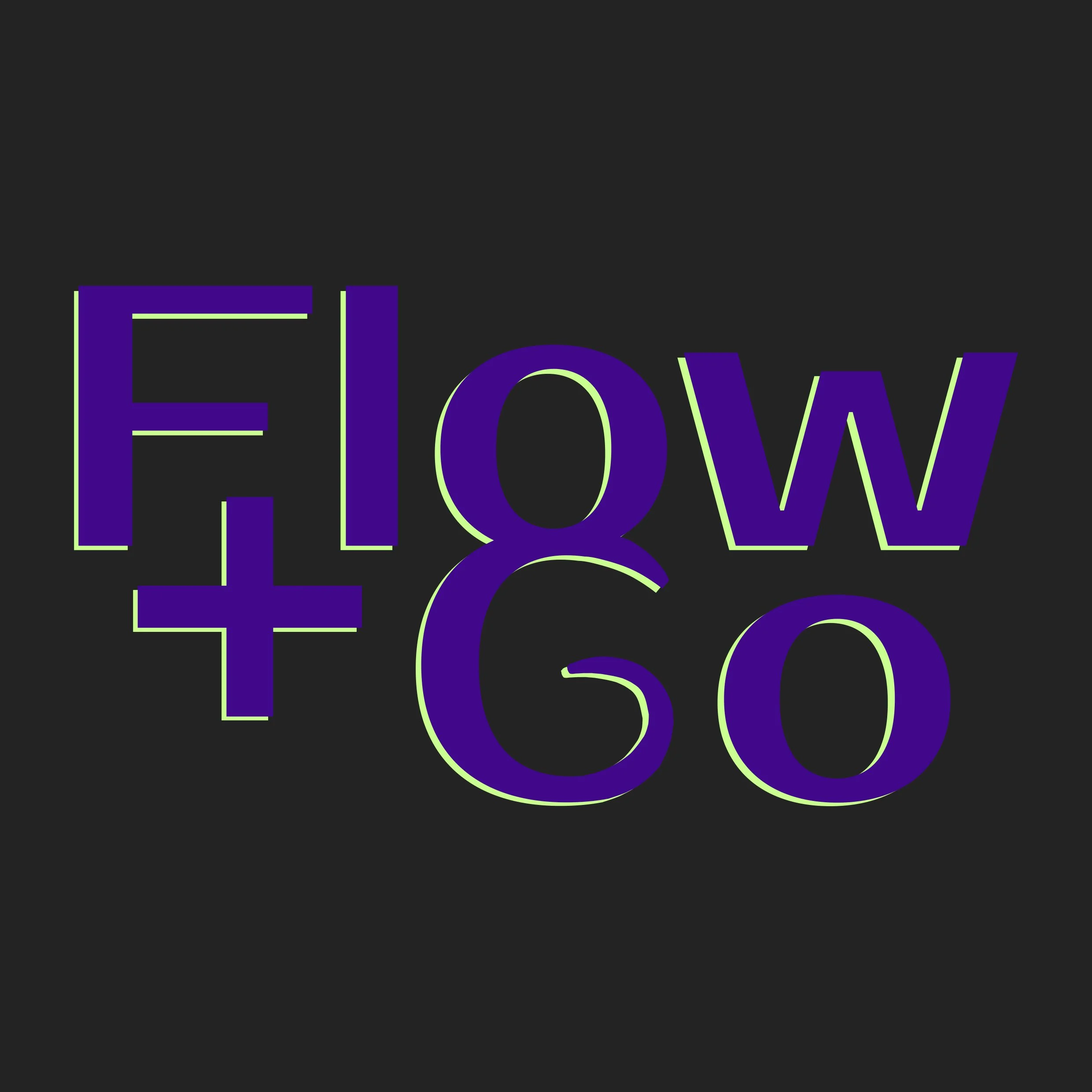
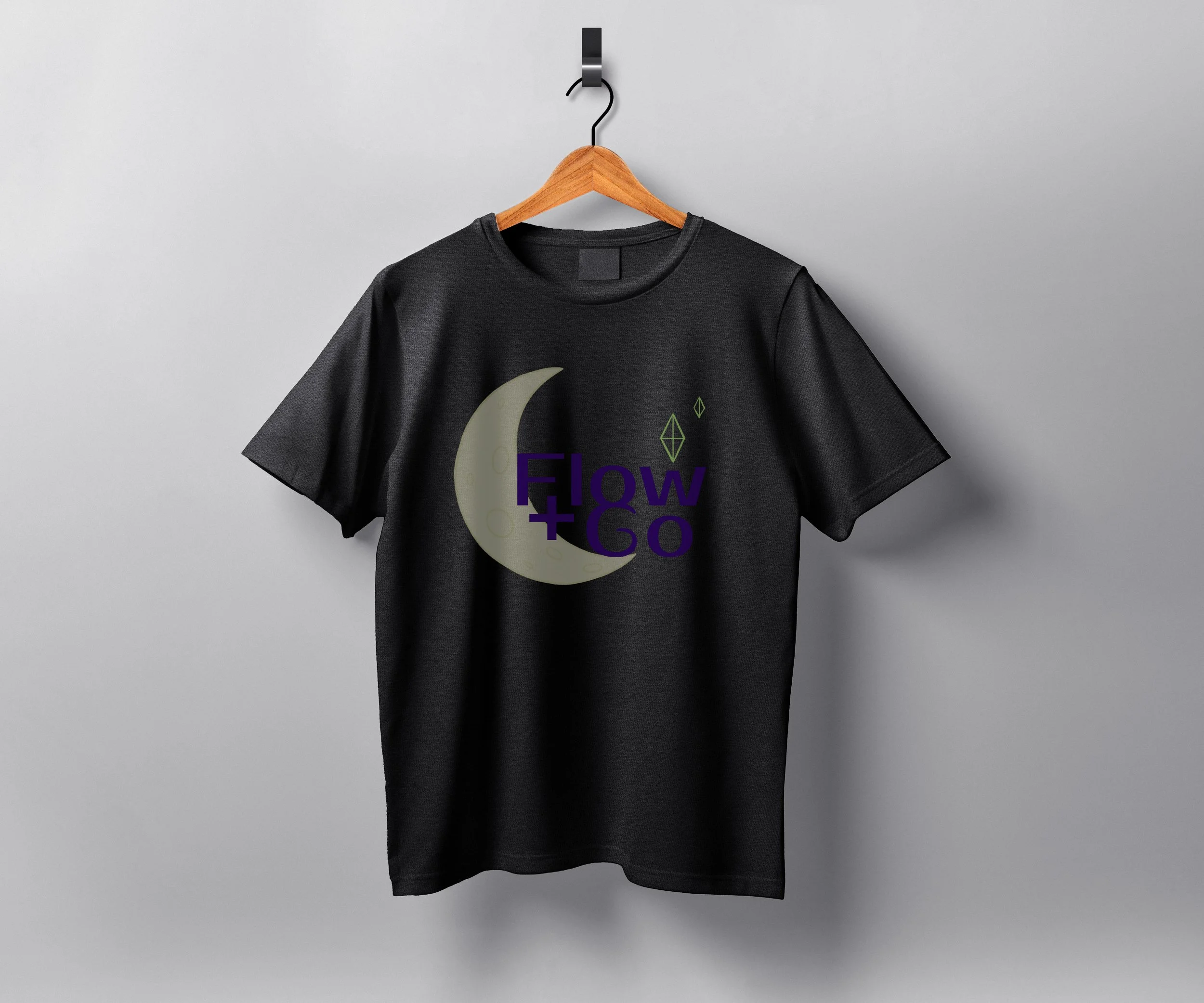
Logo Process
I kept the logo simple but powerful. I chose a font that is modern, trendy and bold to speak to the target market. The two words are linked together in the ‘o’ of the flow and ‘G’ of Go to show the unity of the group.
For the colour scheme, I chose a simple 3 colours which suit the target market well. A trendy colour scheme that I see everywhere is neon orange and purple. I wanted to do something similar to this, mixing a dark colour with a bright colour. I wanted the tone of the dark colour to be moody for the ‘running at night aspect’, and the neon colour is for ‘the safety aspect’. I played around with different tones until I came up with this blue-toned purple and yellow-green-toned neon. And I have a dark grey for a neutral as well.
Activewear Process
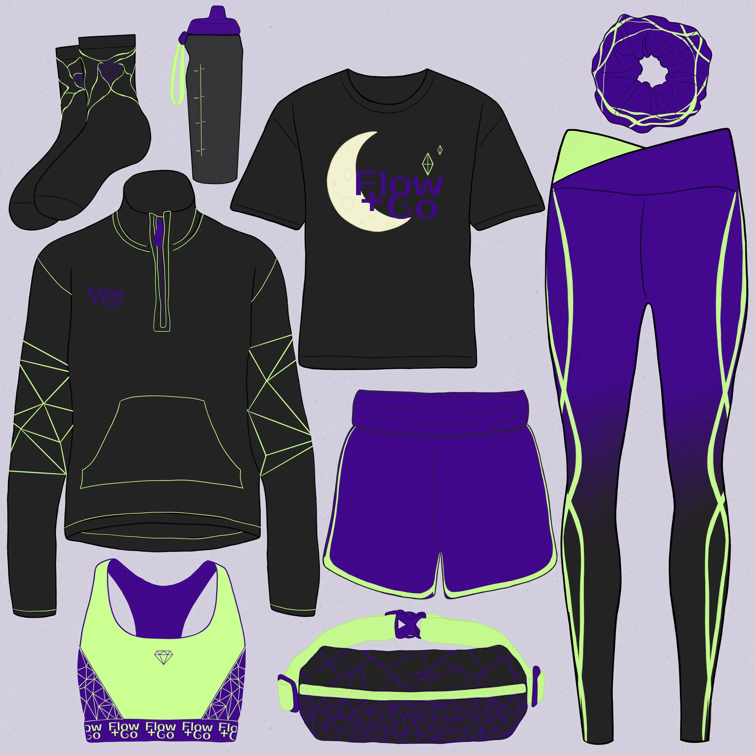
The activewear is a kind of uniform. You don’t have to wear every single piece, but at least one piece, even if it’s the scrunchie or socks. You want to be recognisable as being part of the group for safety.
For the designs on the activewear, I didn’t want to just slap the logo everywhere, but instead, the colour scheme is the brand. While designing, I was thinking, what would I wear? Because I’m not very adventurous in the clothing category, and I wanted something that everyone would want to wear to an extent.
This whole project is a very different style for me, and that’s why I chose it. So I’m purposely challenging myself to stray away from my traditional illustrations and soft style and do something bold and modern for this project. When I think of modern, I think of shapes, lines, and geometric. But I wanted to have so purpose. Diamonds give a feminine aspect, but they are also strong, representing the group. Which is why there are diamonds and triangles. I’ve also used some moon and stars imagery for the night aspect.
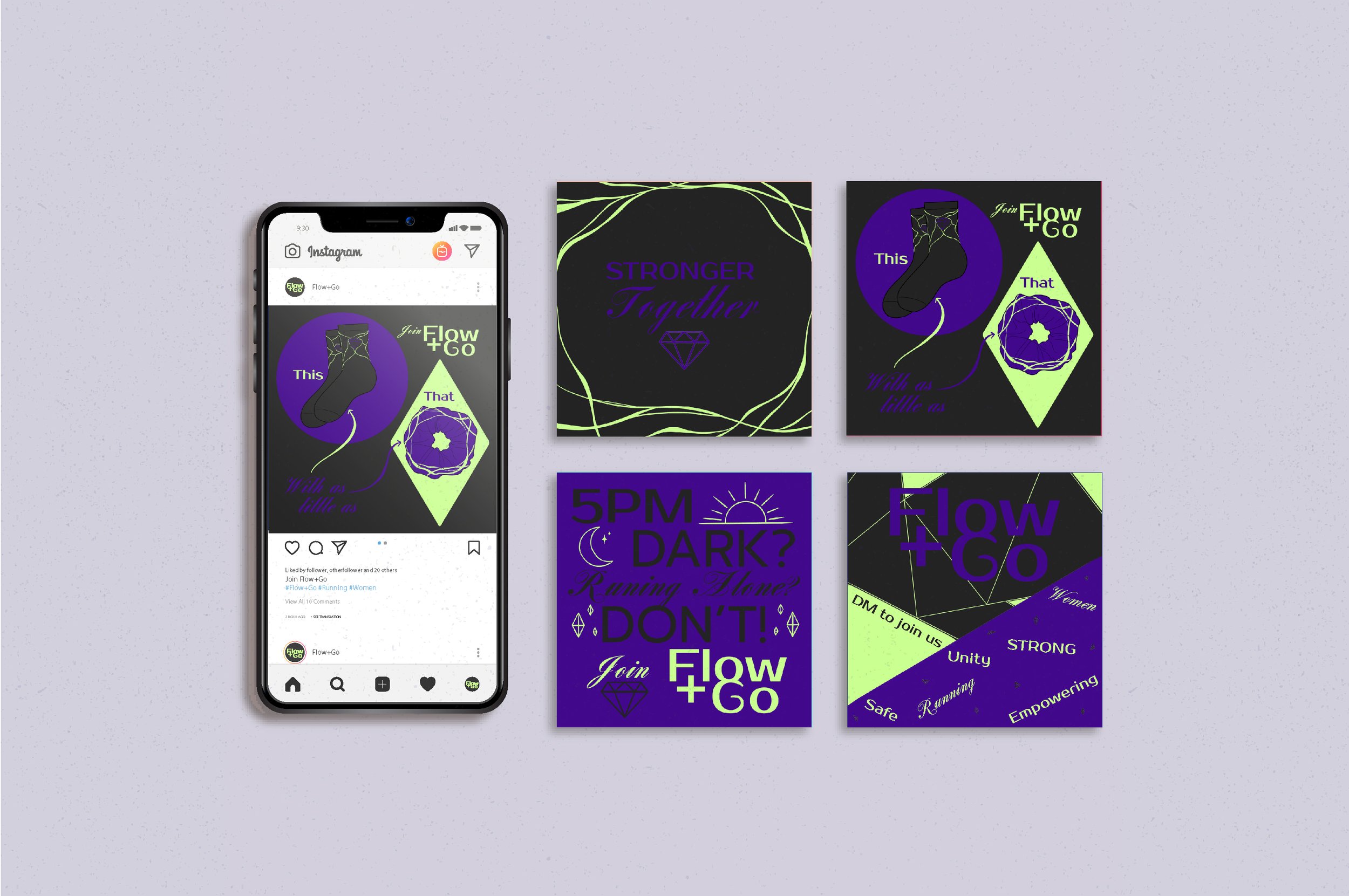
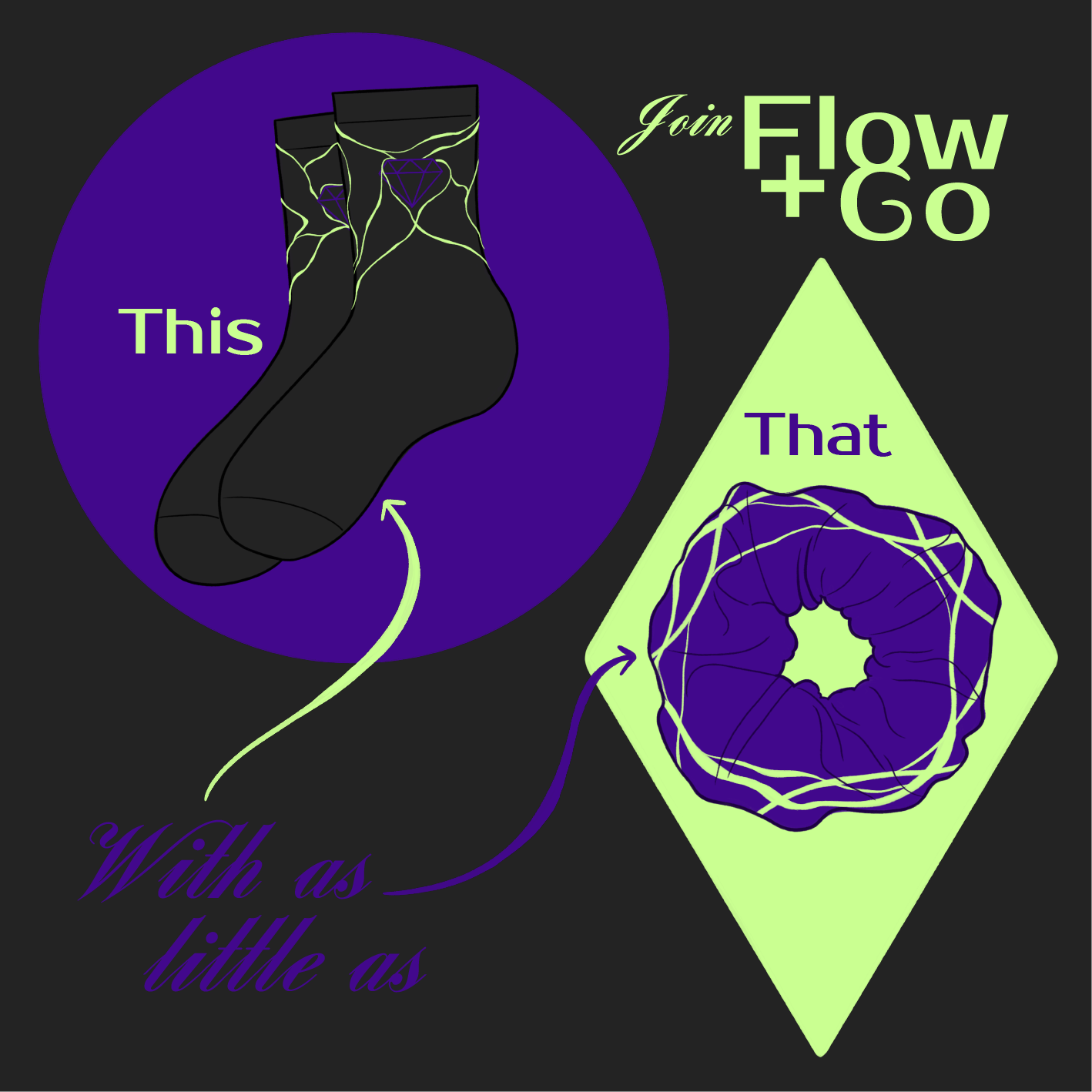
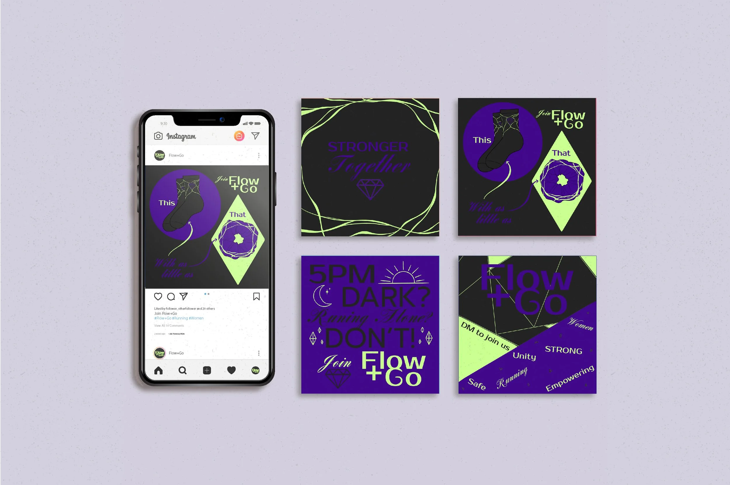
Social Media Posts Process
The social media posts are where I could communicate what Flow + Go is and the type of posts they could use. I’ve used similar designs and the same colour scheme as the activewear. I introduced 2 new fonts for more interest since there was a lot of text being used. One is a feminine calligraphy and the other is a simple bold.