Project Name:
Cosy Corner
Project Type:
Personal, NCEA Boards Redesign
Tools Used:
Adobe Fresco, Illustrator, Photoshop, XD
Month/Date:
Feb 2025
THE BRIEF
THE BRIEF
The idea of this project blossomed by the fact that I needed more design work in my portfolio. I got the sudden idea to redo my NCEA high school design boards since I know that I have improved so much since then and I think they lack the purpose of design. This ticked the box for my brief.
How does this work?
Use the base idea from the NCEA board
Create the same designs unless they are outdated or unnecessary
I allowed changes to the name, and styles because I didn’t understand the importance of this
PROJECT BRIEF
PROJECT BRIEF
The base idea I kept was that it’s a restaurant with a comfortable environment. Firstly I changed the name to something that communicate what the restaurant was all about, Comfort. I added a bigger target market, 18s - 35s, so it’s not just limited to social anxiety which is probably a small market. I changed the cuisine to a more handheld, filling and what I think is comfort food, Mexican food. I used a muted/pastel Mexican colour scheme with watercolour and lineart along loose, minimalistic and clean for all together to communicate soft, cosy, comfortable, and calmness.
The original idea was a social anxiety-friendly restaurant that has a comfortable environment. It’s about going out and eating nice food. The cuisine is Chinese and you would order it off an app. It was called Bear Kitchen.
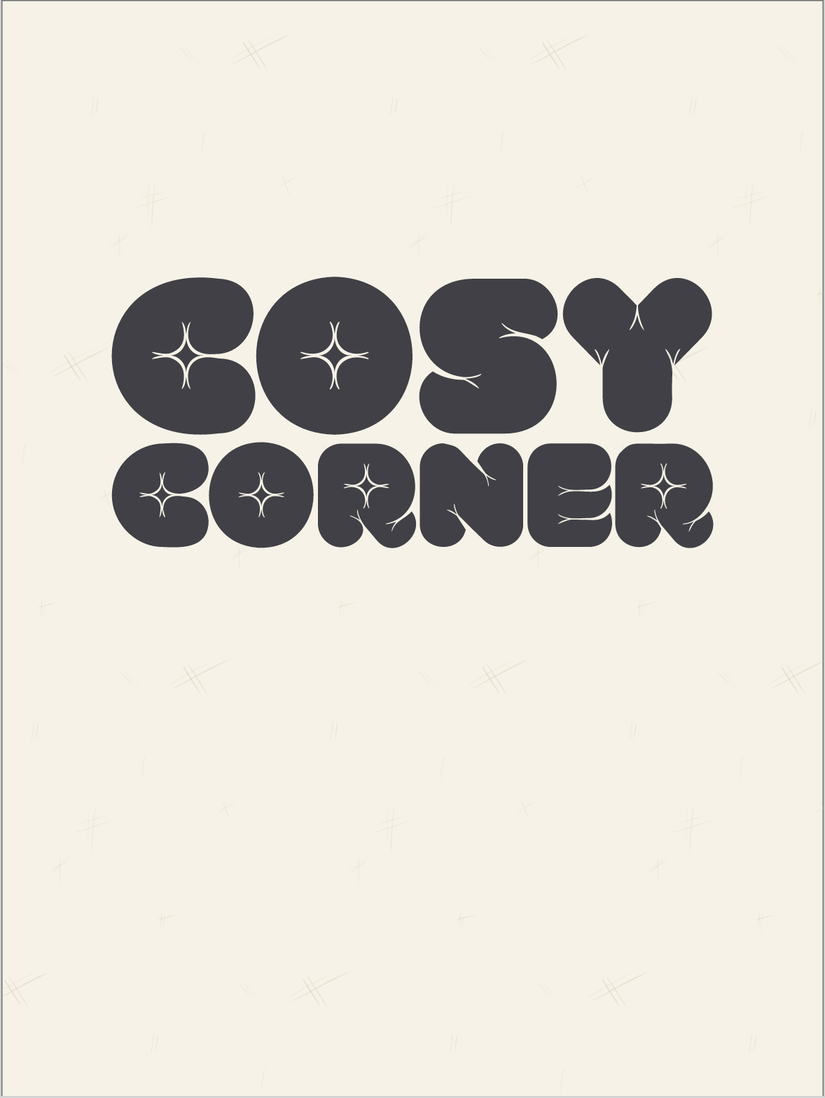
Cosy Corner
Comfortable environment restaurant
Target Market: 18s-35s
Cuisine: Mexican
Colour Scheme: Muted/Pastel Mexican
Overall Style: Loose, Minimalist, Clean
Illustration Style: Watercolour, Lineart
Communicate: Soft, Cosy, Comforting, Calmness

Starting Process
Starting on this project I was trying to make the “Blue Kitchen” name work. I looked at all my old logos. Knew they were too Pinteresty, also could see exactly what my high school teacher said to be back then. They are also too generic using plates, knives, a bear, etc. So I started by going back to what I said the restaurant was, writing these down. Restaurant for social anxiety, comfortable, luxurious/elegant (gold), blue (trust/bravery), safe. I wasn’t feeling any of this anymore. I’ve changed so it needs to change. So what exactly needs to change?
I started with the food. Mexican. I love Mexican food. It’s a no-brainer. I don’t know why I didn’t choose this when I did this project in the first place. Started writing down the type of Mexican food to get more of an idea, and develop more of an idea.
Next, I’m still having a comfortable environment. What people love this and handheld food? Young. I know my parents or older wouldn’t be willing to choose to go to a couch restaurant over a normal one. So, 18s to 35s.
Now that I have developed the base of the brand, I can figure out a name.
Name Ideation
I didn’t come up a lot of names before picking my favourite, as soon as I had Cosy Corner. I loved it.
Something punny?
The ?
Sage and Salt
Silver Spoons
Comfort Corner
Cosy Corner
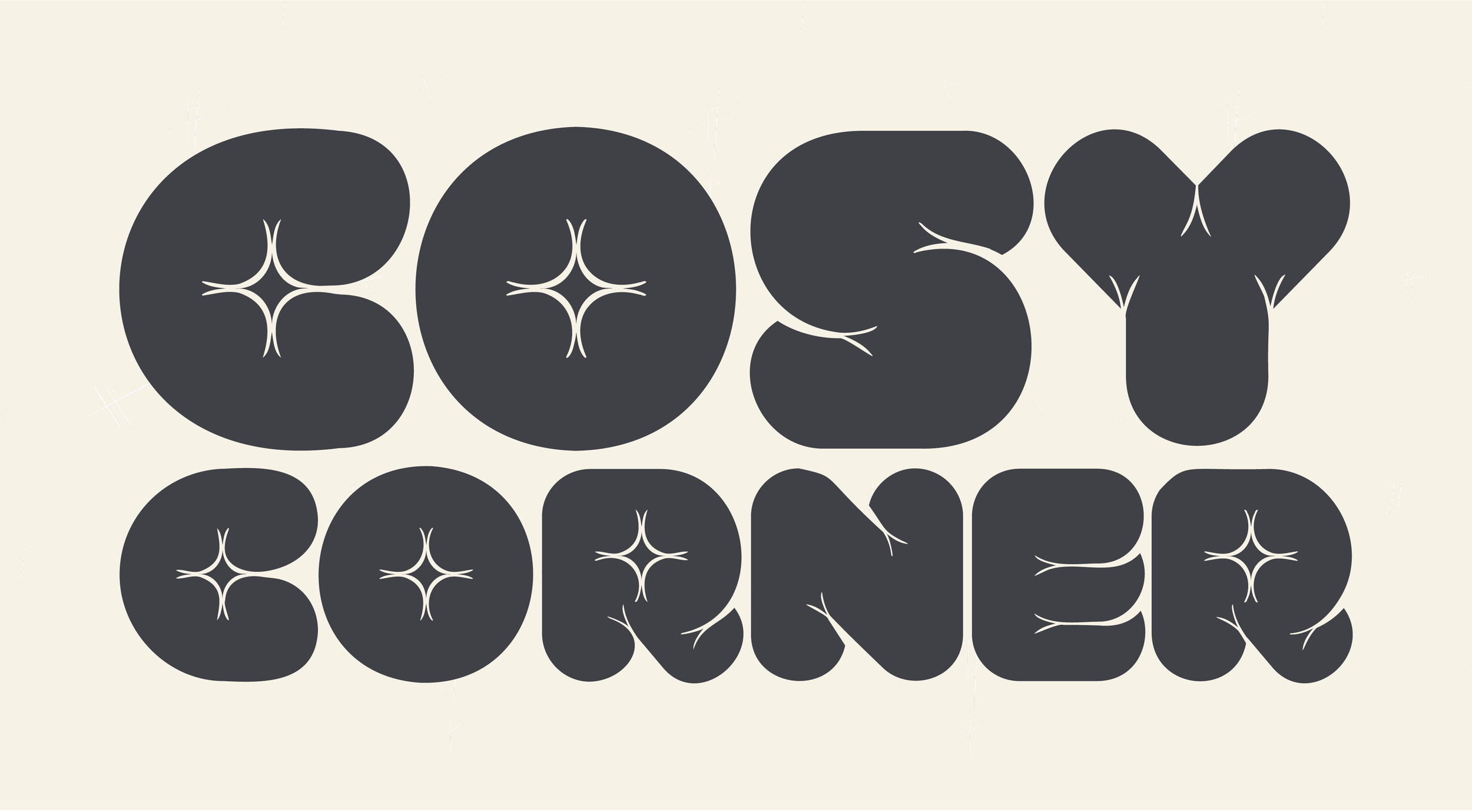
Logo Process
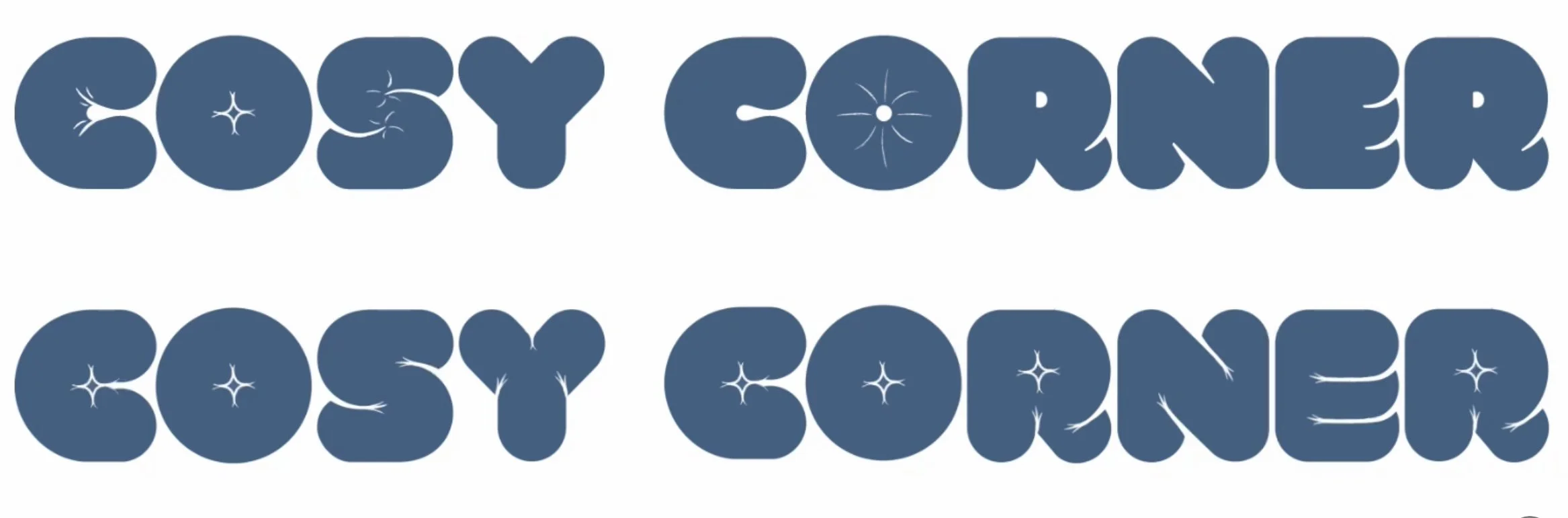
After just staring at the different typefaces, I saw VAL in a new way. What if I took those curves into shapes like with the ‘R’ and turned them into folds like a blanket or pillow?
I started experimenting with different ways I could do this. Made them bigger, with different amounts of lines and I also tried making them asymmetrical but I thought this looked too distracting for a logo.
After I finished experimenting and was happy. I made the logo into a vector by using a vector brush and transferred this into illustrator to tidy it up.
I didn’t really have an idea of what I wanted the logo to look like. I just knew the typeface had to be big, fluffy and lumpy like a big cosy blanket.
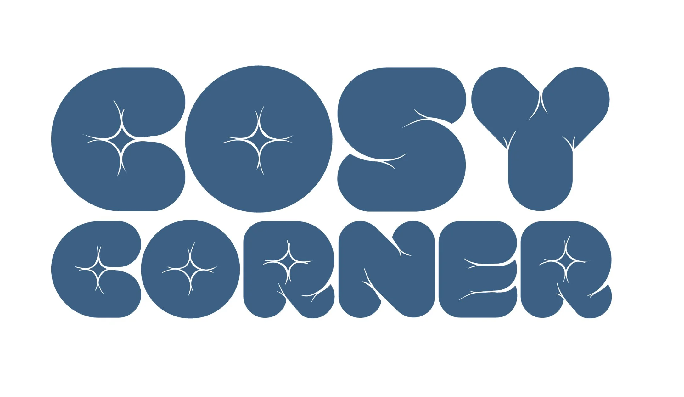
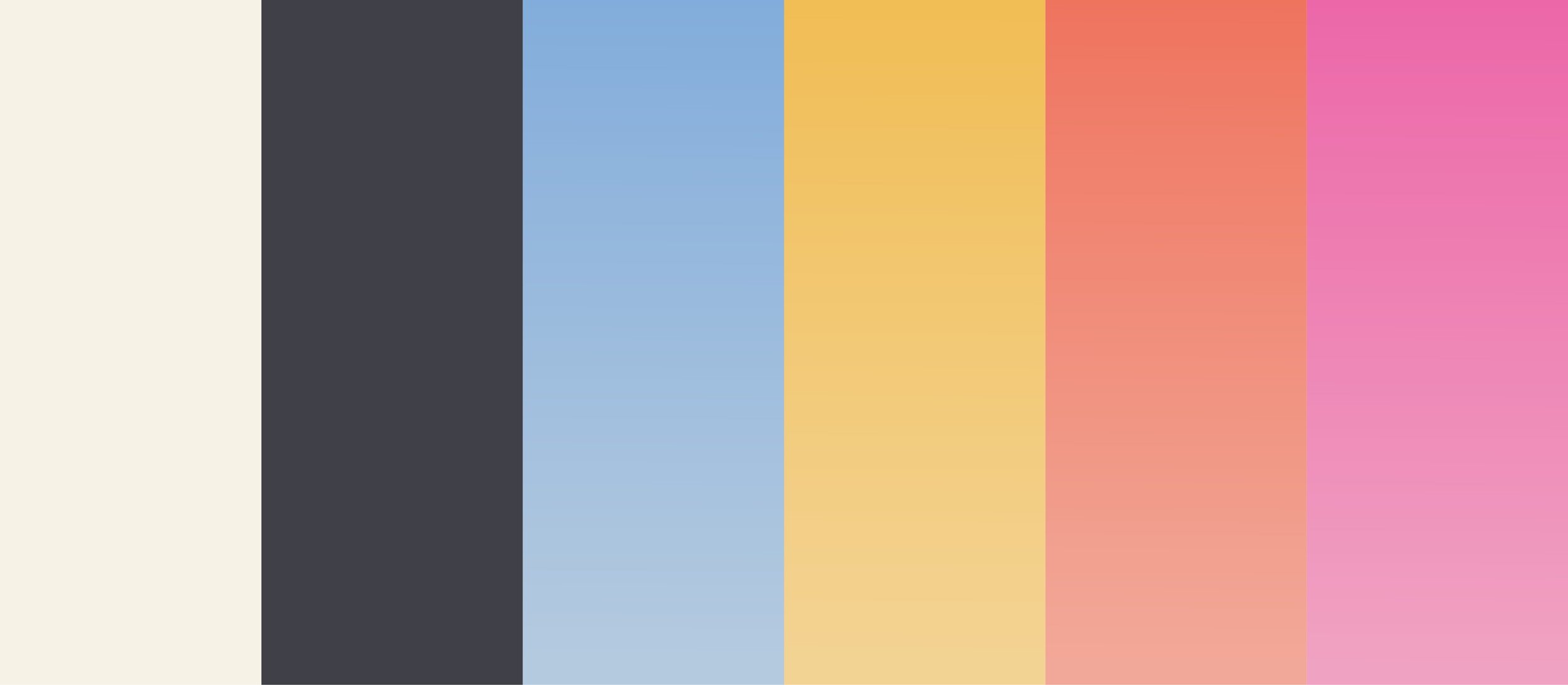
Colour Scheme
The colour scheme inspired Mexico but muted pastel because of the Mexican food connection.
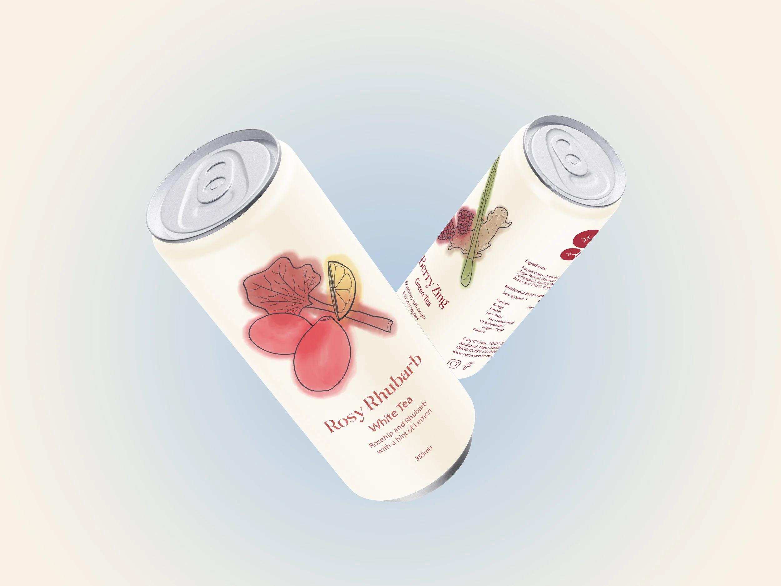
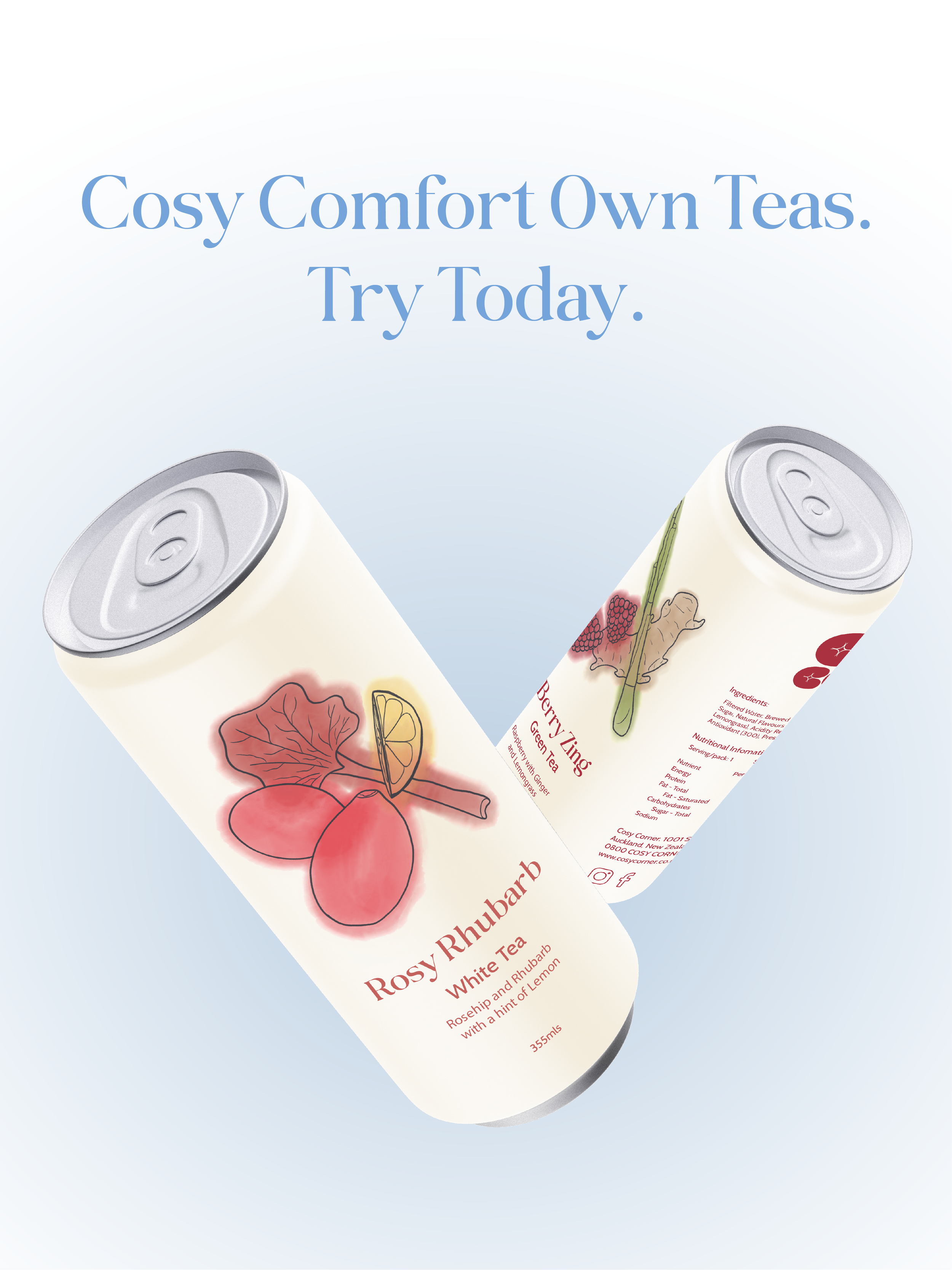
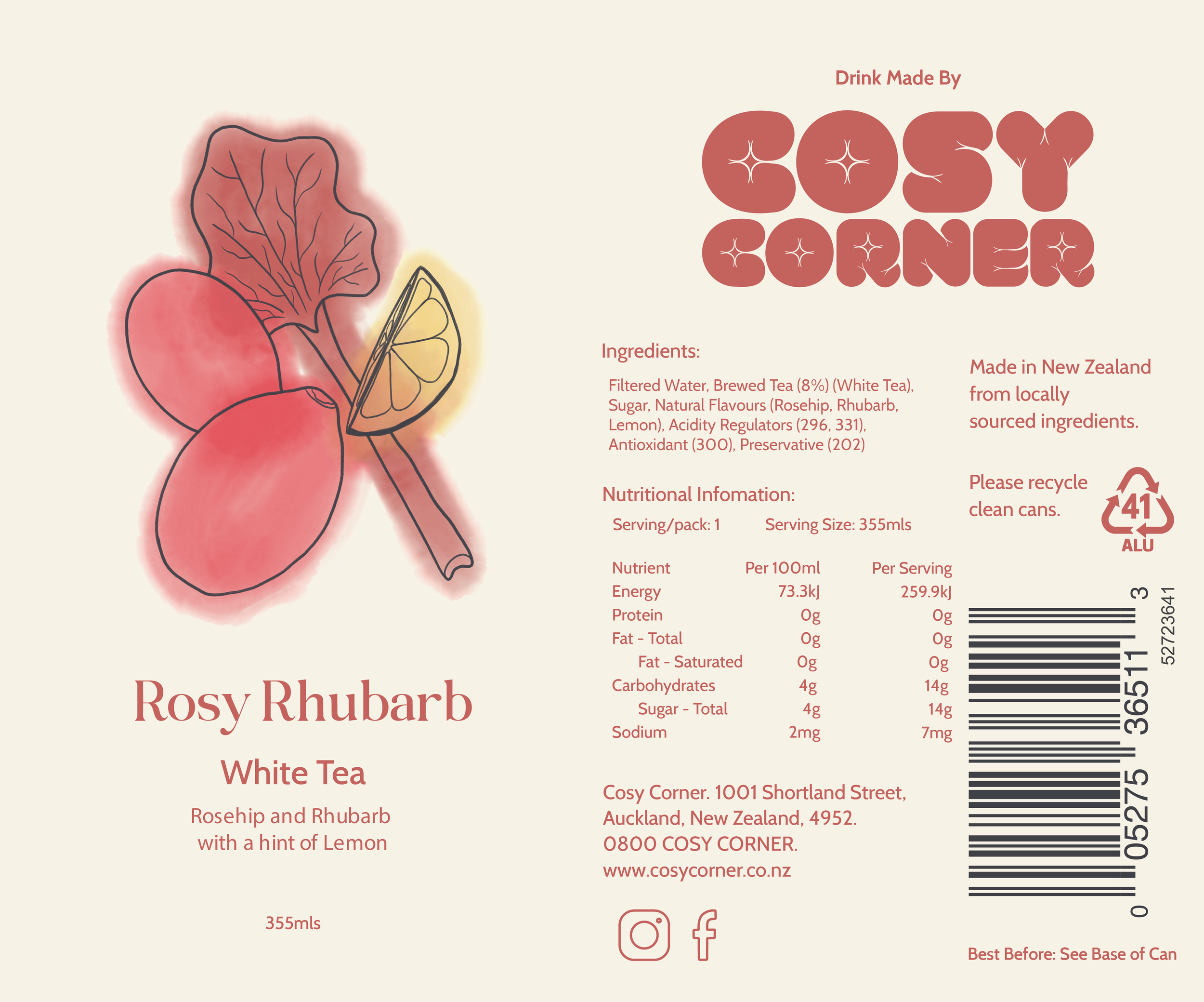
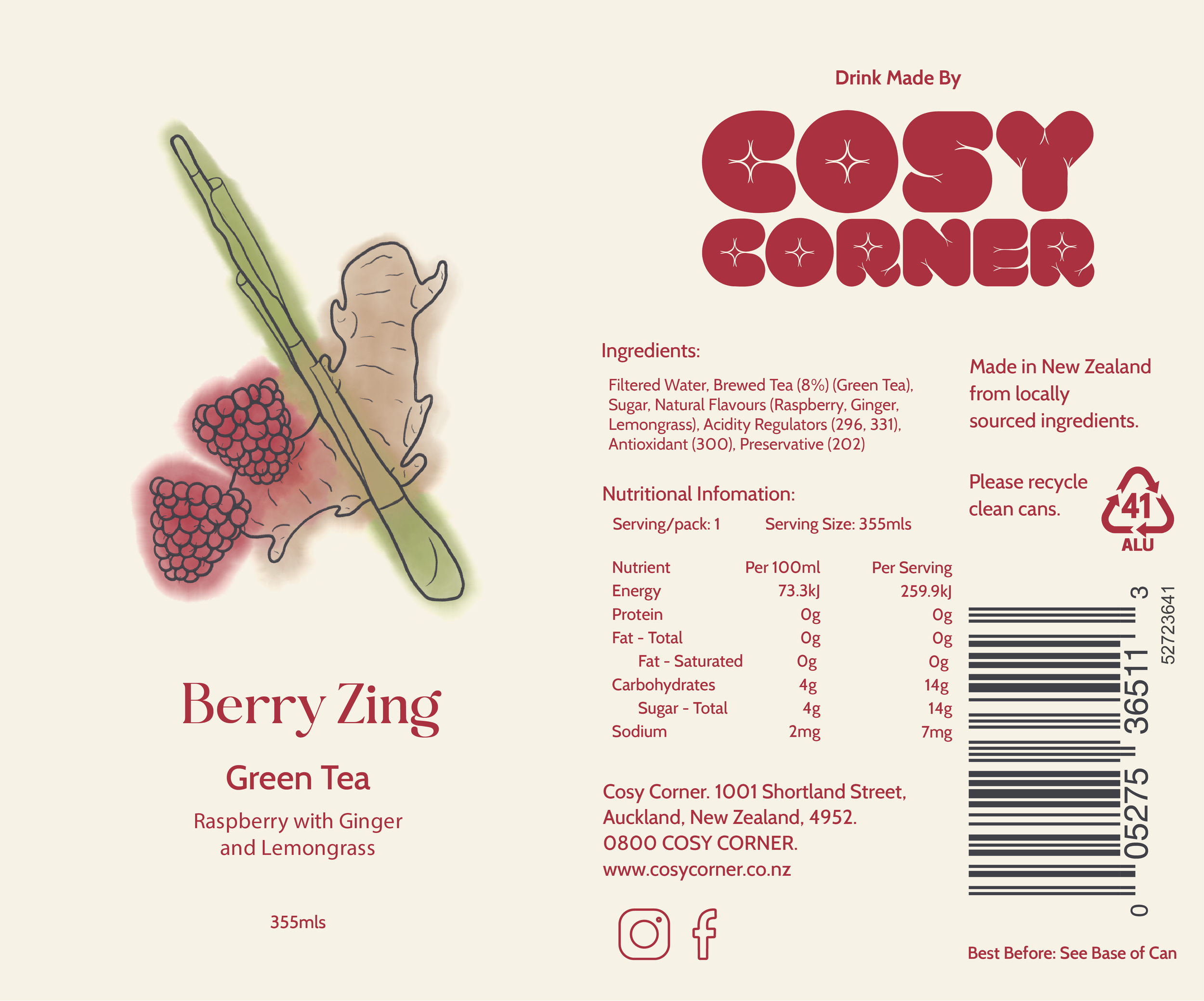
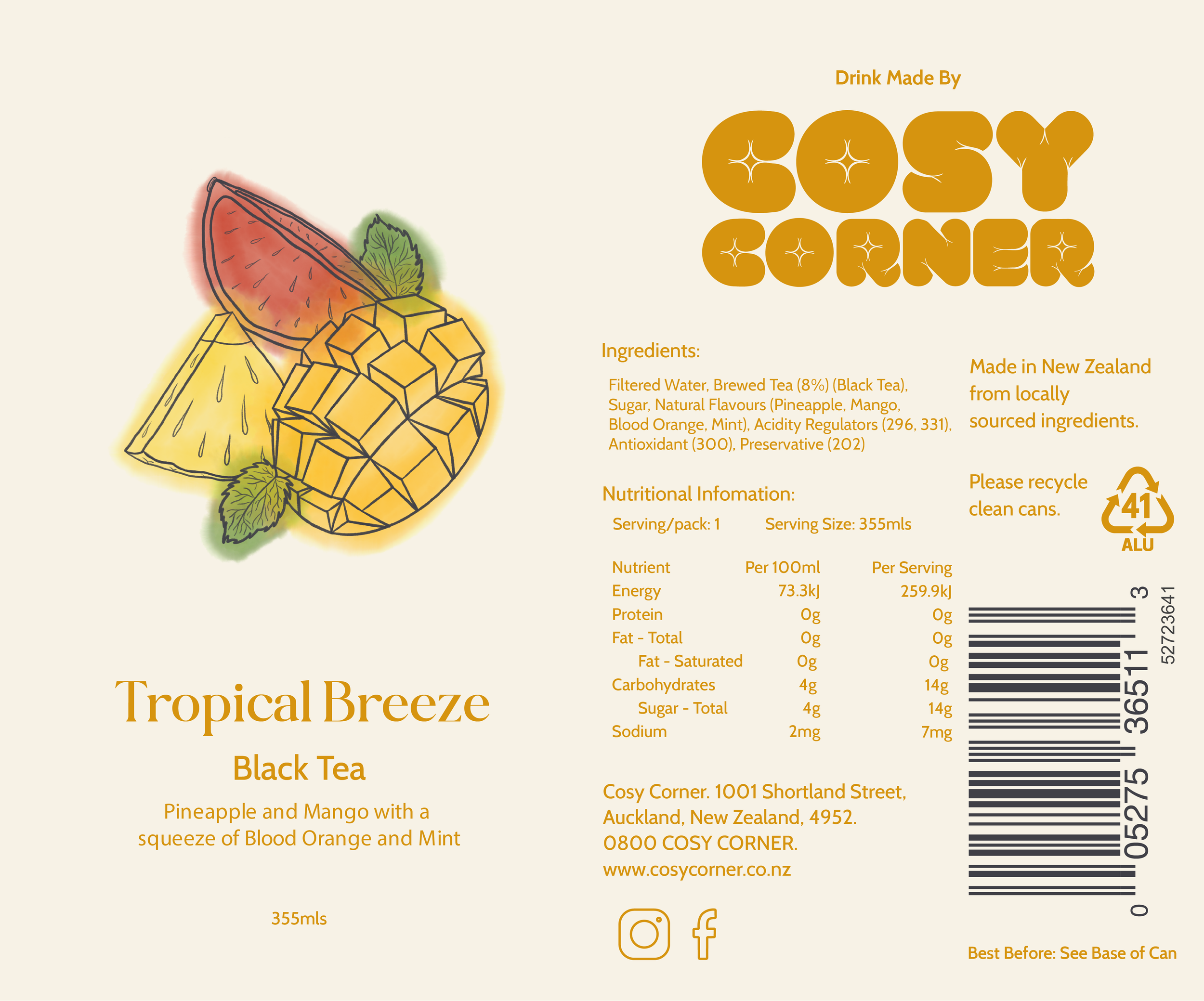
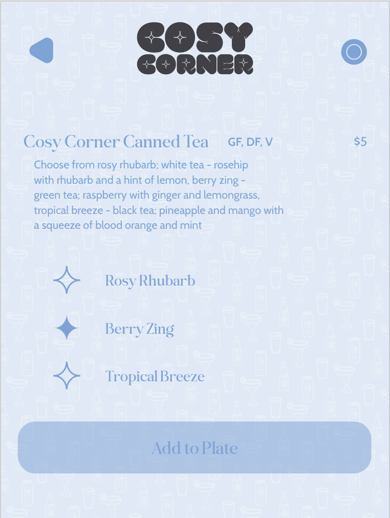
Drink Tea Can Process
For my NCEA boards, I designed a tea can to sell within the restaurant that helped to reduce anxiety. I found out too late that I chose a tea flavour that also made you sleepy. This is what I want to improve on this time round, my research. Because this restaurant is no longer targeted for social anxiety but for cosy and comfort. I still want this to be a tea and a calming but not a sleepy tea.
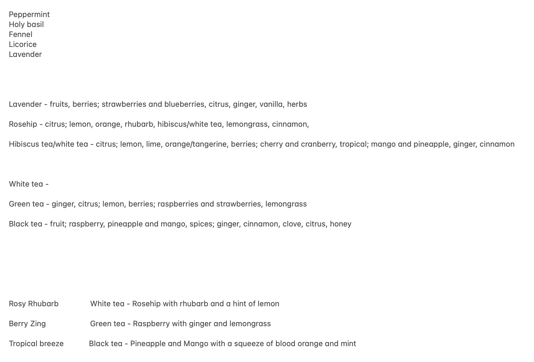
I started researching all the calming not sleepy teas, double checking and writing these down. From there, I pick a couple that sounds nice to me and see what flavours go well with them. From there I used AI to help me come up with drink names.
Rhubarb Rose Mist
Rosy Rhubarb Fizz
Raspberry Zing
Berry Zing
Tropical Breeze

To keep with the calm feeling of the tea. The design must communicate this. The illustration and design styles I’m using is watercolour, lineart, and minimalistic.

After just staring at the different typefaces, I saw VAL in a new way. What if I took those curves into shapes like with the ‘R’ and turned them into folds like a blanket or pillow?
The typeface was a pretty quick and easy decision. I wanted a trendy curvy serif for the name of the drink and a simple clean San serif to compliment and be good for small text.
I kept the colour scheme simple with only 5 colours for each can. A light creme for the background, a dark charcoal for the lineart and barcode and 3 ingredient colours that are slightly muted.
The illustration is a watercolour wash with a loose ingredient outline. For the text, I used the most contrasting ingredient colour.

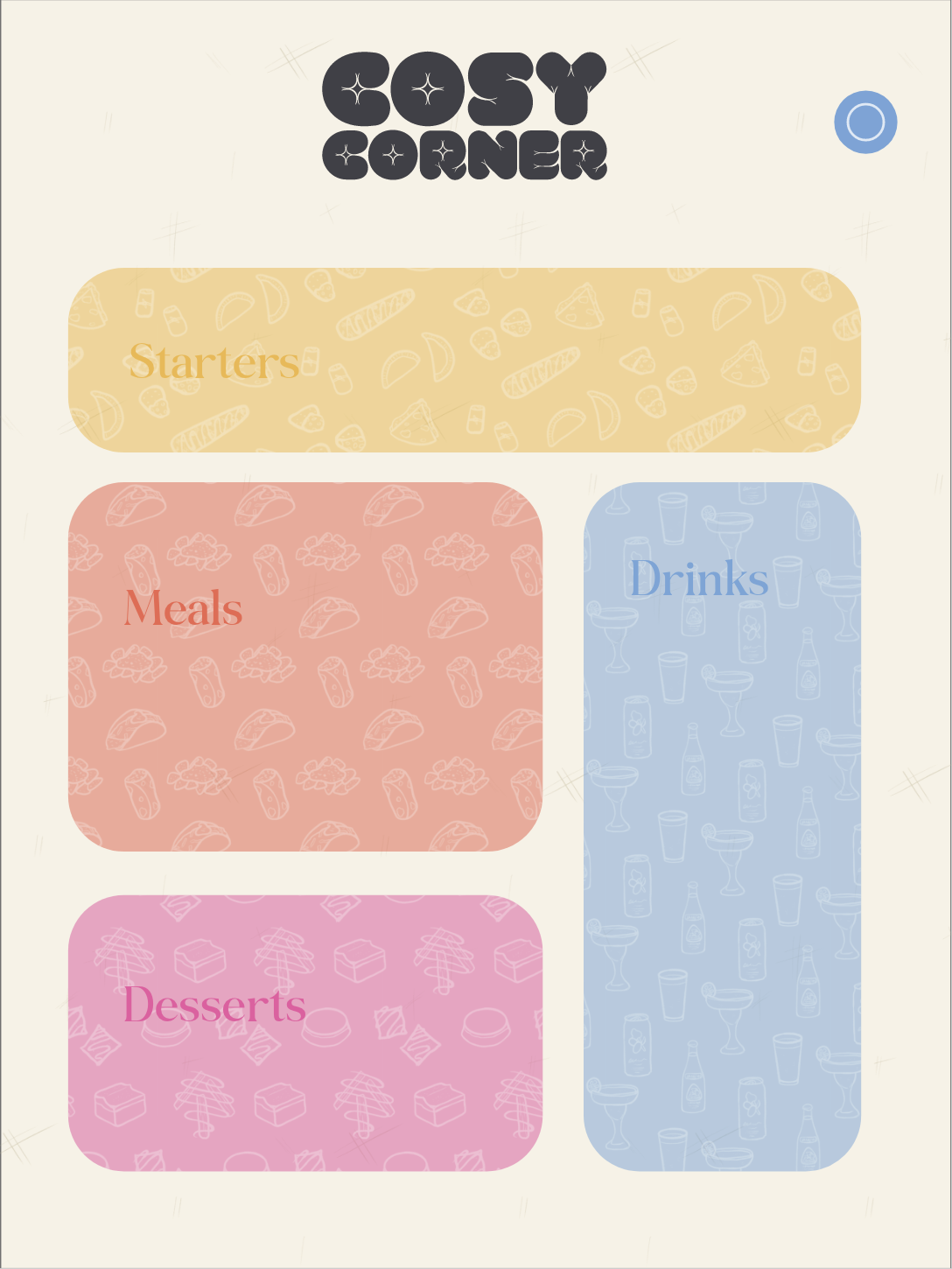
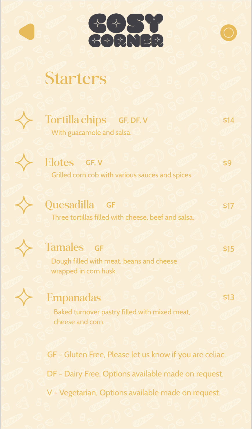
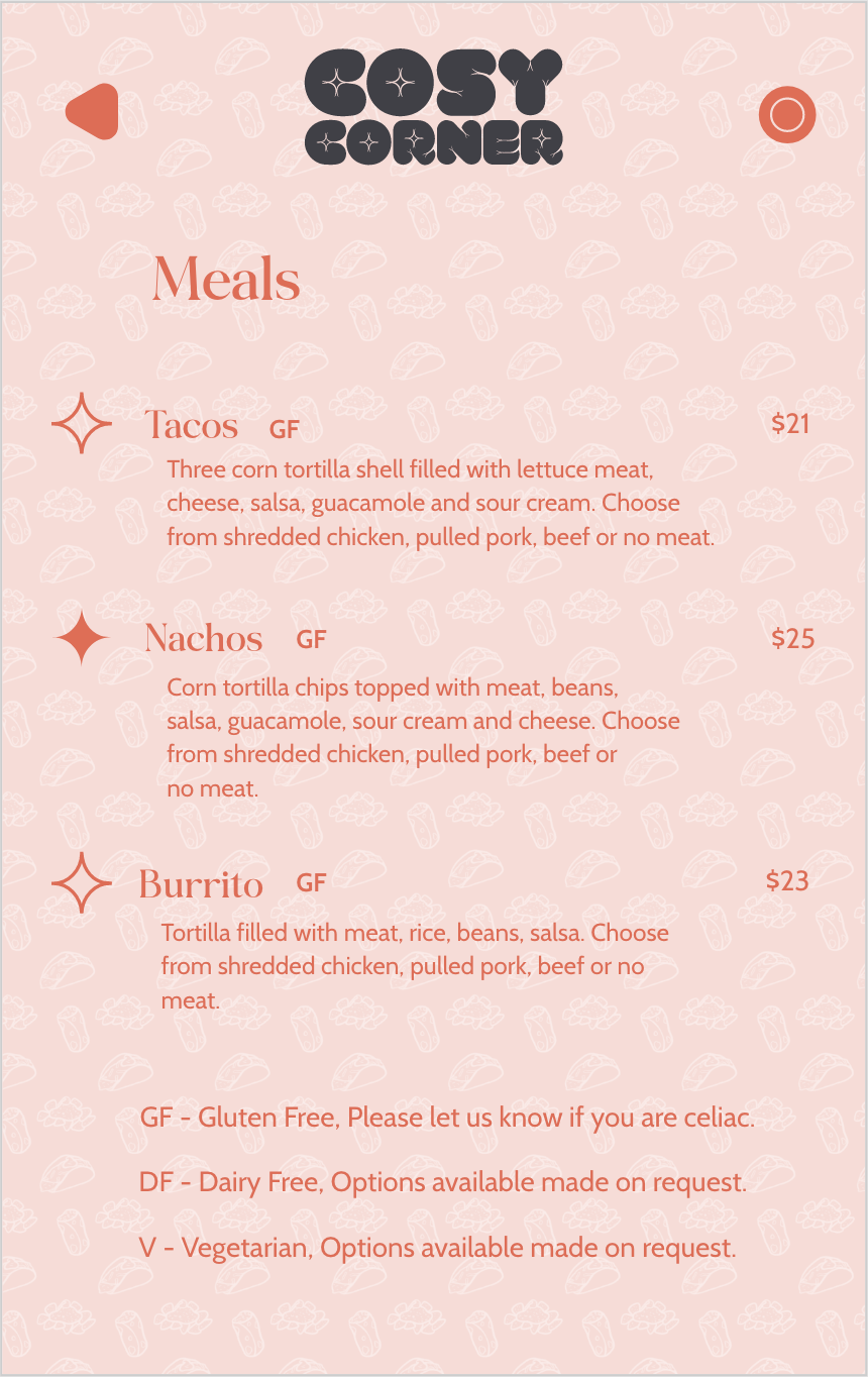
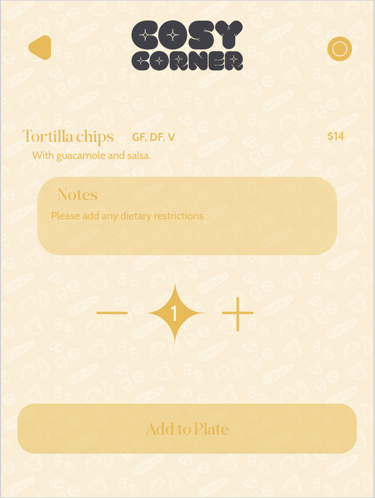
App Menu Process
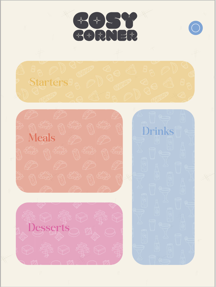
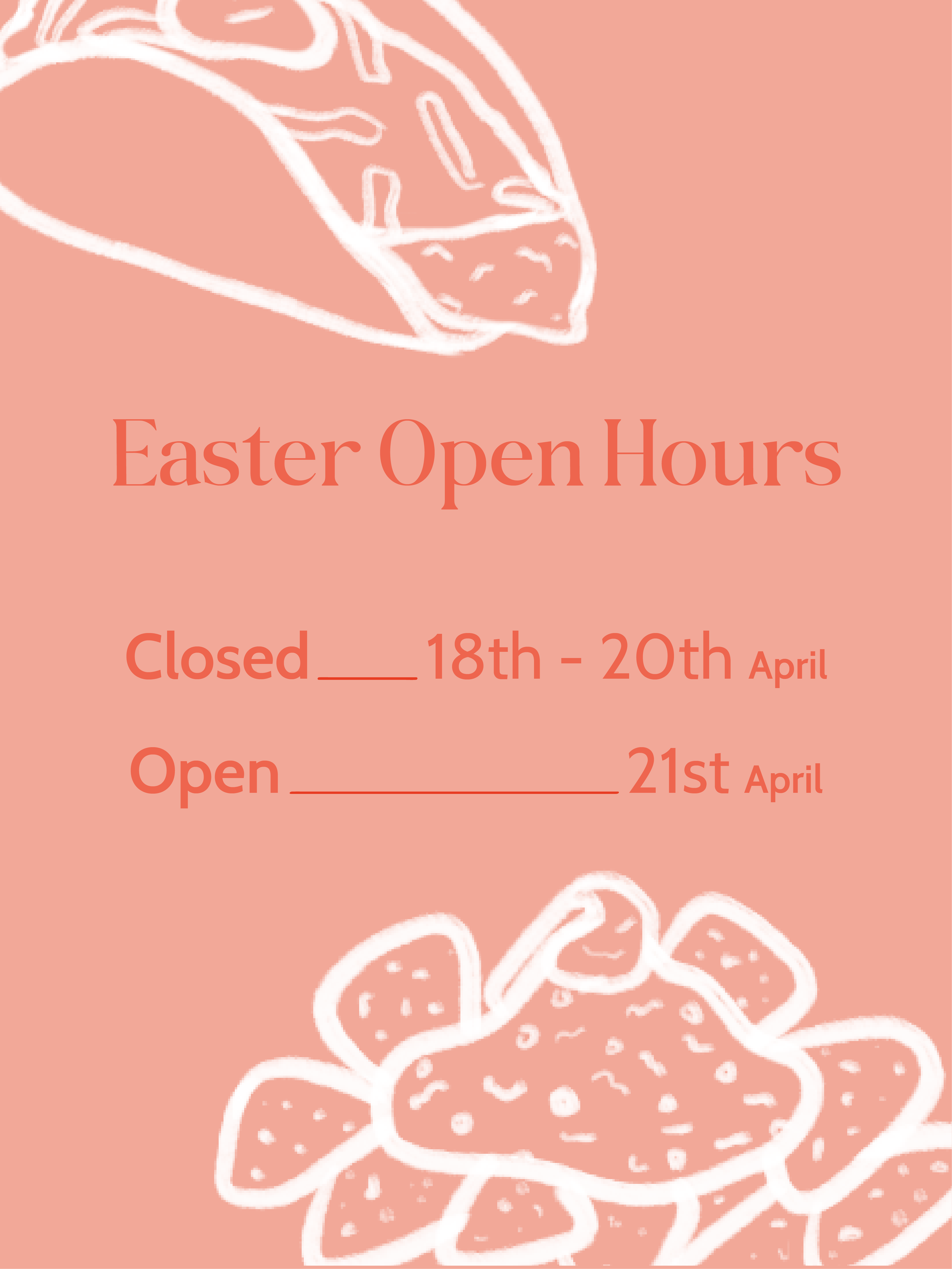
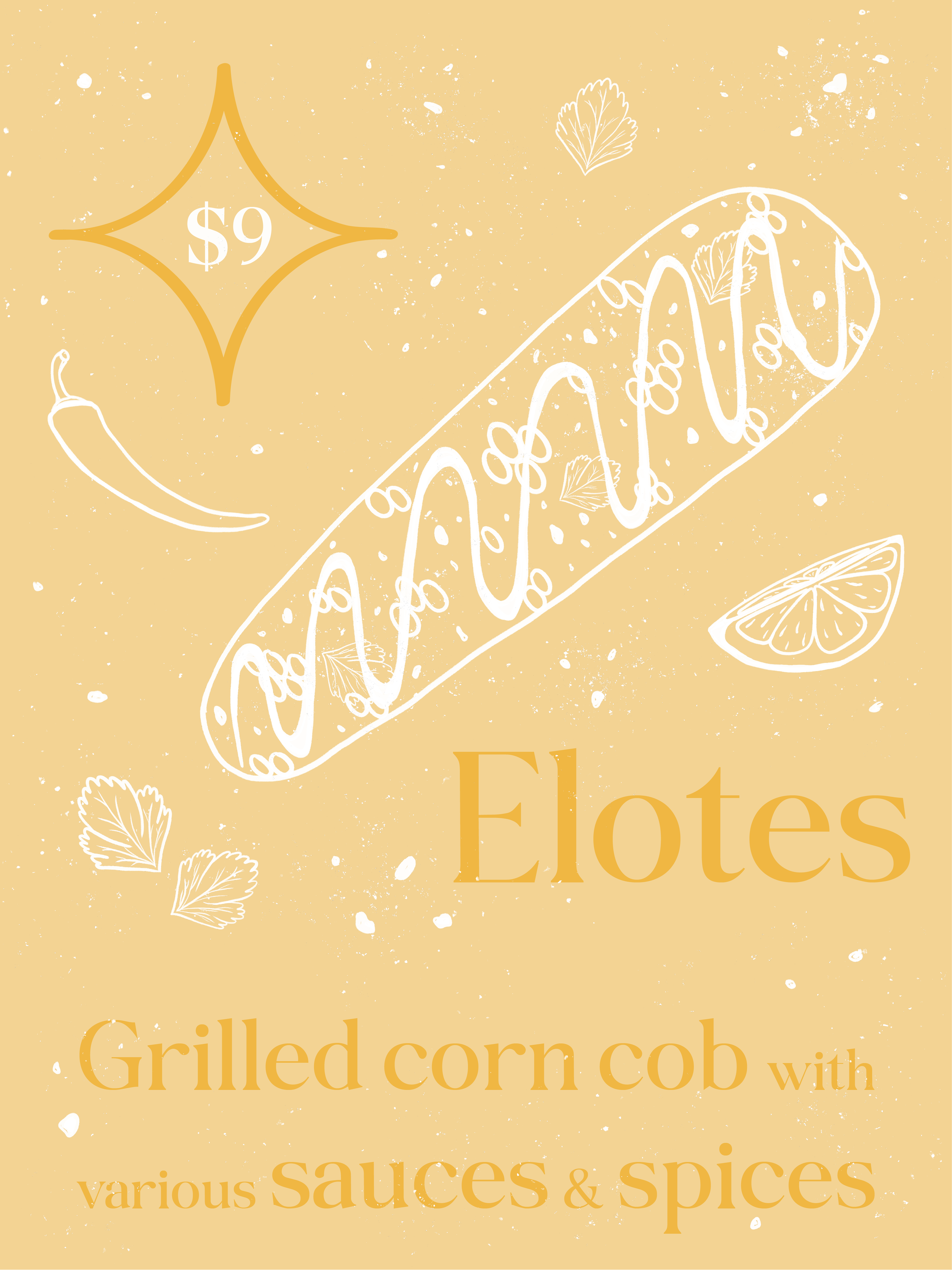
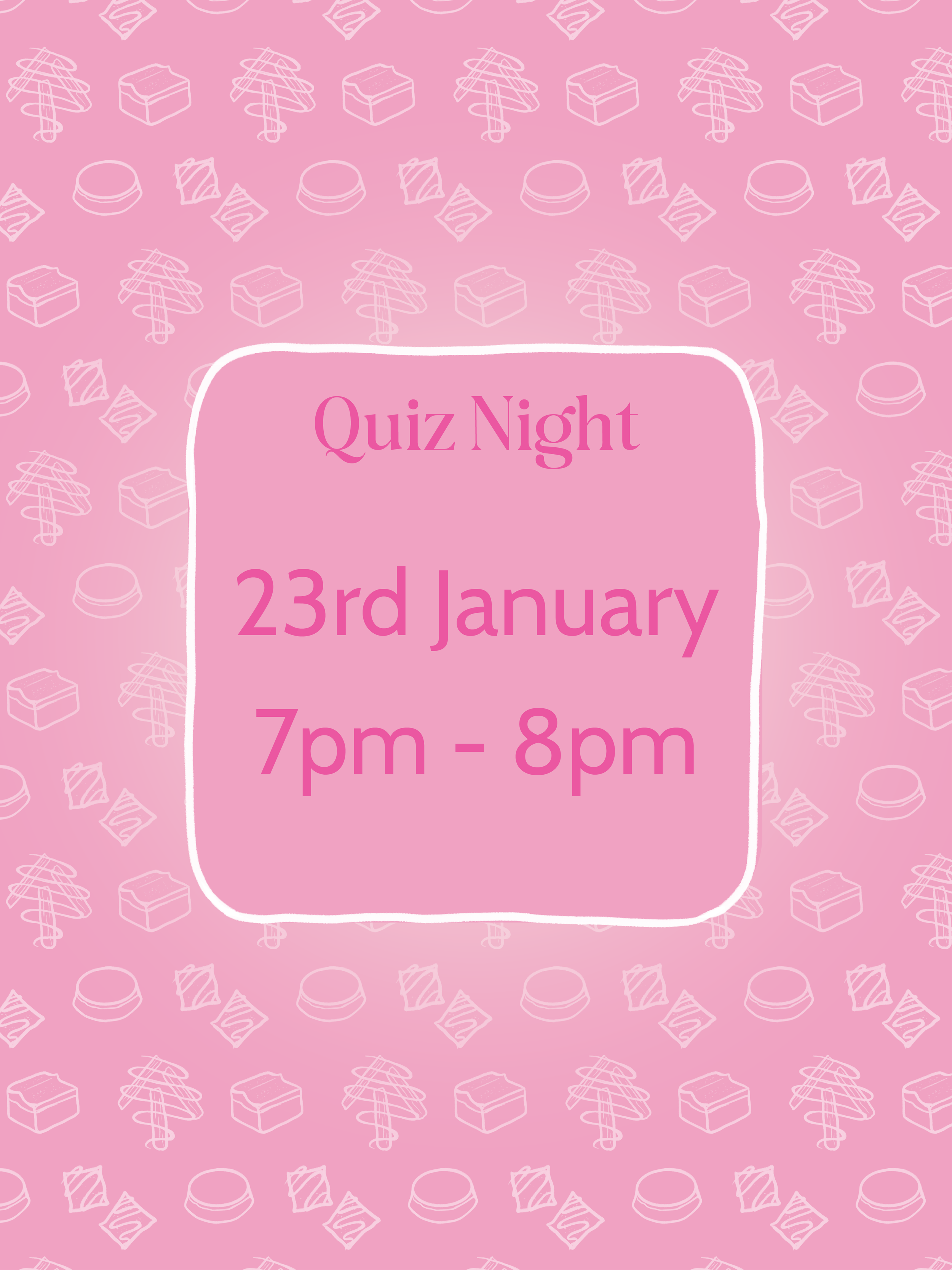
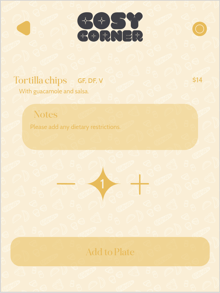
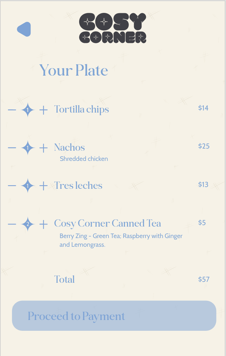
To keep with the feel of the brand of calm and cosy with the illustration and design style of the drink can of watercolour, clean and minimalistic. I wanted to keep this running through the app design. I chose a trendy UI app design style of the bento design since it’s a clean style. I played around with the opacity to give that watercolour feel from the drink packaging. Also using subtle lineart from it as well. I used the same typeface from the drink packaging because it still fit. I used lots of soft, rounded edges for the cosy feel. Instead of using a “cart” for checkout, it’s a plate since it’s a dine-in area. You don’t want to introduce too many shapes so for the quantity shape I used a star from the logo. Lastly, this part isn’t important to the design but the functionality including the dietary.
I started the app menu design process by listing what menu categories I was going to do and what was in them. There could be many directions I could go in. Luckily, I already had the food group sort, Mexican. But if it was going to be the starter, main, dessert, drinks, or into separate food like tacos, burritos, etc. I went with the first option. I also didn’t put a lot on the menu because it’s not about whats on the menu, it’s about the design. If I at least had enough to have a little scroll I would be happy.


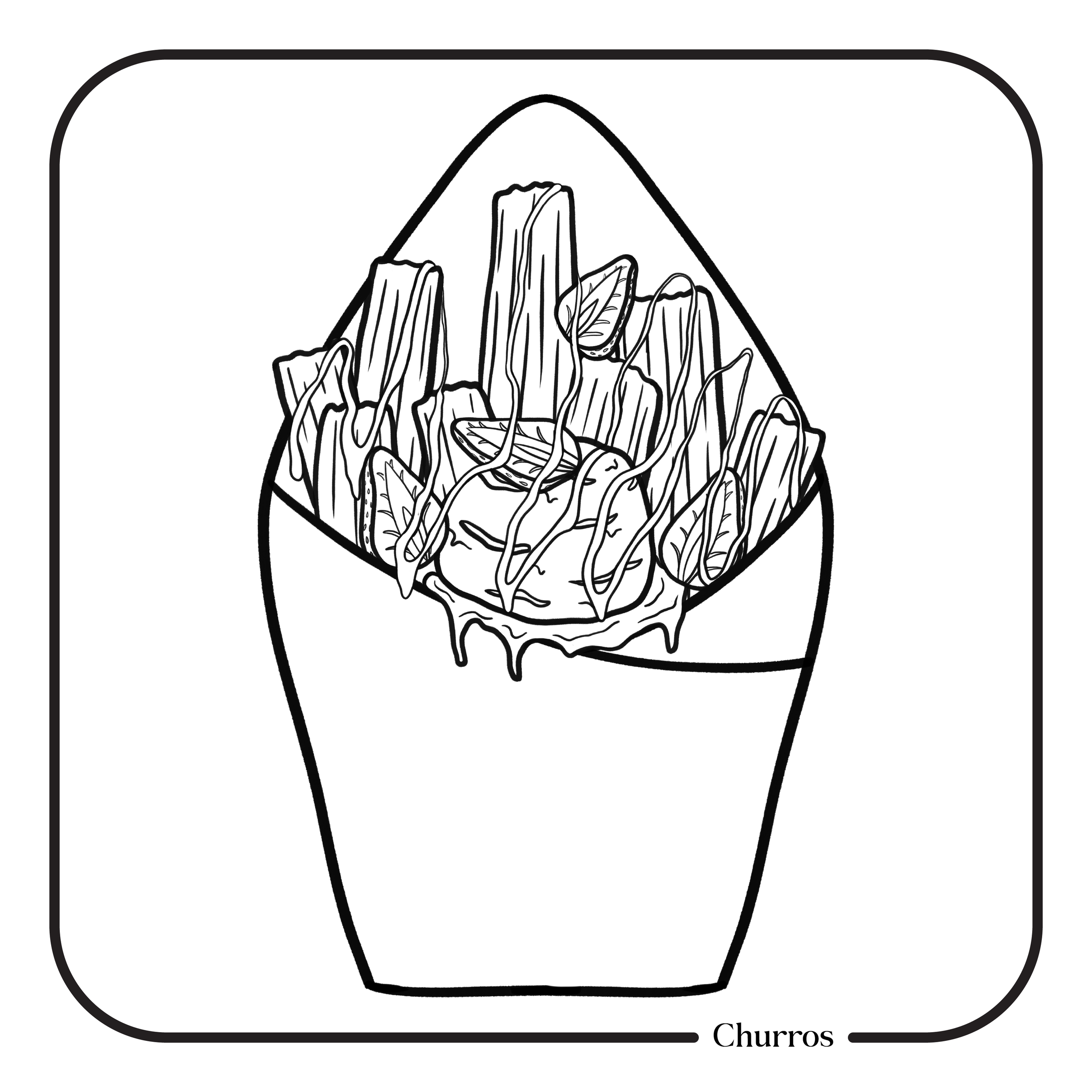
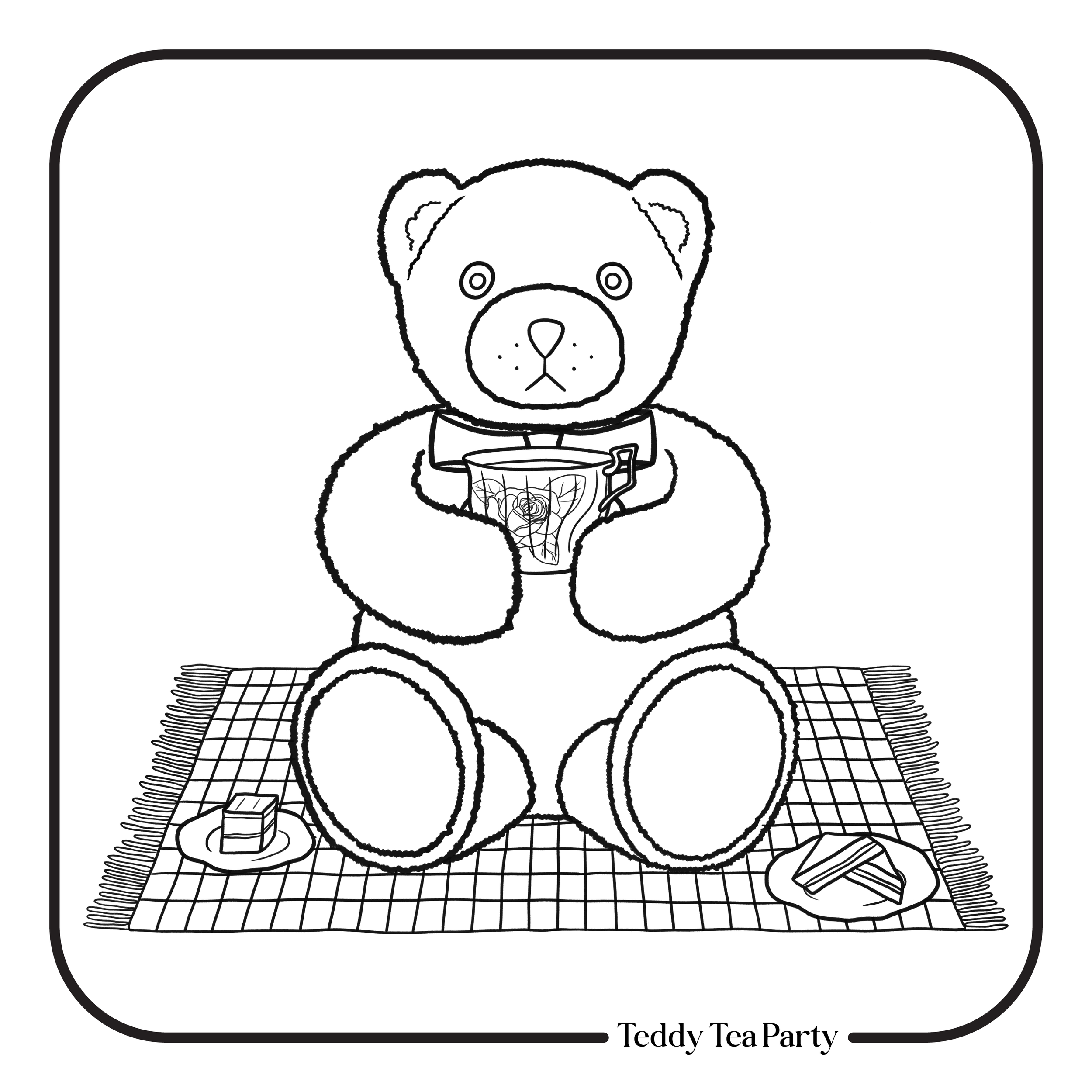
Colouring Page Process
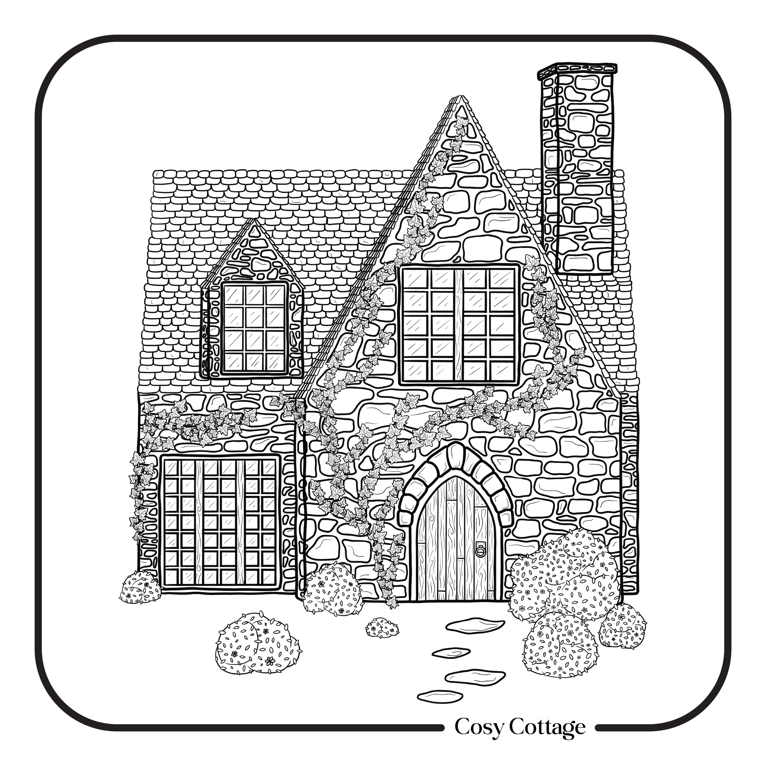
I wanted to do 3 different colouring pages with 3 different levels of creativity and 3 different subjects. So I have done some more detail, some with less detail and more room to add patterns if wanted. I have done a cottage theme which would typically be greens/browns and greys. I have done a food theme where you can pick your favourite sauce or ice cream flavour and a teddy picnic where the colours could be very different for everyone.
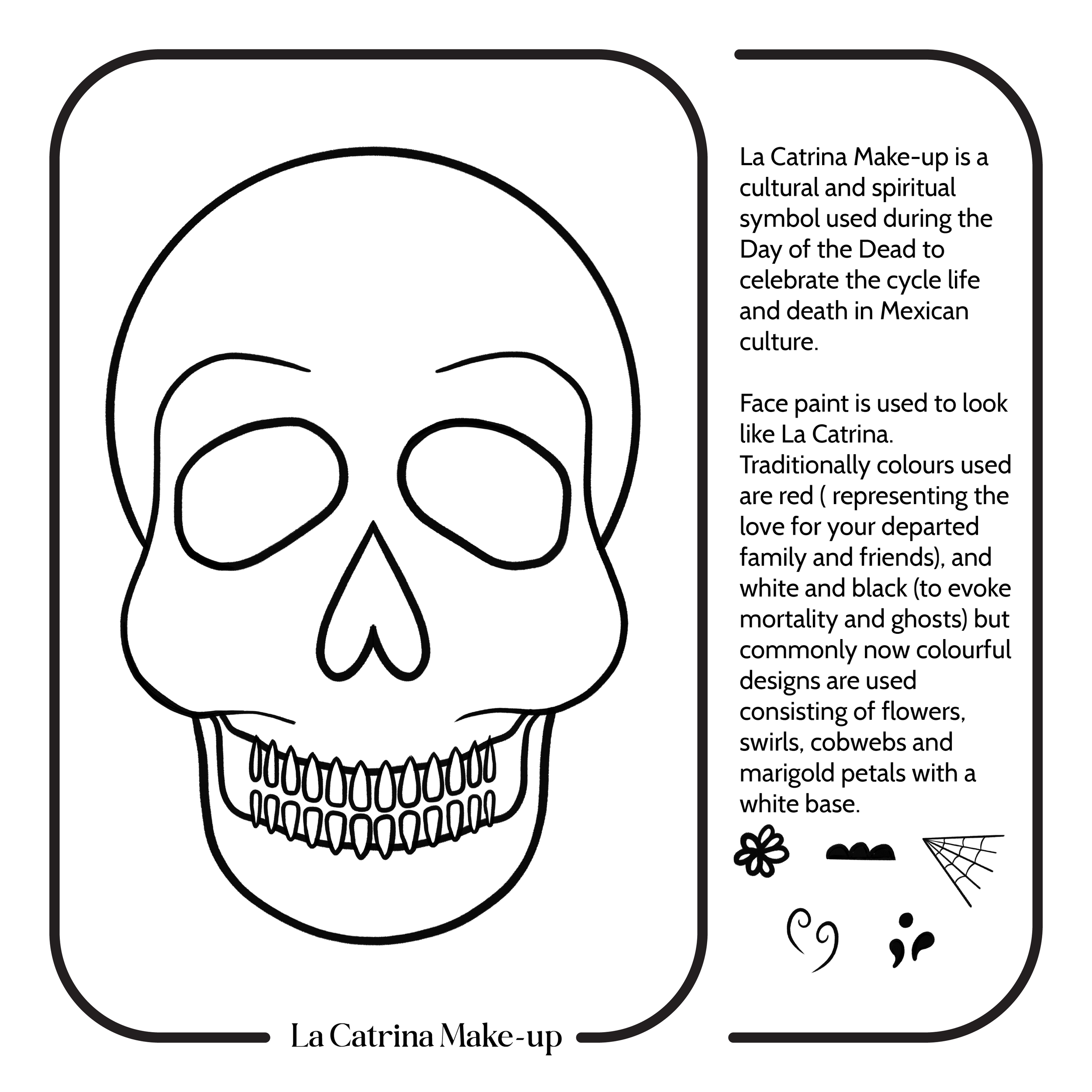
As well as colouring I wanted to include an activity with a bit more creativity and embrace Mexican culture. You can draw different designs over the skull in different colours. I’ve given a little description on the side so you know what you’re doing or you can go wild.
For my NCEA boards, I created an activity booklet to help calm and distract the anxious while waiting for your food in the restaurant. My new aim for the activities pages is just to be a cosy, fun activity to do.
I imagine Cosy Corner having these single colouring pages meeting Cosy Corner values as well as books, puzzles and board games.


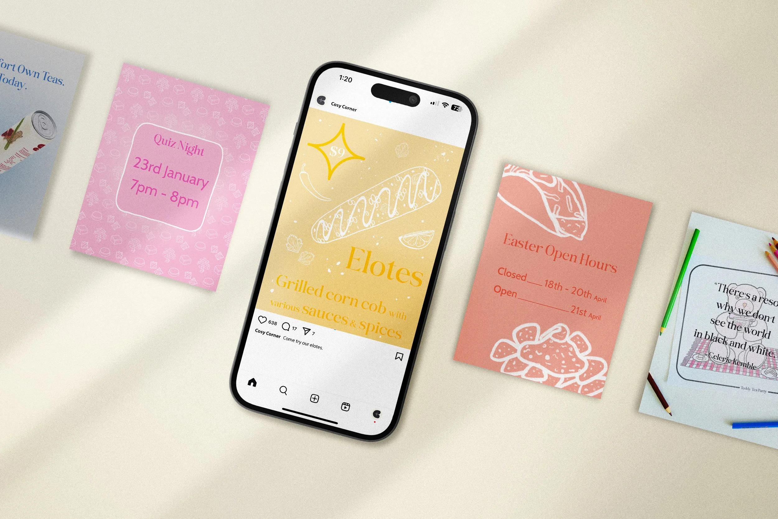
Social Media Posts Process
Social media posts were just reusing elements of the other designs to keep cohesiveness and the brand’s identity. So the colour scheme, typefaces, lineart and patterns.